

🌐 A billion-scale model for understanding radar images
PLUS: A smarter way to measure water scarcity, and a new geospatial data from Meta

Hey guys, here’s this week’s edition of the Spatial Edge — a newsletter that has more rhythm than dembow… In any case, the aim is to make you a better geospatial data scientist in less than five minutes a week.
In today’s newsletter:
Radar Model: Billion-scale AI improves SAR image understanding
Water Resilience: New index captures true water scarcity risks
Cloud-Free Imaging: AI merges cloud removal and sharpening
Canopy Heights: Global 1m forest height dataset from Meta and WRI released
Cropland Emissions: New dataset maps global agricultural emissions
Research you should know about
1. A billion-scale model for understanding radar imagery
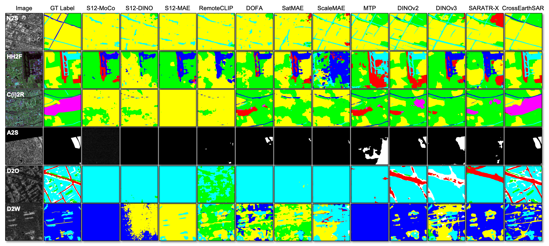
As long time readers know, Synthetic Aperture Radar (SAR) is an incredibly powerful tool for earth observation because it can see through clouds and operate in the pitch black. But teaching AI to understand radar images can be pretty difficult. Unlike normal optical photos, SAR images are plagued by granular “speckle” noise and severe geometric distortions caused by the radar’s side-looking angle. Even worse, SAR data is pretty fragmented. A model trained to identify buildings using one satellite’s specific frequency band or polarisation mode will often completely fail when looking at data from a different satellite. This extreme “domain gap” has prevented the creation of a universal AI model for radar imagery.
Researchers have built CrossEarth-SAR to solve this, the first billion-scale vision foundation model specifically designed to handle the massive diversity of radar data. To keep computational costs down while still using billions of parameters, they employed a “sparse Mixture-of-Experts” (MoE) architecture. Instead of every part of the neural network working on every image, the model uses a “router” to send specific types of radar images to specialised “expert” sub-networks. As part of this, the team built a novel “physics-guided” router that uses actual radar physics (e.g. speckle strength and directional entropy) to decide which expert should handle which image, ensuring the AI adapts to the specific characteristics of the satellite that took the picture.
To train this massive model, the team assembled a dataset of 200,000 radar images, using existing AI models to automatically generate “pseudo-labels” for unlabelled data. They then tested CrossEarth-SAR across 22 benchmarks designed to simulate real-world domain gaps. The model achieved state-of-the-art results on 20 of the 22 benchmarks, outperforming previous models by over 10 per cent in some of the hardest multi-gap scenarios. This suggests that by explicitly hardwiring radar physics into the AI’s routing mechanism, it’s possible to build a single, robust model capable of interpreting radar data from almost any satellite on Earth.
2. A smarter way to measure water scarcity

When we think of water scarcity, we usually just look at how much rain is falling or how full the reservoirs are. But a new paper from Scientific Reports argues that this is missing the bigger picture. Whether a community actually runs out of water has just as much to do with politics, infrastructure and economics as it does with hydrology. To fix this, researchers have proposed the Integrated Water Strategic Resilience Index (IWSRI). Instead of just measuring physical water, this new index acts as a broader, more holistic dashboard, combining data on climate variability, governance quality, political stability and economic adaptability to reveal a country’s true ‘water resilience’.
To test this new tool, the team applied it to the Middle East and North Africa, which is essentially ground zero for water stress. The results challenge some common assumptions. For example, Israel, Qatar and the UAE are practically deserts, yet they scored incredibly high on the resilience index. Why? Because at the time they had wealthy, stable governments that had invested heavily in desalination and wastewater recycling. They might be regretting that rating now… Anyway, on the flip side, countries like Yemen, Syria and Libya scored at the absolute bottom. It’s not just that they lack water; it’s that years of war, political instability and destroyed infrastructure have completely crippled their ability to manage the resources they do have.
The authors point out that traditional metrics like the Falkenmark Indicator would completely miss these nuances by focusing solely on per-capita water availability. By integrating sociopolitical factors, the IWSRI shows that water scarcity is often a manufactured crisis. While the researchers acknowledge that quantifying things like ‘governance’ can be tricky, this new index provides a much more realistic map of where the world’s water systems are actually breaking down.
3. Seeing through the clouds with a new all-in-one AI
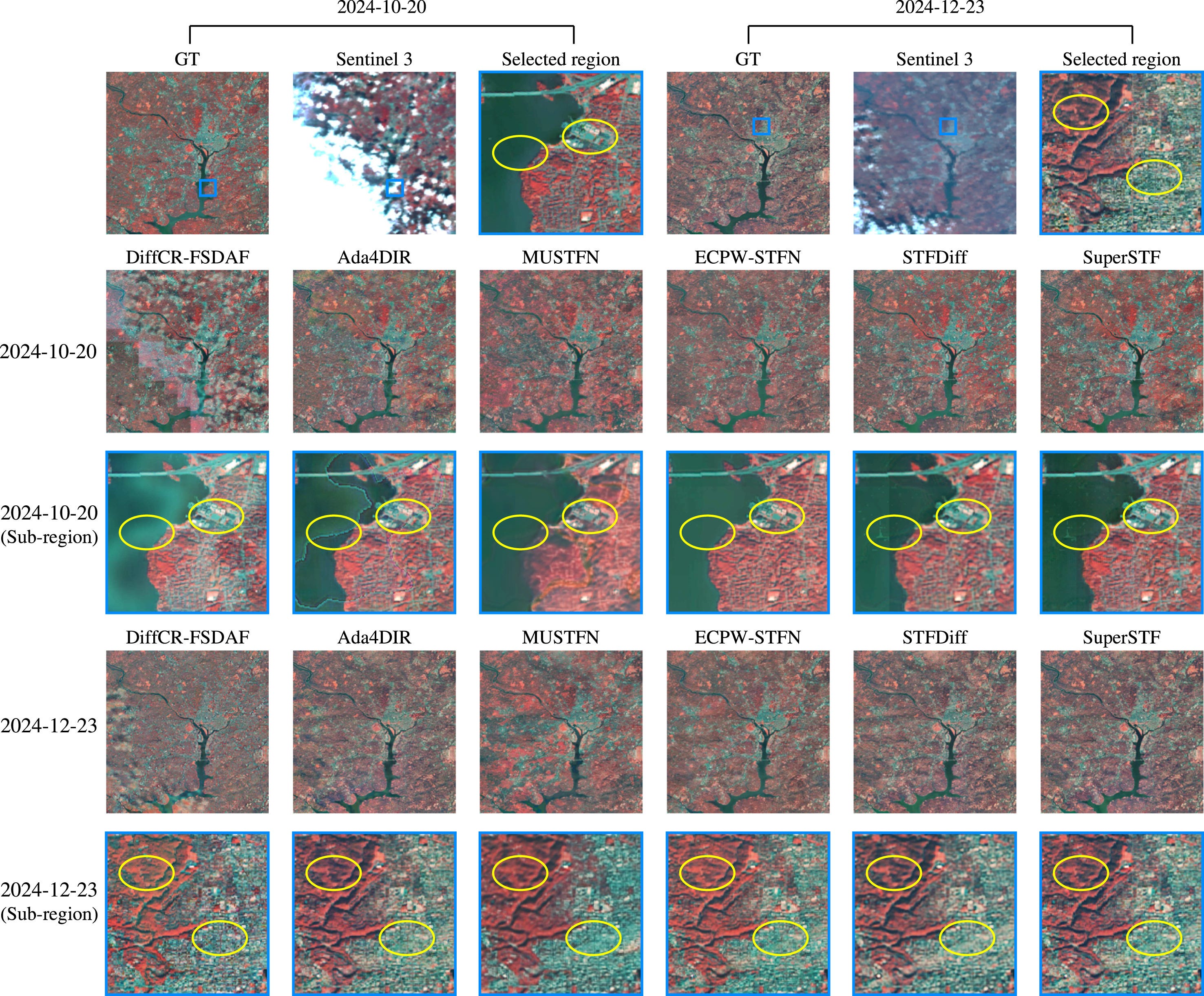
Satellites monitoring the Earth face a frustrating compromise between detail and frequency. You can either get highly detailed images every few weeks or blurry images every few days. To make matters worse, optical sensors are frequently blocked by clouds, resulting in massive gaps in data. Until now, scientists have tried to fix this by using artificial intelligence to first remove the clouds and then artificially sharpen the images through a process called spatiotemporal fusion. However, treating these as two completely separate tasks often introduces compounding errors that ruin the final picture.
This is what SuperSTF tries to address. It’s essentially a framework that tackles cloud removal and image sharpening at the exact same time. Instead of operating directly on the raw pixels, the system uses a latent diffusion model paired with a Swin Transformer. In simple terms, it compresses the images into a more efficient hidden mathematical space, fuses the frequent blurry data with the rare sharp data, and then rebuilds a pristine image. The model is also fed specific data about cloud locations and the time of year to help it intelligently guess what is hiding beneath the cloud cover.
When tested across diverse regions like urban Washington and agricultural Texas, SuperSTF completely outperformed existing sequential methods. It successfully reconstructed sharp, cloud-free image sequences even when up to 70 per cent of the original high-resolution reference image was obscured by thick clouds. Because it operates in a compressed latent space rather than processing every single pixel during its diffusion phase, it’s also surprisingly fast and computationally efficient. Ultimately, this gives scientists a much more reliable tool for tracking rapid environmental changes, crop health, and urban development without having to constantly wait for a clear sky.
Geospatial Datasets
1. Meta & WRI’s high-res global canopy height map
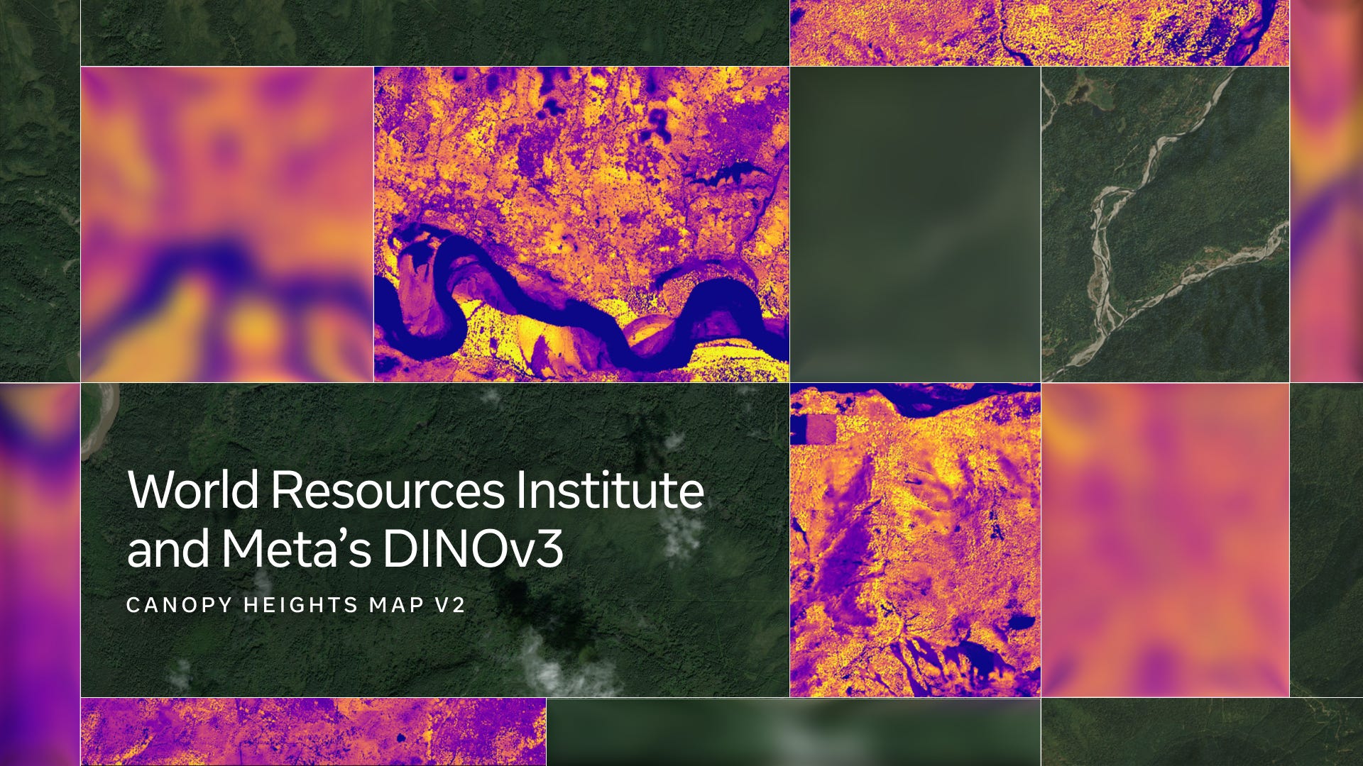
The newly updated CHMv2 dataset, created by a collaboration between the World Resources Institute and Meta, provides a 1-metre resolution global canopy height map. You can access the data here and the code here.
2. Global cropland emissions dataset
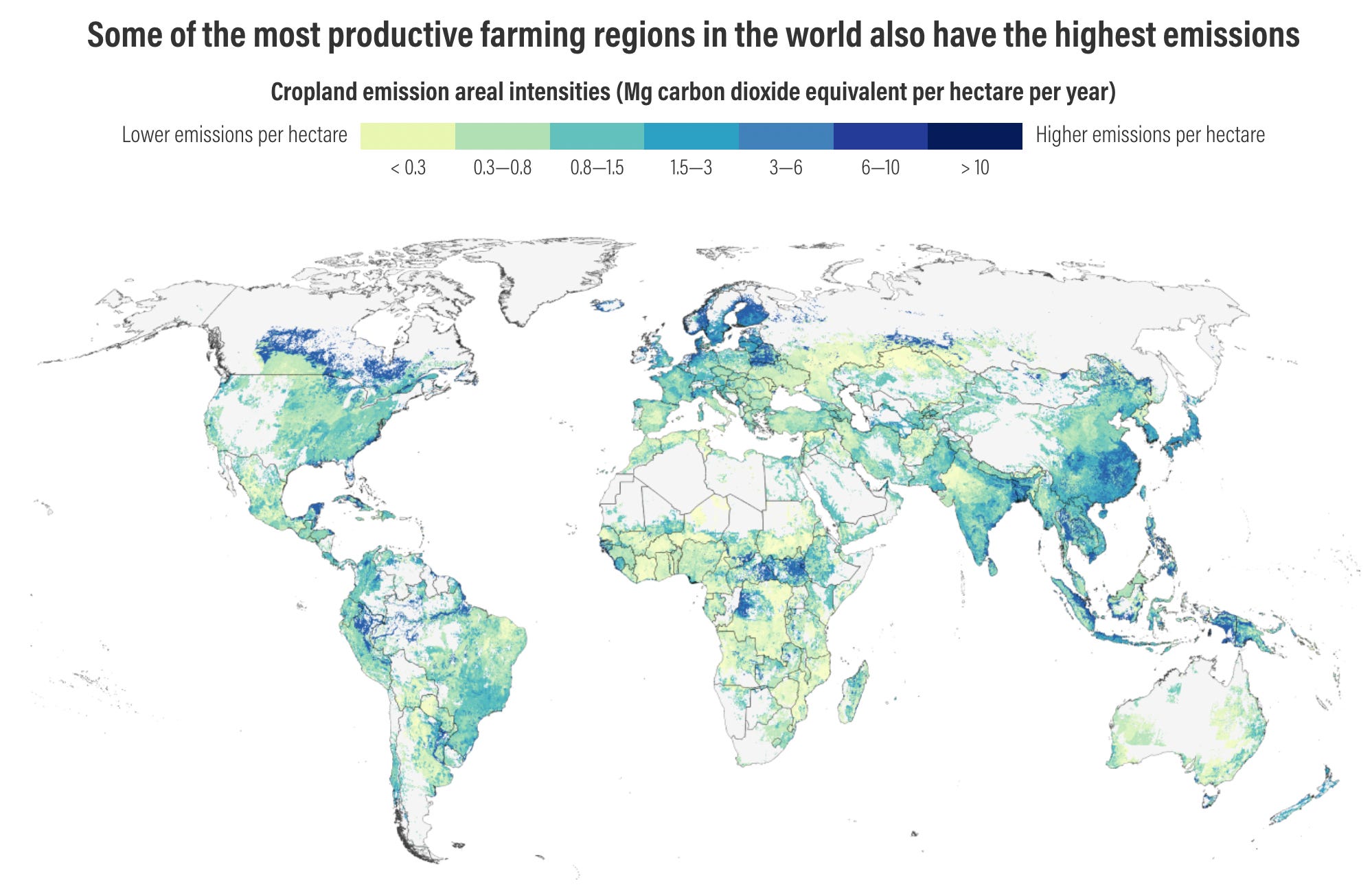
A new dataset from Cornell University and the Land & Carbon Lab maps the greenhouse gas emissions generated by the world's croplands (rice, maize, wheat, and oil palm). You can access the data and code here.
3. Convective weather forecasting dataset
 | Climavision")
The newly introduced CIDS dataset is designed to train machine learning models for detecting and nowcasting severe convective weather. It covers southeastern China from 2018 to 2023, and captures intense events like short-duration heavy rainfall, thunderstorm winds, and hail at crisp 10-minute intervals. You can access the data here and the code here.
4. Global cropland and irrigation dataset

The MIRCA-OS dataset maps monthly irrigated and rainfed harvested areas between 2000 and 2015. It includes 5-arcminute gridded data for 23 major crop classes. You can access the data here and the code here.
Other useful bits
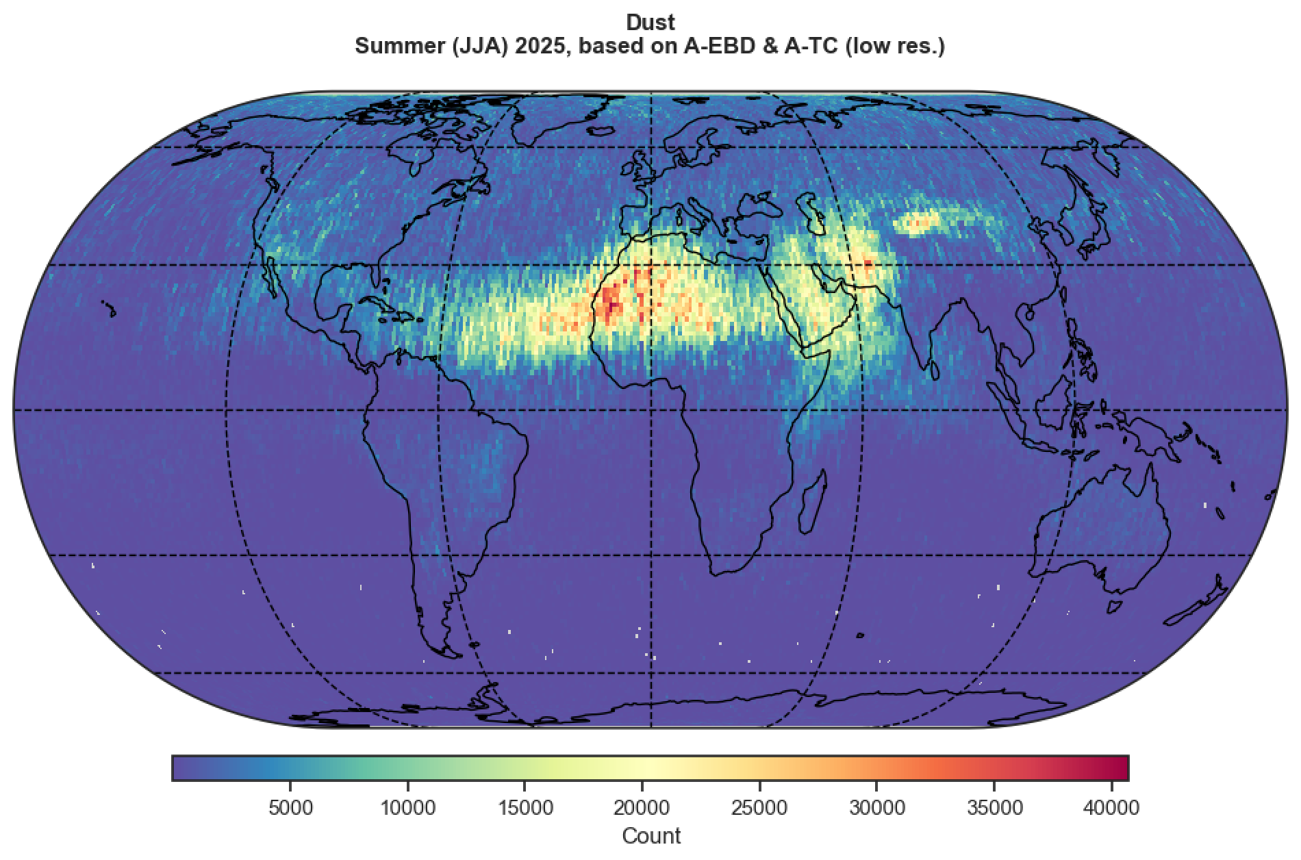
ESA’s EarthCARE satellite has just delivered some new global maps of atmospheric dust trails. By using an advanced laser instrument to track how these tiny mineral particles travel across the globe, researchers are getting a wonderfully clear picture of how dust impacts our climate and weather systems.
Google Earth’s 2026 roadmap has been unveiled, showcasing a shift towards professional workflows. We’re going to see everything from global elevation contours and seamless custom data imports to AI assistants that turn natural language into instant geospatial insights.
A new initiative in Australia is using Google Earth AI and a bunch of spatial datasets to tackle heart disease in remote communities. By combining environmental data with health records, the approach identifies spatial patterns in risk exposure. The aim is to support earlier intervention by directing care to locations where underlying risk factors are highest.
Jobs
The UN Department of Economic and Social Affairs is looking for two interns in (1) Geodesy & Geospatial Research Support and (2) Digital Design, Data Visualization & Geospatial Communications.
FAO is looking for a Remote Sensing and GIS Specialist based in Rome.
IOM is looking for a Displacement Tracking Matrix (DTM) Systems Developer and Architect based in Geneva.
UNGSC is looking for a remote ArcGIS Enterprise Administrator from Europe, Middle East and North Africa.
GHD is looking for a GIS Analyst based in Melbourne.
Just for Fun
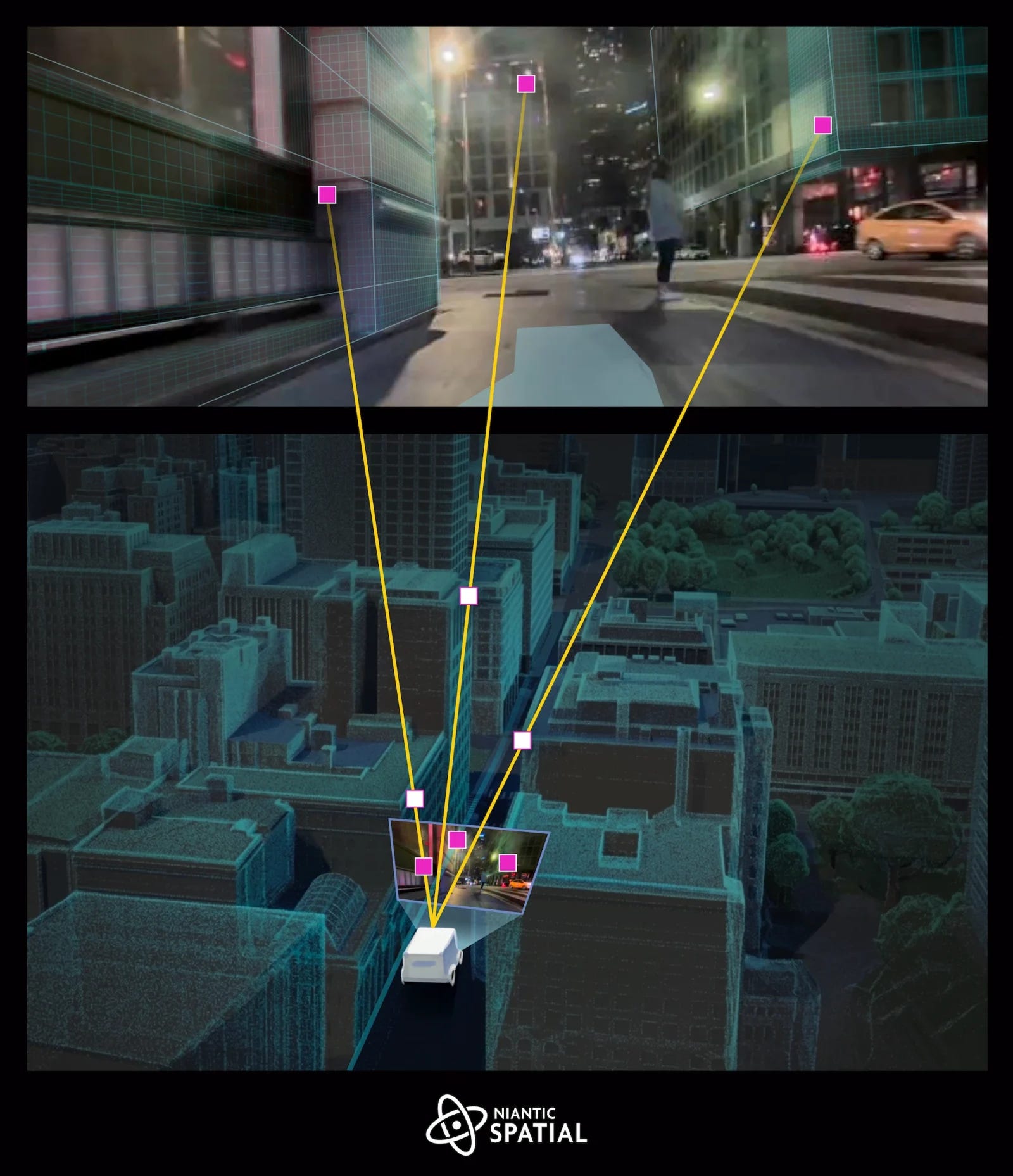
This is pretty nuts… 143 million people who spent the last eight years catching Pokémon were actually building one of the largest real-world visual datasets in AI history. Niantic has just revealed that this staggering collection of over 30 billion crowdsourced images is now being cleverly used to train visual navigation AI for delivery robots.
That’s it for this week.
I’m always keen to hear from you, so please let me know if you have:
new geospatial datasets
newly published papers
geospatial job opportunities
and I’ll do my best to showcase them here.
Yohan