🌐 Early stage crop-mapping just got a lot better
PLUS: zero-shot map labelling, building Youtube maps using text, and more.
Hey guys, here’s this week’s edition of the Spatial Edge, a place map fetishists feel no shame in inhabiting. The aim is to make you a better geospatial data scientist in less than five minutes a week.
In today’s newsletter:
Crop Mapping: AgriFM improves early-stage classification accuracy.
Map Animation: MapStory builds editable scenes from plain text.
Zero-Shot Labelling: GVL tags images with no training data.
Commuting Flows: New Origin-Destination dataset for 1,625 global cities.
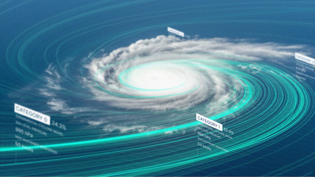
Weather AI: DeepMind model forecasts tropical cyclones early.
Research you should know about
1. Addressing the challenge of early-stage crop mapping
Crop classification is particularly tough in the early months of the growing season, when satellite signals are weak and crops are harder to tell apart. But a new model called AgriFM performs surprisingly well under these conditions.
When tested on France, it outperformed CNNs, 3D CNNs, LSTMs and transformer models like SatMAE and Prithvi. AgriFM reached 59.9% F1 and 77.5% overall accuracy, making it the clear front-runner. Its strength lies in how it combines spatial and temporal signals, which most earlier models struggle to do effectively.
Interestingly, AgriFM performs consistently across both rare and common crops. Models often do well when classes are balanced but fall apart when faced with small sample sizes. AgriFM holds up even for underrepresented crops like truffle and strawberries, thanks to its ability to pick up early phenological cues. It also improves steadily as more temporal data is added, and doesn’t collapse when only short time series are available.
The model also scales well beyond France. When tested on rice and wheat mapping across Monsoon Asia using lower-resolution MODIS and HLS data, it again outperformed the rest. For rice, it achieved 90.8% F1 when combining the two data sources. For winter wheat, it scored 75.4% F1 using MODIS alone. These are strong results, especially given the coarse resolution and frequent cloud cover in the region. A key reason is AgriFM’s pretraining strategy, which uses land cover maps rather than generic self-supervised tasks, giving the model more grounded spatial knowledge.
The code is open source and available here.
2. Turning plain text into editable map animations
Creating animated maps on Youtube usually means dragging keyframes in After Effects or writing a bunch of code. A new prototype tool called MapStory provides a simpler approach. You type a sentence like “zoom into London, then follow a ship across the Atlantic to Toronto,” and it builds the animation for you. Each part of the scene is broken down into steps like zoom, route, or highlight, and displayed on a timeline. You can edit, reorder, or adjust visual styles like colours, labels, or opacity, without needing animation experience.
MapStory fetches real geospatial data to match your script. If you write “highlight the Ontario Legislative Building,” it uses tools like OpenStreetMap to find the exact coordinates. You can also ask follow-up questions to refine the output. The system runs on two language models: one breaks down your script into animation steps, the other retrieves the data needed to make them accurate.
The key value-add is that MapStory lets you animate through plain language. Once animation becomes something you can describe in a sentence, it unlocks some prett interesting use cases. It’s still a prototype, and prototypes can be tricky. But if this can get this working consistently and at scale, this could be pretty powerful.
3. A new zero-shot tool for labelling satellite images
Training models to classify satellite imagery usually needs lots of labelled data. But that’s a problem when labels are hard to come by, especially after disasters or in low-resource settings. A new tool from Microsoft, called GeoVision Labeler (GVL), tries to solve this. It classifies images with no task-specific training at all. It uses a two-step pipeline: a vision-language model describes the image in words, and then a language model maps that description to a user-defined category.
This “description first, classify second” approach is flexible. You can swap in different image models or LLMs, define your own classes, and trace how a label was chosen by reading the intermediate text. The paper tested GVL on three common benchmarks: a simple binary task (Buildings vs No Buildings from SpaceNet v7), and two more complex ones (UC Merced and RESISC45, both with 20+ land-use classes). On the binary task, GVL gets up to 93.2% accuracy. On the more complex datasets, accuracy drops when all 21 or 45 classes are forced into the prompt, but improves when labels are grouped into broader meta-classes first.
This hierarchical trick is pretty much the key feature. Instead of making the model choose from 45 categories right away, it first asks it to pick from 4 or 5 meta-classes, then narrows it down in stages. With this method, GVL reaches 86.4% on UC Merced and 84.3% on RESISC45 at the top level. Accuracy falls at finer levels, but this approach still helps manage confusion between similar labels like ‘parking lot’ and ‘residential’.
There are limits, of course. Performance varies a lot depending on which vLLM and LLM you use, and longer prompts with too many class names often make things worse. Also, GVL currently works only with RGB images, so you can’t use near-infrared or other spectral bands yet. But as a fast, interpretable zero-shot tool, it’s a pretty promising option for tagging satellite imagery.
You can access the repository here.
4. Segmenting 300 years of cartography
Can we track changes in France’s forests over three centuries using just old maps and modern machine learning?
That’s the question tackled by a new paper that builds a large dataset of historical French maps and uses them to segment features like roads, rivers, and forests. The problem, of course, is that these historical maps often come without labels.
So the authors try something clever. Instead of manually labelling them, they use “image translation” to convert old maps into a modern cartographic style, then apply segmentation models trained on contemporary data. It turns out this weakly supervised approach works pretty well.
On the 18th-century Cassini maps, forests and rivers were segmented more accurately using the translation + segmentation method than by directly applying models to historical imagery. But it wasn’t perfect. The model sometimes hallucinated roads where there were none, or mistook old relief lines for urban features. This might be because the training labels came from the modern period, where roads and built-up areas are much more common.
Still, the best-performing models successfully picked out even small towns and individual buildings on some maps. The foundation model SAM, meanwhile, struggled in this setting. Since it was trained on natural images, it couldn’t handle the stylised look of hand-drawn cartography.
The real value came when the authors applied their best-performing models to map long-term changes in forest cover across France. For example:
Forests in the northeast during the 18th century matched historical records of dense woodlands in Franche-Comté.
In the southwest, the model captured the transformation of marshlands into pine forests in the Landes.
Nationwide, it showed a gradual increase in forest cover from the 1800s onward.
This is one of the first large-scale, ML-driven efforts to extract structured information from historical maps at this scale.
While there are clear limitations, it’s a novel and interesting step towards using old maps to study environmental change. And importantly, it does so without relying on hand-labelled historical data.
You can access the dataset and code here.
Geospatial Datasets
1. Global commuting origin-destination flow dataset
This dataset provides commuting origin-destination (OD) flows for 1,625 cities across 179 countries and six continents. Built using a deep graph generative model trained on satellite imagery, population data, and points of interest, it predicts commuting patterns between residential and workplace areas without relying on expensive surveys or mobile phone data. Each city is divided into fine-grained grid regions, with flows represented as a matrix and provided alongside shapefiles for spatial analysis.
2. Multi-Angle UAV dataset for invasive species mapping
MAVSD is a high-res, multi-angle UAV dataset for detecting Solidago canadensis L., a fast-spreading invasive species. It includes 1,700+ images captured at 30°, 45°, 60°, and 90°, each with pixel-level annotations across 13 ecological classes. You can access the data here and the code here.
3. Multimodal biodiversity research dataset
BioCube is a massive new dataset combining images, audio, eDNA, climate, land-use, and species data for over 40,000 species between 2000–2020. You can access the data here and the code here.
4. Multimodal street-level visual place recognition dataset
MMS-VPR is a richly annotated dataset designed for visual place recognition in dense, pedestrian-only environments, focusing on commercial streets in Chengdu, China. It includes over 78,000 images and 2,500 videos captured in both day and night, with matching GPS and text metadata. You can access the data here and the code here.
Other useful bits
Google DeepMind has launched Weather Lab, a new tool showcasing its AI model for predicting tropical cyclones up to 15 days in advance. The model shows some pretty promising accuracy in forecasting cyclone track and intensity, and it's already being tested in real time with the U.S. National Hurricane Center.
Google DeepMind, in collaboration with Google Research, has also released three open-source projects to support geospatial AI research:
Jeo – a JAX/Flax-based toolkit for Earth observation model training.
GeeFlow – tools for processing large-scale geospatial datasets using Google Earth Engine.
ForesTypology – datasets for global forest mapping and biodiversity protection.
The Amazon Sustainability Data Initiative (ASDI) makes high-value open data more accessible to support sustainability research and innovation. Its goal is to reduce the time and cost of using big datasets, helping scientists, policymakers, and developers build solutions faster.
A new Python tool called MultiRTC is tackling a key roadblock in satellite disaster response: combining public and commercial SAR data. It improves geolocation and radiometric accuracy across datasets, making it easier to build consistent before‑and‑after maps during emergencies.
Jobs
The Caribbean Development Bank is looking for an economist based in Barbados.
UN is looking for a Geospatial Information Officer in New York to support the Geospatial Information Section under the Office of Information and Communications Technology (OICT).
Mapbox is looking for a US-based Software Development Engineer under its Location AI team.
UNICEF is looking for a remote Data Processing and Analysis Consultant to support its Data and Analytics Team.
IMPACT Initiatives is looking for a Global GIS Specialist based in Geneva and a remote Senior Data Officer.
Earthworks is looking for a US-based Data Analyst to help their Energy Team.
Image of the week
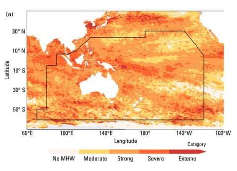
A huge marine heatwave in 2024 covered an area five times the size of Australia, hitting oceans across Southeast Asia and the Pacific. Driven largely by climate change, the extreme heat coincided with deadly floods, typhoons, and rapid glacier loss across the region, and triggered mass coral bleaching on the Great Barrier Reef.
That’s it for this week.
I’m always keen to hear from you, so please let me know if you have:
new geospatial datasets
newly published papers
geospatial job opportunities
and I’ll do my best to showcase them here.
Yohan


