

🌐 Central Africa’s forests are losing carbon

Hey guys, here’s this week’s edition of the Spatial Edge, a place where no polygon is ever left unclosed. Anyway, the aim (as usual) is to make you a better geospatial data scientist in less than five minutes a week.
In today’s newsletter:
Displacement Settings: Satellites estimate living standards around refugee camps.
Forest Carbon: Central Africa’s forests lose 58 Tg carbon yearly.
Neolithic China: Terrain shaped where early settlements clustered.
Methane Plumes: Google maps methane plumes from EMIT imagery.
Overture Maps: Places data grows to 81.5 million features.
Research you should know about
1. Estimating living standards in displacement settings from space
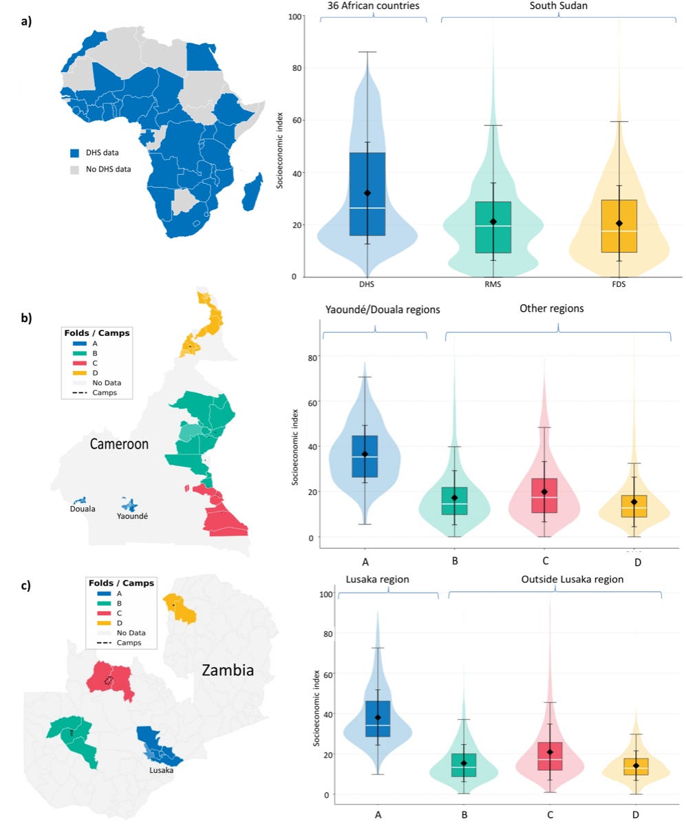
If you’re in the field of economic geography, then you’ve probably come across heaps of satellite-based poverty and wealth maps. This one (from researchers at UNHCR, Chalmers University and the World Bank) is a bit different though, since it’s focussed specifically on forced-displacement settings. For these groups, welfare can change pretty quickly between surveys, and surveys can obviously be quite costly and infrequent. Camps and settlements also look pretty different from the towns and villages these models learned from.
They took a vision transformer pretrained on 1.2 million DHS households across 36 African countries and adapted it to UNHCR survey data from South Sudan, Cameroon and Zambia. The inputs were Landsat imagery, VIIRS night-time lights and Open Buildings footprints on 6.72 km grid cells. They froze the early layers and fine-tuned the rest on the Forced Displacement Survey (2023–2025) and the Results Monitoring Survey (2024). A sliding window boosted the number of training cells in dense camps from 608 to 1,123, and testing was spatially blocked so test regions were never seen in training.
Out of the box the model failed (R² near zero), but after fine-tuning it reached an R² of 0.40 overall and 0.66 in grid cells overlapping camps. Performance varied a lot by country: 0.62 in South Sudan, 0.44 in Zambia and 0.28 in Cameroon. Projected forward, the model suggests South Sudan’s mean socioeconomic index fell 27% between 2023 and 2025. Anyway, the authors pitch it as a way to flag areas that are getting worse for field checks between survey rounds, rather than a replacement for surveys. This is ultimately the approach I think most people take with deriving remote-sensing based insights on socio-economic issues.,,
2. Synchronised global heat is at a 1,000-year high
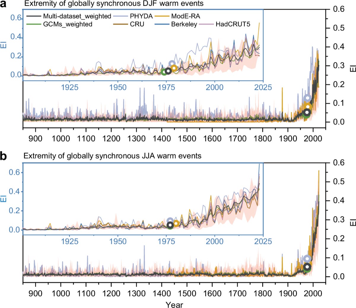
So heat extremes that hit several regions at once can do a lot more damage than isolated ones. Interestingly, most prior research has focused on northern summers. So a new study in Nature Communications led by Beijing Normal University looks at globally synchronous warm seasons across all four seasons, going back to 850 CE.
The team built an Extremity Index that combines how intense local land temperature anomalies are with how much land crosses a warm threshold at the same time. They calculated it from instrumental records, paleo-reanalysis products and climate model simulations, then ran detection and attribution analyses to separate natural, greenhouse gas and aerosol influences. The index catches things plain averages miss: in the 2009/10 northern winter, the global land temperature anomaly ranked only 22nd since 1901, but the Extremity Index ranked it 3rd.
These synchronous warm events have intensified sharply since the 1970s in every season, reaching levels not found earlier in records going back to 850 CE. Before 1970, only 18% of December–February seasons and 15% of June–August seasons made the index’s top 5%; since 1970, it’s 89% and 86%. Greenhouse gas forcing is the main driver, and the tropics contribute a lot because their naturally low variability makes warm anomalies stand out. The data and code are on Zenodo.
3. Central Africa’s forests are losing carbon
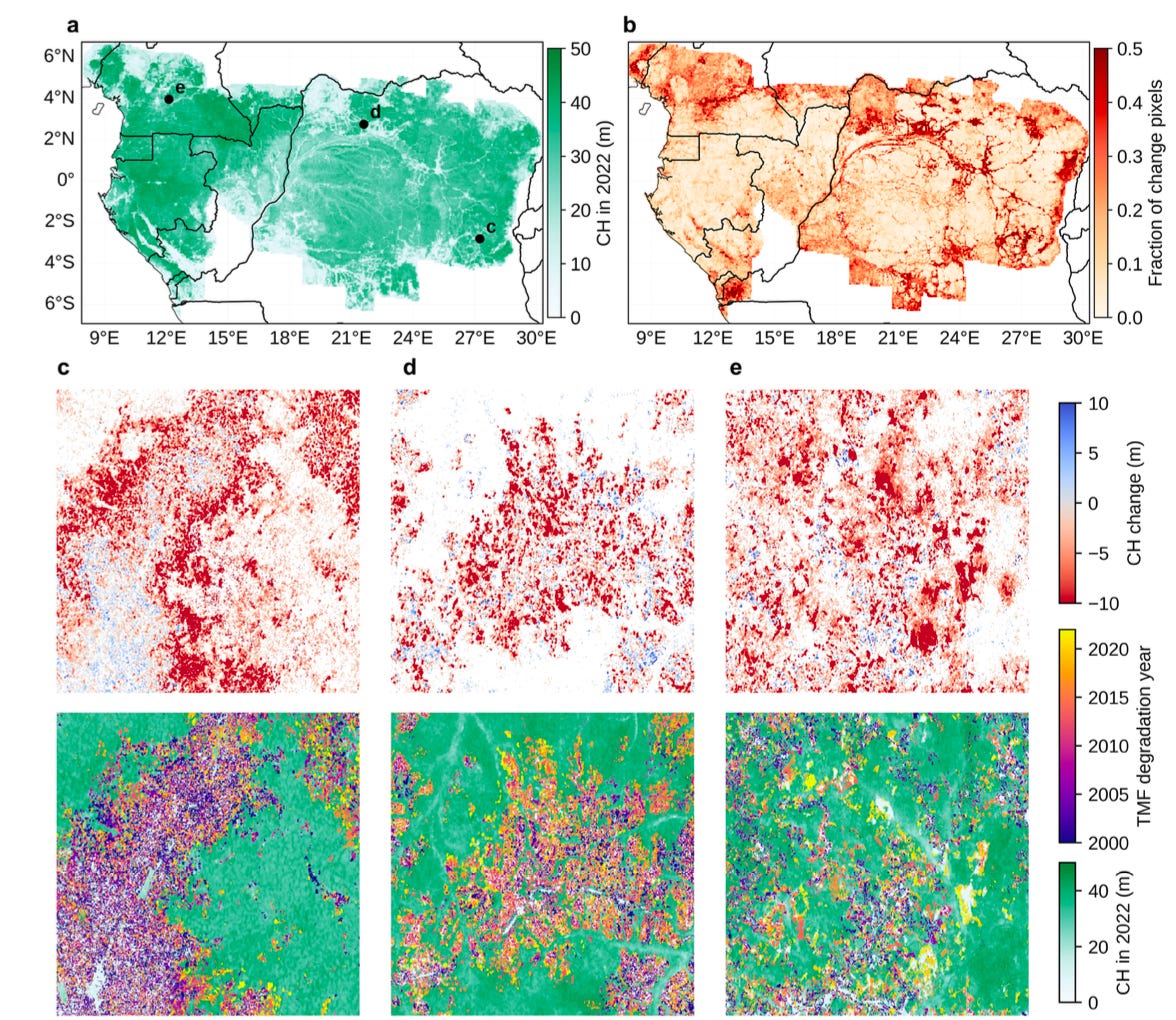
Central Africa’s dense humid forests hold vast carbon stocks, but they’re increasingly hit by small-scale disturbances that current satellite observations struggle to pick up. That makes it hard to say how much carbon the region is actually gaining or losing, and where. A new study in Nature Communications led by LSCE in France tackles this with much finer maps.
The team used deep learning to map canopy height at 10 m for every year from 2019 to 2022, then turned those maps into 30 m estimates of biomass change. The model combines spaceborne lidar with Sentinel-1 radar and Sentinel-2 optical imagery. They then built carbon budgets for each country and compared them with national inventories and bookkeeping model estimates.
The region’s forests lost a net 58 ± 14 Tg of carbon a year, and small patches did a lot of the damage. 87% of disturbance patches are smaller than 1 hectare, yet they account for 37% of carbon losses from deforestation and 48% of carbon gains in regrowing forests. Gross losses of 126 Tg C a year were only partly offset by 68 Tg C of gains. The Democratic Republic of the Congo is a net source of 46 Tg C a year (79% of the regional loss), mainly through degradation, even though it also has the largest gains in young secondary forests. The estimates broadly line up with country-level inventories, which is a good sign for transparent, map-based carbon monitoring.
4. How terrain shaped settlement in Neolithic China

Cities grew out of settlement networks that existed long before formal roads, states or urban planning, but we know surprisingly little about how those early networks were organised. A new study in Nature Cities from the London School of Economics and colleagues in China looks at how terrain shaped settlement across Neolithic China between 5000 and 2000 BCE.
They combined a newly compiled set of 3,587 georeferenced archaeological sites with a terrain-accessibility index derived from topography. The index captures how easy it is to move overland given the shape of the landscape. They counted sites in 0.25° grid cells, regressed settlement intensity on accessibility across four Neolithic phases, and tracked clustering with Moran’s I and nearest-neighbour distances. The results held after controlling for distance to major rivers.
Settlements clustered more and more along accessible corridors until about 2500 BCE, and then that link weakened sharply. In the core agricultural region, the accessibility coefficient rose from 0.413 in the Early Neolithic to 0.470, then dropped to 0.358 in the final phase (2500–2000 BCE). Across all of China it roughly halved, from 0.163 to 0.083. Clustering kept getting stronger (Moran’s I rose from 0.24 to 0.33), but the main concentration of sites moved into intermediate-accessibility areas. So terrain structured early settlement, but that relationship shifted as societies grew more complex. The data and code are on Zenodo.
Geospatial Datasets
1. A global map of mobile coverage from 1999 to 2030
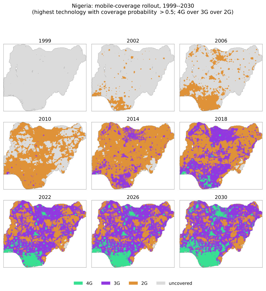
This mobile network coverage raster maps 2G, 3G and 4G coverage at 1 km across 214 countries and territories from 1999 to 2030, with modelled estimates to 2020, predictions for 2021–2024 and extrapolations to 2030. It combines three models tuned on 2,409 operator-reported coverage maps, and the machine-learning model reaches an AUC of 0.89–0.92 on held-out countries. You can access the data here.
2. US evapotranspiration back to 1985
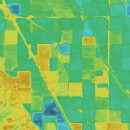
OpenET has added monthly evapotranspiration estimates for 1985–1999 across the contiguous US at 30 m, using Landsat 5 and an ensemble of six models. You can access the data here, with each individual model also available in the Earth Engine catalog.
3. Methane plumes detected from space
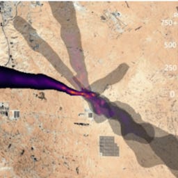
Google Research’s MAPL-EMIT plume dataset uses deep learning to detect methane plumes in hyperspectral imagery from NASA’s EMIT instrument on the International Space Station, at 60 m globally from August 2022 to June 2026. You can access the data here.
4. Where cocoa, coffee, palm and rubber are grown
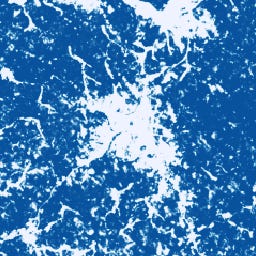
Google and the Forest Data Partnership have released a 2026 version of their commodity probability models for cocoa, coffee, palm and rubber. The cocoa layer gives the probability that each 10 m pixel contains cocoa trees across the tropics (24°S to 24°N) for 2018–2024, and is designed to help track commodity-driven deforestation. You can access the data here and the documentation on GitHub.
5. City-scale 4G and 5G measurements for Vienna
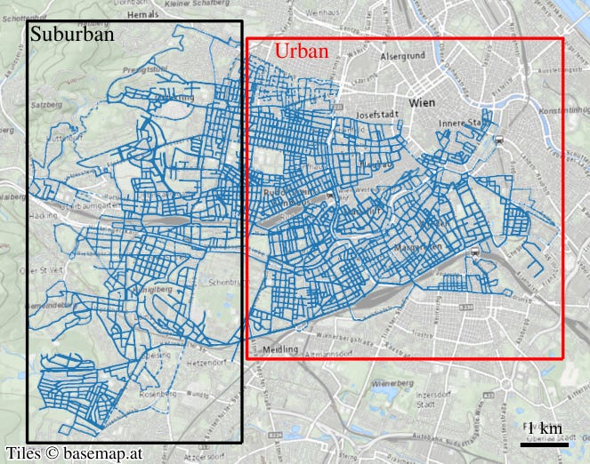
The Vienna 4G/5G Drive-Test Dataset combines georeferenced LTE and 5G measurements from wideband scanners and phones across Vienna, with estimated base station locations, sector azimuths and antenna heights, plus building and terrain models for ray-tracing work. You can access the data here.
Other useful bits
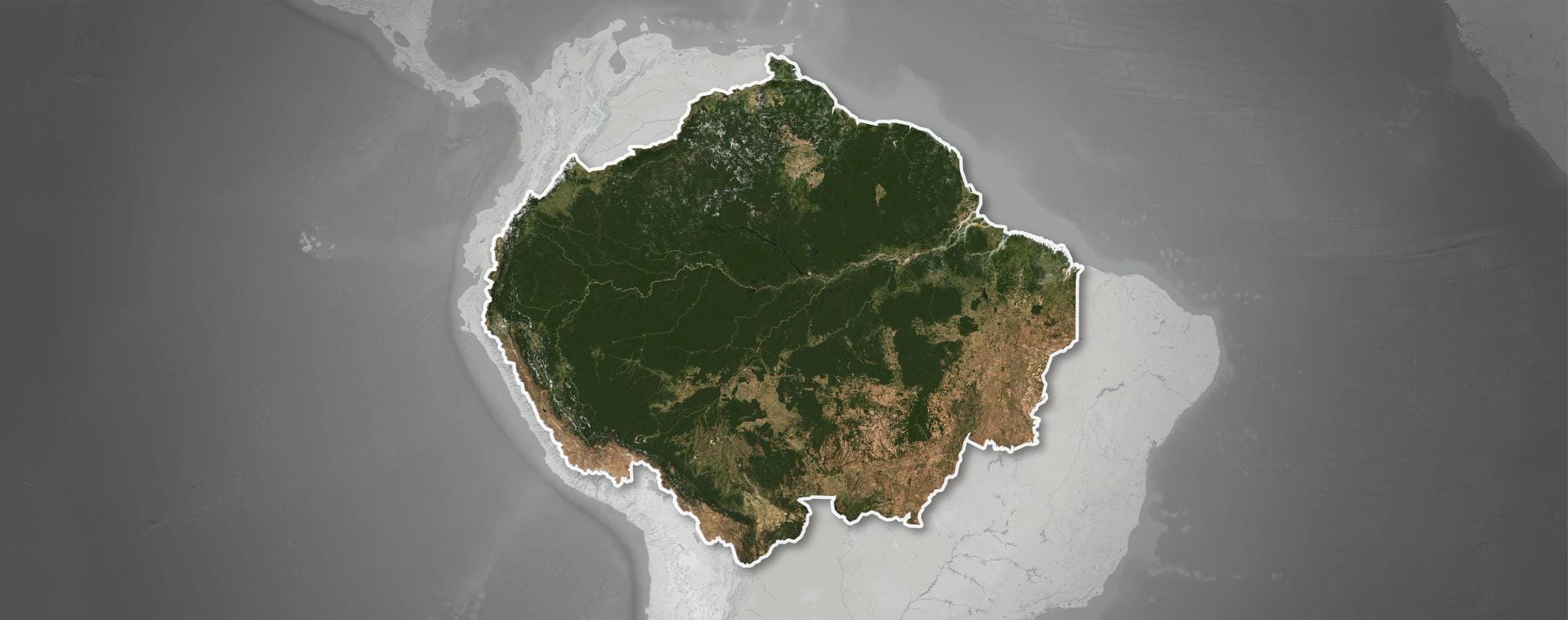
Planet has launched Amazon.ia, an initiative combining satellite imagery, ground data and AI to monitor biodiversity across the Amazon, backed by more than $14 million from the Bezos Earth Fund. Interestingly for me though, the website doesn’t actually work. So not sure what’s up with that… Anyway, more than two dozen partners, including Microsoft’s AI for Good Lab, MIT, Cornell and WWF, will produce change alerts, ecosystem condition assessments and evidence of protected-area effectiveness.
Overture Maps’ September release is out, and it comes with schema v2.0.0 and a breaking change: places now use
taxonomy(orbasic_category), and the oldcategoriesproperty is gone. Places grew 10.6% to 81.5 million features as BrightQuery coverage expanded into Germany, Italy and Denmark, and buildings now total 2.53 billion features.Europe has launched Copernicus Sentinel-3C, which lifted off on a Vega-C from Kourou on 14 September to join Sentinel-3A and 3B. It measures sea temperature, sea level, ocean colour and land temperature, which feeds into monitoring of heatwaves, wildfires and marine pollution.
Image: EU Agency for the Space Programme.

Planet has opened a satellite factory in Berlin, a 5,700 m² site that will build its Pelican satellites and add 70 jobs. The first Berlin-built satellites are due to launch on an Isar Aerospace rocket from Norway in early 2027.
Image: Planet, via Via Satellite.
Orbify’s warped 3D map demo bends the scene so you can see nearby and distant features at the same time, which could be handy in navigation apps. The Oslo-based company’s warping technology is patent-pending, and the demo runs in the browser with WASD controls.
Jobs
ABPmer is looking for a Principal Geospatial Consultant based in Southampton, United Kingdom (hybrid).
Utrecht University is looking for a Postdoc in AI-driven Urban (Re)Design for Health based in Utrecht, Netherlands.
Utrecht University is looking for a PhD candidate in Spatial Optimization of Land Use in Brazil based in Utrecht, Netherlands.
National Biodiversity Data Centre is looking for a GIS Officer based in Waterford, Ireland.
Just for Fun

Omega Centauri packs about 10 million stars, all much older than the Sun, into a ball roughly 150 light-years across. At 15,000 light-years away, it’s the largest and brightest of the 200 or so globular clusters in the Milky Way’s halo. Unusually, its stars span a range of ages and chemical make-ups, so it may be the leftover core of a small galaxy that merged with ours.
That’s it for this week.
I’m always keen to hear from you, so please let me know if you have:
new geospatial datasets
newly published papers
geospatial job opportunities
and I’ll do my best to showcase them here.
Yohan