


Hey guys, here’s this week’s edition of the Spatial Edge, a place where nobody ever loses their projection… Anyway, the aim as usual is to make you a better geospatial data scientist in less than five minutes a week.
In today’s newsletter:
Income Mapping: Google Maps pins predict São Paulo neighbourhood incomes.
Urban Cooling: Canals cool nearby streets by nearly a degree.
Wildfire Risk: AlphaEarth embeddings transfer between regions without retraining.
Crop Forecasts: Sequence models predict wheat canopy a month ahead.
Vector Mapping: One click draws a building polygon in QGIS.
Research you should know about
1. Estimating neighbourhood income from Google Maps pins
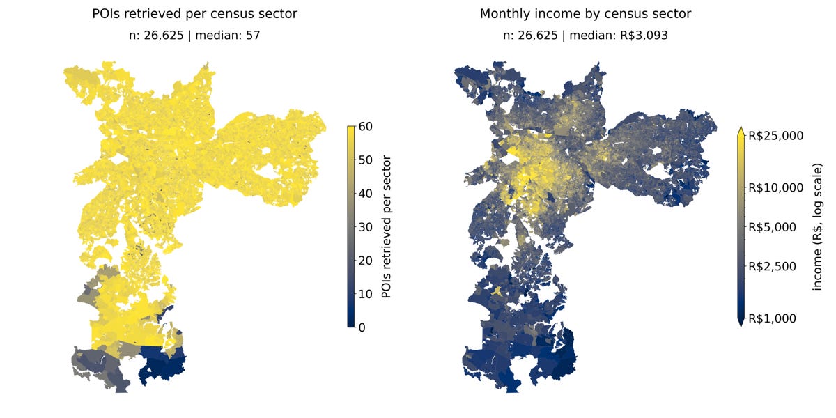
A new study from Bowdoin College and PUC-Campinas asks whether the businesses listed on Google Maps can stand in for a census when it comes to mapping income across São Paulo. Brazil’s census runs every ten years, so for most of the decade policymakers are working from stale numbers at the neighbourhood level. Points of interest, on the other hand, update constantly and cost almost nothing to pull.
The researchers queried Google Places for 47 theoretically chosen anchor categories, which surfaced 386 distinct subtypes across São Paulo’s 26,625 census sectors, with a median of 57 POIs per sector. They reduced the counts with PCA and non-negative matrix factorisation, then tested 77 configurations across seven regression models, from ridge regression to XGBoost, against household income from the 2022 IBGE census.
The best setup, NMF with 50 components feeding gradient boosting, reached a held-out R² of 0.646, so POIs alone explain close to two thirds of the variation in sector income. Churches and bars cluster in lower-income sectors, while doctors, dentists and parking lots track affluence. The model over-predicts the poorest areas and under-predicts the richest, and the residuals are spatially clustered (Moran’s I of 0.334), so there’s still room for spatial modelling. The code is on GitHub.
2. Canals are quietly cooling Britain’s cities
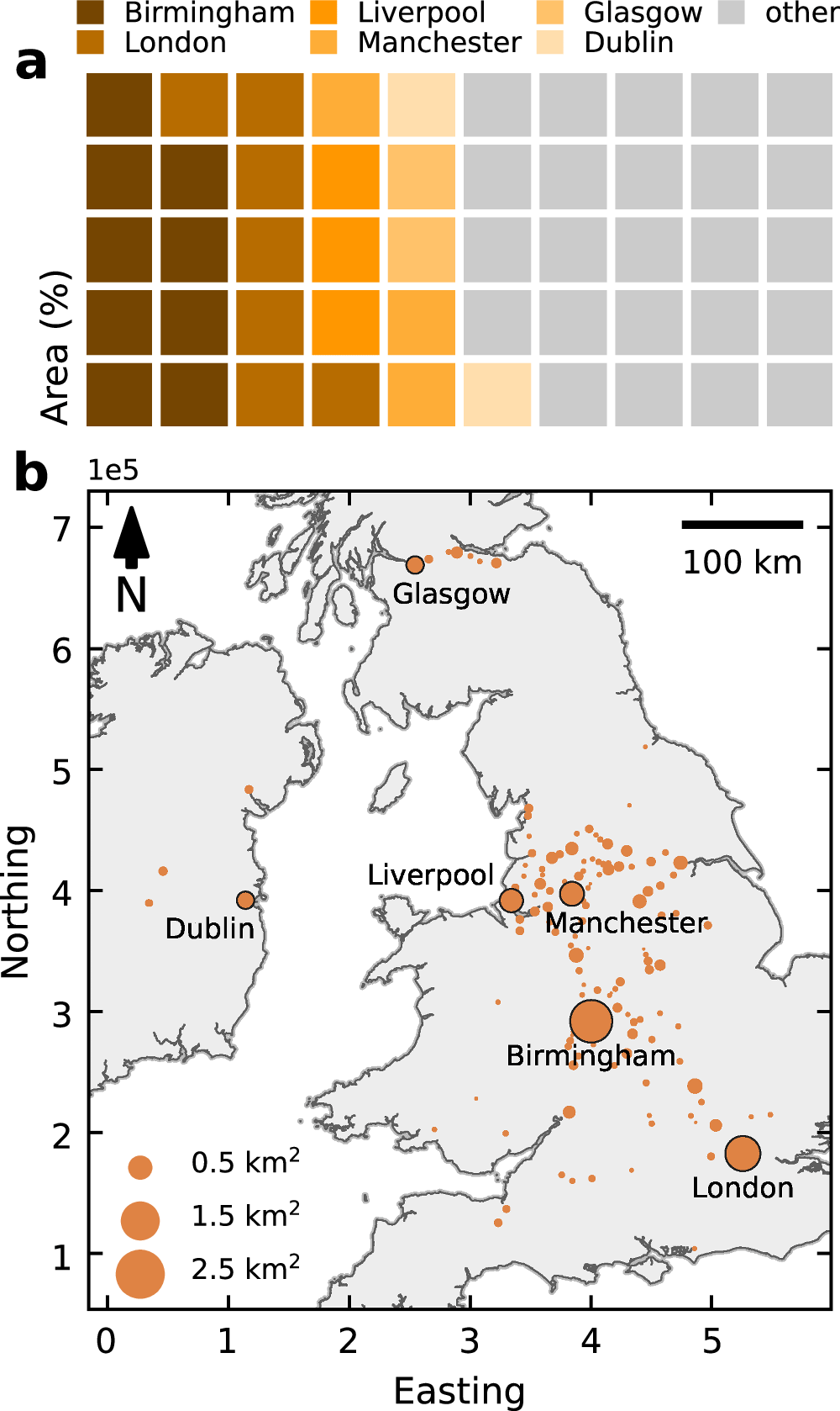
A new study in Nature Communications from the University of Manchester models the thermal effect of every urban canal in Great Britain and Ireland, and finds they cool the air around them by about 0.8°C on a typical day. Urban greenspace gets a lot of attention as a heat fix, with trees and parks shown to cut daytime temperatures by roughly 0.94°C. Bluespace, meaning rivers, lakes and canals, has had far less scrutiny, partly because micrometeorological simulations only ever cover a handful of sites for a day or two, while satellite land surface temperature products are too coarse to see what a 15 metre wide canal does to the street next to it.
The team built an energy balance model that compares the radiative, evaporative and convective fluxes of canal water against an equivalent surface of asphalt, and ran it at 15-minute intervals for the whole of 2022 across 2,356 canal sections. Inputs are canal geometries and depths from the Ordnance Survey and the Canal and River Trust (OpenStreetMap for Ireland), building heights for shading, and hourly OpenWeather data. Modelled water temperatures were checked against Canal and River Trust sensors at six sites, with residuals mostly within 1 to 2°C.
The median annual daytime cooling is 0.77°C within roughly 20 to 50 metres of the banks, rising to 1.2 to 1.4°C in spring and early summer and 1.5 to 2.3°C during the three 2022 heatwaves, including the one that produced the UK’s 40.3°C record. The flip side is a small nighttime warming of about 0.16°C, because water holds its heat. Regionally the daytime effect ranges from 0.32°C to 1.37°C depending on cloud and wind, and the area that benefits is around 12.4 km² in Birmingham, 8.1 km² in London, 4 km² each in Manchester and Liverpool, and 2 km² each in Glasgow and Dublin.
3. Mapping wildfire risk with AlphaEarth embeddings
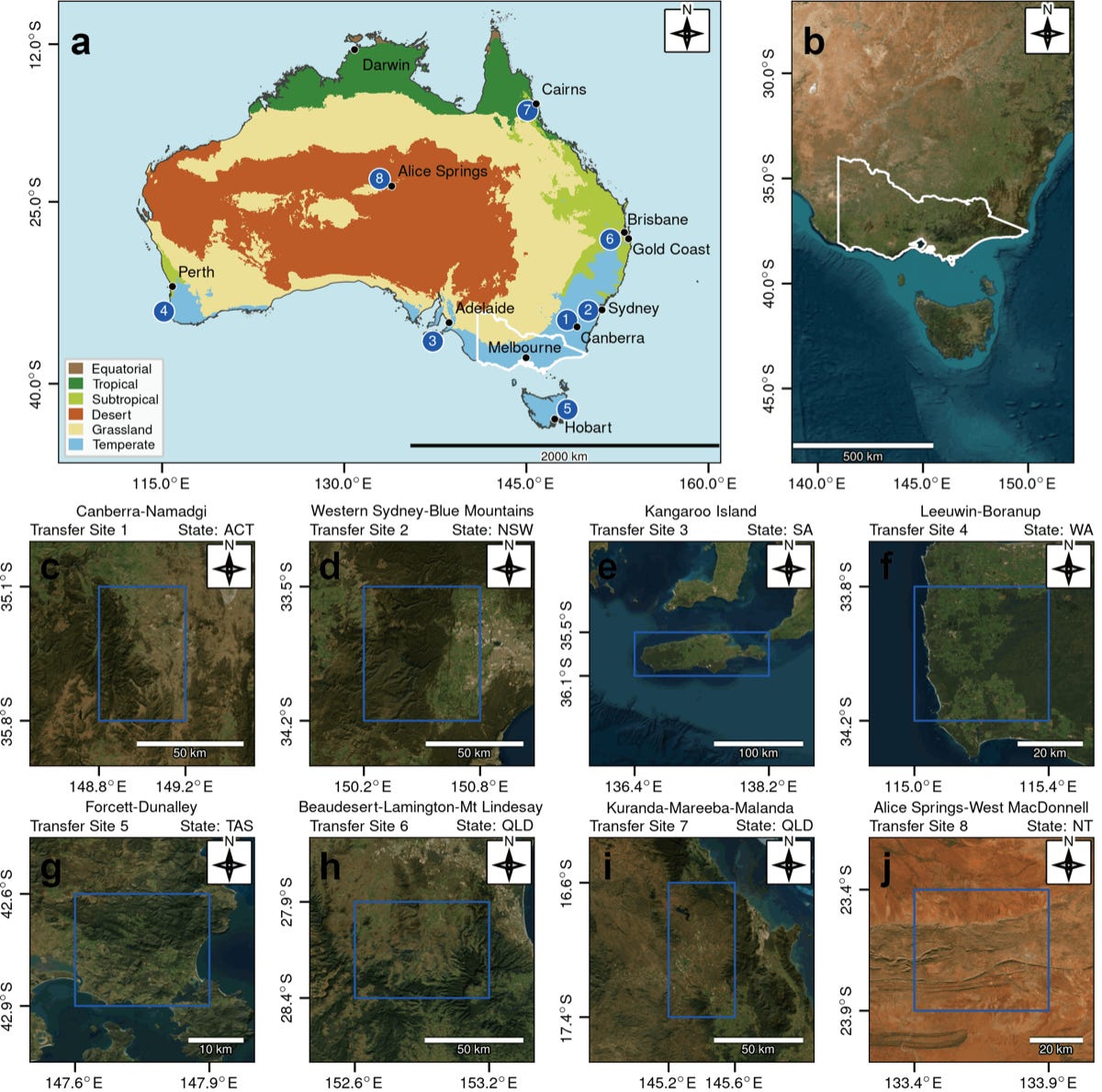
A new study from UNSW Sydney and the University of Wisconsin-Madison tests whether Google’s AlphaEarth Foundations embeddings can replace the usual stack of hand-built predictors in wildfire susceptibility mapping. The conventional approach means harmonising dozens of layers, from slope and land cover to fire weather indices and soil moisture, and the resulting models tend to fall apart when you move them to a new region.
The team used MODIS active fire detections for Victoria, Australia from 2017 to 2025, giving 18,140 fire cells on a 1 km grid (about 8% of the state) matched 1:1 with pseudo-absences. They trained random forests, XGBoost, LightGBM, an MLP, TabPFN and CNNs on 9, 17 and 25 km patches of embeddings, and compared them against the same models fed 22 physical predictors screened from an initial pool of 35.
The embedding models scored ROC-AUC above 0.92 in Victoria, and when transferred without retraining the AUC rose about 4% in Canberra and fell only about 2% in the Western Sydney and Blue Mountains region, whereas the physical-variable models lost around 25%. High and very high susceptibility concentrated in eastern Victoria along the Great Dividing Range, the Victorian Alps and Gippsland, plus parts of southwestern and central Victoria. The authors pitch it at government agencies and insurers who need risk maps that travel.
4. Forecasting wheat growth a month ahead from Sentinel-2
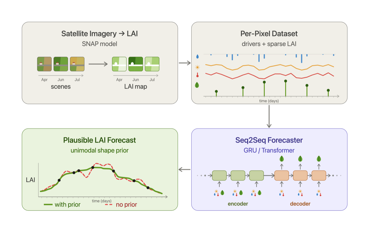
A new study from Agroscope and the Swiss Data Science Center shows that satellite time series plus weather can forecast how a wheat canopy will develop up to 32 days ahead, at 10 metre resolution, across an entire country. Most crop monitoring is backward looking: you see what the leaf area index did, not what it’s about to do. Clouds make it worse, leaving the satellite record full of gaps that models tend to fill with implausible wiggles.
The team assembled 20.6 million pixel-level Sentinel-2 LAI time series for winter wheat across Switzerland over five seasons (2021 to 2025), paired with daily temperature, sunshine and precipitation. They trained a bidirectional GRU sequence-to-sequence model and a transformer encoder-decoder against MLP and LightGBM baselines, and added a lightweight unimodal shape regulariser that penalises valleys in the predicted trajectory so it keeps the rise-peak-decline shape a wheat season should have.
In leave-one-year-out tests the GRU reached a mean R² of 0.823 and RMSE of 0.731 LAI units, with the transformer close behind at 0.803, and both comfortably beat the non-sequential baselines. The regulariser cost almost nothing in accuracy while making the trajectories biologically sensible. The setup is crop and region agnostic, so the same recipe should port to other crops where LAI is available.
5. One click to draw a building polygon in QGIS
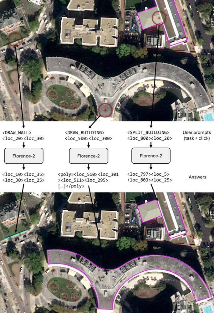
A new paper from LuxCarta, accepted at IGARSS 2026, introduces Click2Poly, a vision-language model that lets a mapper click once on a satellite image and get a clean building polygon or wall line back. Automated building extraction has got good, but production mapping still ends with a human fixing the outputs by hand, and that correction step is where most of the time goes.
Click2Poly extends Microsoft’s Florence-2 with three tools: draw a building, split a connected block into separate buildings, and trace a wall or fence. It was trained on 377,207 building polygons across 202 areas (about 1,344 km²) and 197,234 wall linestrings across 117 areas, all on 30 cm Pléiades Neo imagery cut into 768 pixel patches, with user clicks simulated by sampling random points inside each building during training. It ships as a QGIS plugin talking to a server that caches image encodings.
In a timing study with four operators across four test areas, Click2Poly cut editing time from 303.5 to 199 minutes, a 1.53x speed-up overall, reaching 2.30x in the Philippines and 1.78x in Angola, though it was marginally slower (0.93x) in a dense São Paulo scene. Agreement between operators stayed at 90.7 to 96.5% IoU, and inference runs at about 1.3 seconds to encode an image and 0.8 seconds per polygon on an RTX 3060.
Geospatial Datasets
1. Four decades of global forest fire patches from Landsat
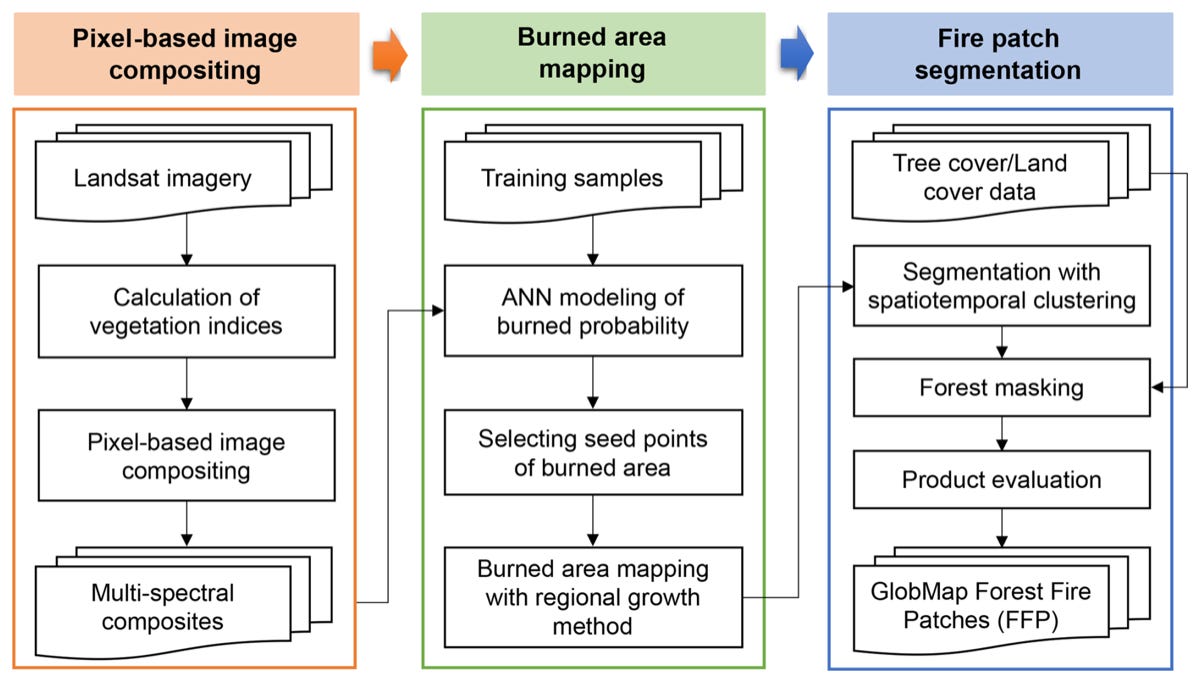
GlobMap FFP is a global inventory of 11.97 million individual forest fire patches mapped at 30 m from Landsat between 1984 and 2022, covering all forest with more than 25% tree cover. You can read the paper here and access the data here.
2. Global forest disturbance regimes inferred from satellite biomass
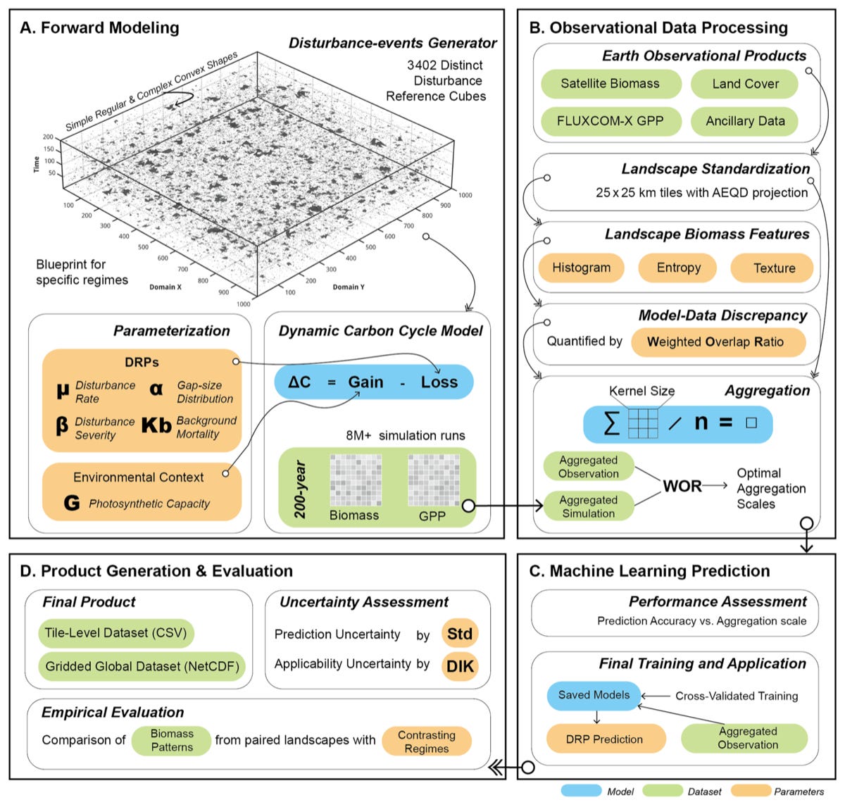
A Max Planck Institute for Biogeochemistry dataset of four disturbance regime parameters (disturbance rate, gap-size distribution, severity and background mortality) for the world’s forests, derived by inverting the spatial pattern of ESA GlobBiomass 2010 with random forests trained on more than 8 million synthetic forest simulations. It comes as 25 km tiles in CSV and a 0.25° global grid in NetCDF, with reliable predictions for roughly 90% of forest regions. You can read the paper here, access the data here and the code here.
3. Snowmelt runoff onset from Sentinel-1, 2015 to 2024
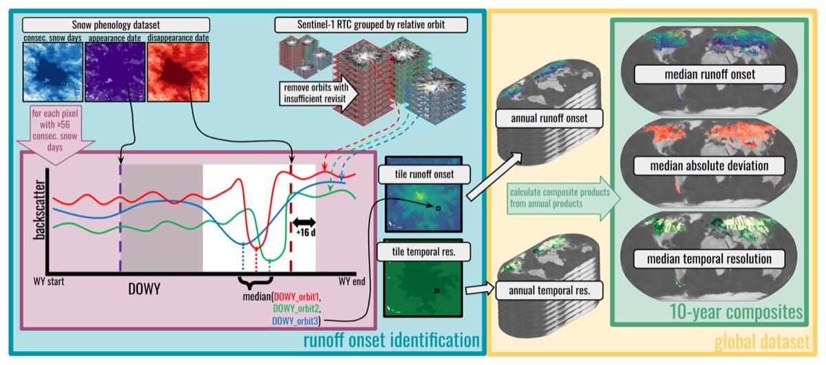
A University of Washington dataset of the date snowmelt runoff begins each year at 80 m resolution for almost all seasonal snow on Earth (60°S to 81.1°N), for water years 2015 to 2024, plus ten-year median and variability composites. You can read the paper here, access the data here and the code here.
4. Thirty years of paddy rice maps for South and Southeast Asia
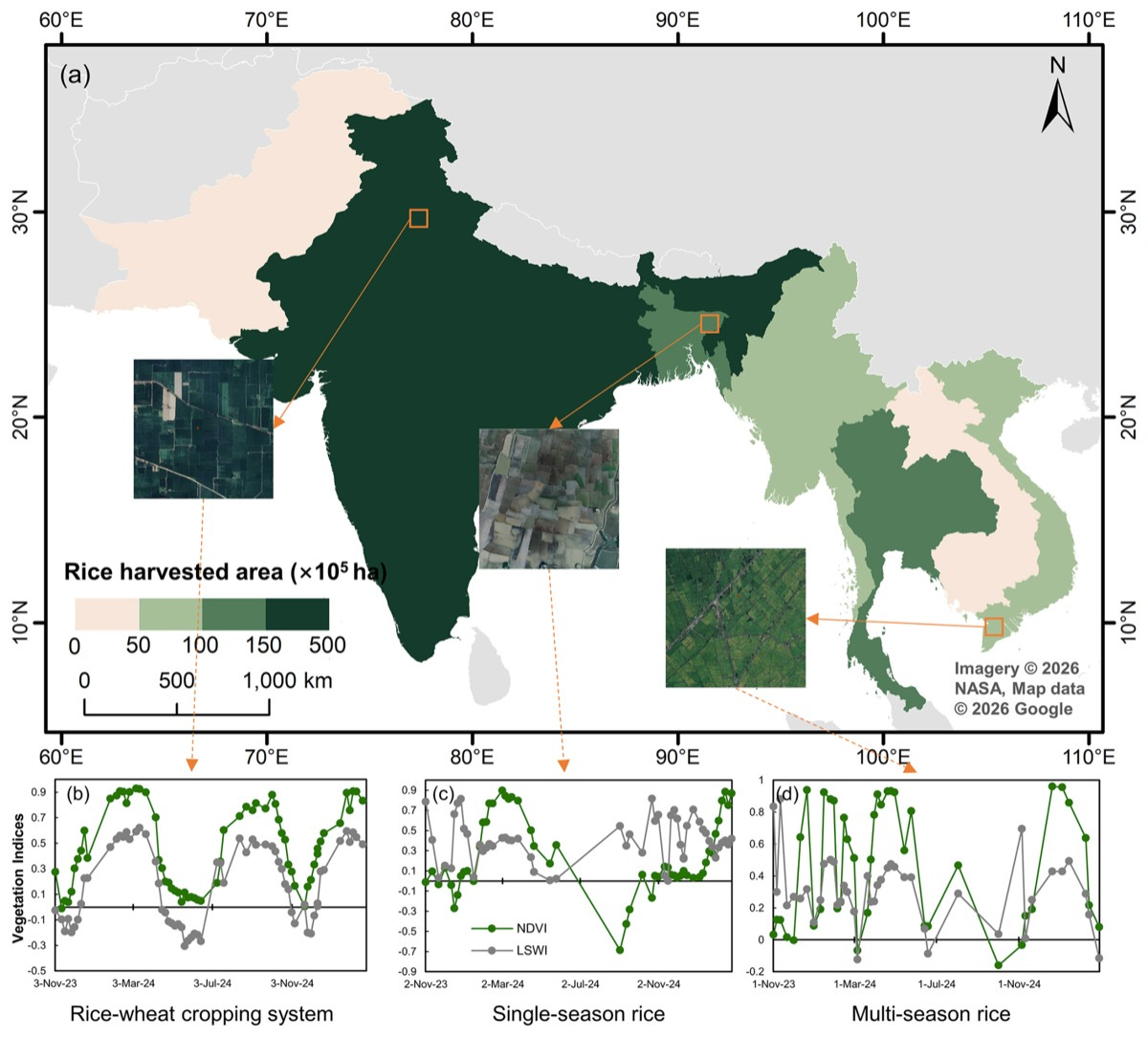
Maps of paddy rice extent and cropping intensity (single, double or triple season) at 30 m for India, Pakistan, Bangladesh, Myanmar, Thailand, Laos, Cambodia and Vietnam, for nominal years 1995, 2005, 2015 and 2024, each built from multi-year Landsat and Sentinel-2 composites. You can read the paper here, access the data here and the Earth Engine code here.
5. Using a community wireless network as a rain gauge in New York
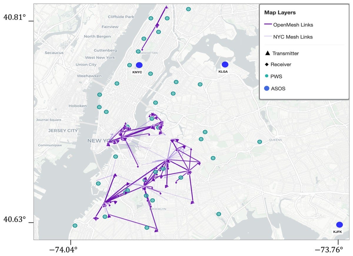
OpenMesh is eight months (29 October 2023 to 1 July 2024) of one-minute received signal level measurements from 103 wireless sublinks across 75 hops of NYC Mesh, a community-run network in lower Manhattan and Brooklyn covering about 10 km², in the 5 to 6 GHz, 24 GHz and 58 to 70 GHz bands. You can read the paper here, access the data here and the code here.
Other useful bits
Europe’s next weather satellite, MTG-I2, launches on 27 August on an Ariane 62 from French Guiana, the first Ariane 6 flight to geostationary transfer orbit. Built by a Thales Alenia Space, OHB and Leonardo consortium for ESA and EUMETSAT, it carries the Flexible Combined Imager and a Lightning Imager, scans the full disc every 10 minutes and Europe every 2.5 minutes, and will pair with Meteosat-12 to produce at least 50 times more data than the Meteosat Second Generation satellites.
The Copernicus Land Monitoring Service has released 2024 croplands, grasslands and tree cover and forests layers from its High Resolution Vegetated Land Cover Characteristics suite, covering the EEA-38 countries and the UK. The full 2017 to 2023 archive has moved to the Copernicus Data Space Ecosystem at the same time, so the whole time series is now in one place and browsable in Copernicus Browser.
Schneider Electric is buying AiDASH for USD 350 million in enterprise value. The Palo Alto company uses satellite imagery and AI to flag vegetation, storm and wildfire risk to power lines for utilities, and will slot into Schneider’s One Digital Grid platform. Schneider’s venture arm had put USD 10 million into the company back in 2022.
Verisk has acquired McKenzie Intelligence Services, a UK geospatial intelligence firm that does real-time post-event damage assessment for catastrophes and conflict events. It joins Verisk’s Catastrophe and Risk Solutions division, where its imagery-derived damage data will feed the existing risk models. The price wasn’t disclosed.
Intermap has agreed to acquire the rest of PCI Geomatics, the Canadian company behind the CATALYST imagery processing software, for USD 11 million in cash. PCI’s 750-odd algorithms handle imagery from more than 500 satellites across roughly 30,000 licences, and the plan is to pair them with Intermap’s 3D elevation models.
NASA’s Earth Observatory has a nice piece on reading Adélie penguin diets from the colour of their guano in Landsat imagery. Krill-heavy diets leave pink stains and fish-heavy ones don’t, and across more than 100 Antarctic colonies the colour tracks sea ice: warmer, less icy regions like the Antarctic Peninsula eat krill, while East Antarctic colonies with more ice eat more fish, and fish-fed chicks grow and survive better.
Jobs
Muon Space is looking for a Senior Remote Sensing Data Scientist for calibration and validation, fully remote.
Overstory is looking for a Staff Data Scientist working on wildfire, remote in the US or Canada.
Mapbox is looking for a Senior or Lead Software Data Engineer on its Roads team based in Helsinki, Finland.
Mapbox is also looking for a Senior Software Engineer for its Rust routing engine based in the United States.
IUCN is looking for a Director of its Global Information Systems Group based in Gland, Switzerland.
European Space Agency (ESA) is looking for a Copernicus Sentinel-2 NG Lead Instrument End-to-End Data Chain Engineer based in Noordwijk, Netherlands.
Just for Fun
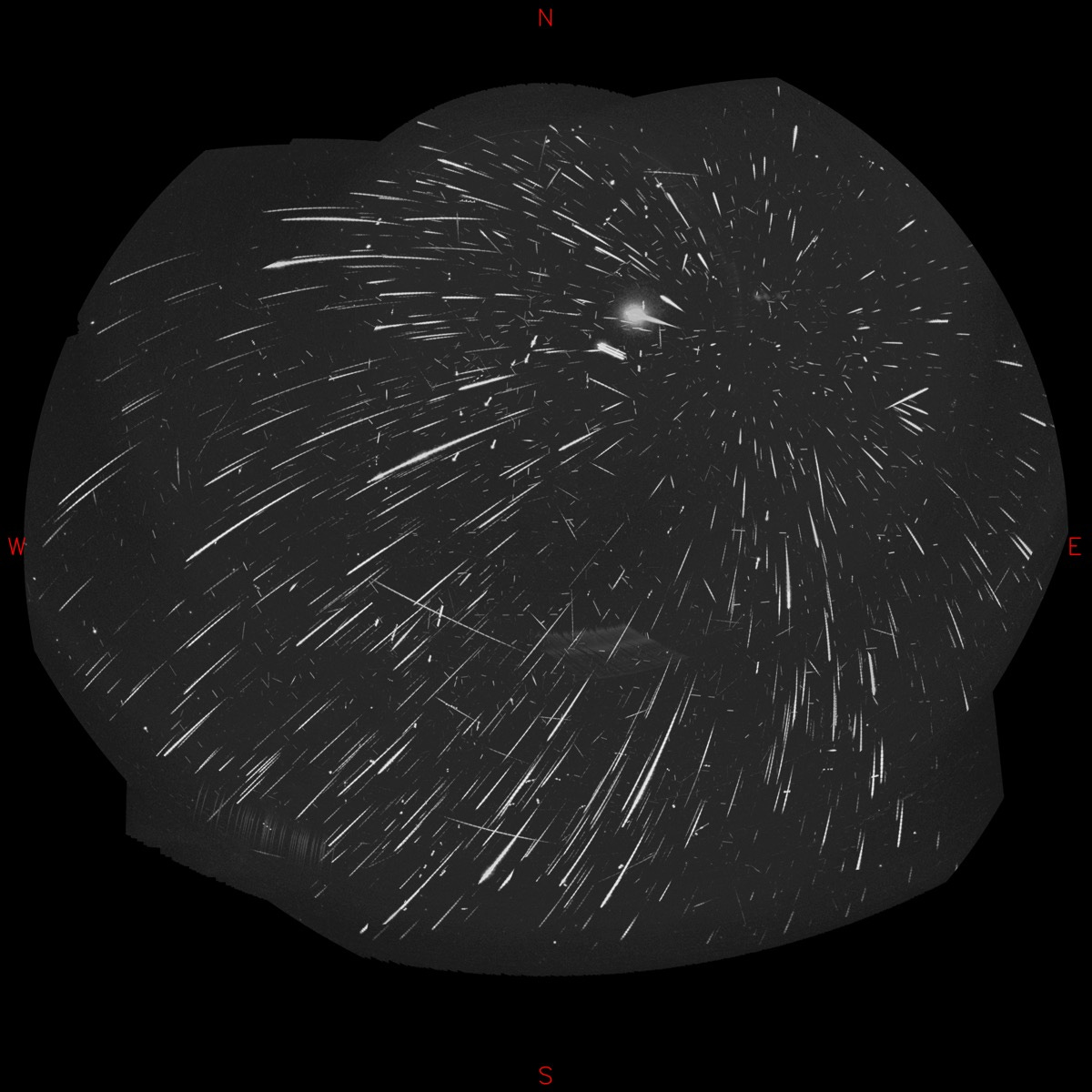
This all-sky composite stacks the footage from four meteor-monitoring cameras at an observatory in Czechia over the night of 12 to 13 August, when the Perseid shower was at its peak. The cameras logged 1,706 meteors that night, and nearly all of the trails trace back to a single radiant in Perseus at the upper right. Look closer and you can pick out the fainter showers hiding underneath, including the Kappa Cygnids radiating from Cygnus and the antihelion complex near Aquarius, the weak source that sits directly opposite the Sun.
That’s it for this week.
I’m always keen to hear from you, so please let me know if you have:
new geospatial datasets
newly published papers
geospatial job opportunities
and I’ll do my best to showcase them here.
Yohan