🌐 How to map hidden rural populations using existing data
PLUS: Why satellite forecasting models keep getting it wrong, further problems with foundation models, and more.
Hey guys, I’m coming to you this week from ESA’s Living Planet Symposium in Vienna. If you’re around, respond to this email or drop me a DM on X. It’d be great to meet you in IRL.
In today’s newsletter:
Population Counting: Health data improves satellite census estimates.
Satellite Forecasting: Graph models predict water changes from imagery.
Model Testing: Earth observation AI struggles with image corruptions.
Seafloor Mapping: Synthetic sonar reveals deep-sea features and nurseries.
New Datasets: NASA displacement data and harmonized Landsat-Sentinel imagery.
Research you should know about
1. A better way to count people when censuses fall behind
In many low-income countries, census data is outdated or missing, making it pretty hard to allocate resources or plan services at a local level. One way to fill the gap is to combine satellite imagery with on-the-ground surveys, but even that has its problems. In forested or cloudy areas, buildings can be hidden from view, and running new microcensus surveys is expensive.
A new study in Nature Communications comes up with a pretty interesting solution. They use health data, like household counts from malaria bednets or vaccination campaigns, to adjust satellite images for missing buildings. They do this using a two-step Bayesian model.
In Step 1, they use geospatial covariates to “fill in” settlement data that’s likely to be missing due to cloud or canopy cover. In Step 2, they use this bias-adjusted data to estimate population density. They tested the model on two datasets from Papua New Guinea (PNG): a 2021 urban listing survey, and household counts from a 2019–21 malaria bednet campaign.
The model consistently produced more accurate estimates, especially when satellite settlement data was incomplete. It reduced national error by about 32 % and delivered a 2021 population estimate of 11.8 million. Uncertainty maps pinpoint where extra surveys would help most, and outputs are already on the PNG National Statistical Office and WorldPop sites.
The method lets health campaign data double as a running micro-census. This is a win for vaccination logistics, disaster response and any agency that needs up-to-date village counts without the cost of a full census.
You can access the code here.
2. Forecasting satellite imagery is harder than it looks
Forecasting satellite images might sound a bit like science fiction, but it’s a real and growing research area. A new study benchmarks how well graph-based deep learning models can predict water-related changes using Sentinel-2 imagery.
The goal was to forecast NDWI (a satellite-derived water index) one time step ahead, using a year’s worth of past observations. The study focuses on the SEN2DWATER dataset, which covers lakeshores and farmland.
The team benchmarked graph-based model against several alternatives, including:
LSTM (which ignores spatial patterns),
ConvLSTM, and
TDCNN-ConvLSTM (which combine spatial and temporal learning).
The graph-based method, which first segments the last image into regions and models their evolution, outperformed all others on key metrics like RMSE and PSNR, and held its own on visual similarity.
One of the key findings is that performance improves as more past images are added. Using fewer than three images actually led to worse results than a simple baseline that just repeats the last image. Segmenting the input into superpixels was surprisingly robust. Performance barely changed across different levels of granularity, as long as a minimal spatial structure was maintained. Unsurprisingly, the model struggled with abrupt changes, like those caused by floods or harvests, which is likely due to the low frequency of observations. It also showed some inconsistent performance at specific locations, suggesting room for improvement in generalisability.
But while the graph-based model did best overall, no single approach wins everywhere. It handled water and impervious surfaces well, while TDCNN-ConvLSTM slightly outperformed it on farmland, where patterns are more irregular due to human activity. In any case, graph-based approaches in remote sensing are not super common, and I think they warrant further study.
3. Testing 20 Earth observation foundation models (the results weren't good).
If you've been following the rapid development of AI foundation models for Earth observation (like satellite and aerial imagery analysis), you've probably assumed they're pretty reliable. But a new study testing these models under realistic conditions suggests there are some issues with the accuracy of foundation models.
The researchers created REOBench, the first comprehensive benchmark to test how well Earth observation foundation models handle image corruptions (i.e. noise, blur, and distortions that happen in real-world satellite and aerial imagery). They tested 20 different models across six key tasks using 12 types of image corruptions that mimic what happens when satellites deal with atmospheric interference, sensor issues, or data transmission problems.
The results weren't great.
Pretty much every model they tested showed noticeable performance drops when dealing with corrupted images, though some fared much better than others. What's particularly interesting is how different types of models responded to these corruptions. Masked image modelling (MIM) methods that learn by reconstructing missing parts of images got hit the hardest, losing over 20% of their performance on average for scene classification tasks. In contrast, contrastive learning and large language model approaches proved much more robust, typically seeing performance drops below 10%. The researchers think this is because these models learn higher-level semantic features through text-image pairing, making them less sensitive to low-level corruptions.
Motion blur turned out to be the biggest troublemaker across all model types, causing the most severe performance degradation. The study also revealed some counterintuitive findings about model size: larger models were more robust for high-level tasks like scene classification, but actually performed worse under corruption for detailed pixel-level tasks like semantic segmentation.
So while this is a bit worrying, the good news is that this benchmark gives us a clear framework for testing and improving model robustness.
You can access the data and code here.
Geospatial Datasets
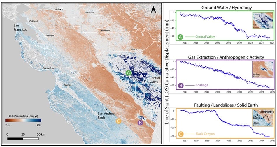
1. NASA OPERA Level 3 surface displacement dataset
NASA’s OPERA project has released the first open-access InSAR time-series displacement dataset for North America, derived from Sentinel-1 radar data. It tracks subtle land movements caused by earthquakes, subsidence, landslides, and more, with 30 m resolution and millimetre-level precision.
2. Harmonised Landsat and Sentinel-2 data
HLS v2.0 provide global, cloud-optimised 30 m surface reflectance data by fusing Landsat-8/9 and Sentinel-2A/B observations from 2013 onwards. You can access the data here.
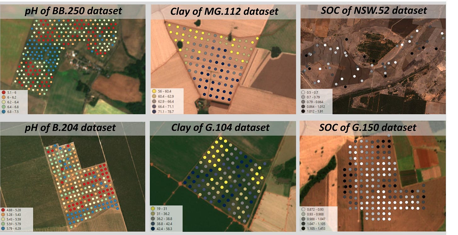
3. Precision liming soil dataset
LimeSoDa is a new open dataset for soil modelling. It combines 31 field-scale datasets from over 20 institutions, covering soil organic carbon, clay content, and pH. You can access the data here.
4. Invasive plant segmentation dataset
MAVSD is a high-resolution UAV-based dataset for segmenting Solidago canadensis L., a major invasive plant. You can access the code here.
Other useful bits
A new generation of synthetic aperture sonar (SAS) is giving scientists a detailed view of the seafloor. It reveals burrows, shipwrecks, hydrothermal vents, and even deep-sea shark nurseries.
New mapping reveals that 80% of England’s peatlands are dry and degraded, which poses a pretty big climate risk. Scientists created the most detailed map yet of England’s peat extent, depth, and condition using satellite imagery, AI and field data. While healthy peatlands store carbon and support biodiversity, degraded ones emit carbon.
A new study warns that rising solar storm activity is damaging satellites, including SpaceX’s Starlink fleet. Increased solar energy causes more atmospheric drag, shortening satellite lifespans and raising collision risks. With no global rules on safe re-entry, many satellites return uncontrollably, which unfortunately adds to space debris and potentially harms Earth’s atmosphere.
New research from ILO shows that while generative AI could affect tasks across many jobs, full automation of entire occupations is unlikely. Most jobs will be transformed rather than replaced, with varying levels of exposure depending on the type of tasks involved.
Jobs
Development Seed is looking for a Geospatial Data Architect based in one of the ESA member states.
Mapbox is looking for a Software Development Engineer for Location AI based in the US.
UNOPS is looking for multiple remote GIS and AI Solutions Specialists under their Peace and Security Cluster (PSC).
Esri is looking for a Solution Engineer for Natural Resources based in Texas.
Planet is looking for a Software Engineer under their Defense and Intelligence pod based in the US.
IMPACT is looking for a Global GIS Specialist based in Geneva.
Just for Fun
Turns out, the Sun and Earth’s atmosphere are vaporising the most fragile, carbon-rich space rocks before they ever reach us. These rare meteorites may have carried ingredients for life, so we’re likely missing some big clues about where we came from.
That’s it for this week.
I’m always keen to hear from you, so please let me know if you have:
new geospatial datasets
newly published papers
geospatial job opportunities
and I’ll do my best to showcase them here.
Yohan


