Not all nightlight datasets are the same: Introducing NASA's Black Marble dataset
Part 1: Why you should be using NASA's Black Marble dataset
Not all nightlights datasets are the same. This means some are better than others (depending on what your use-case is).
In this post, I’ll be providing an overview of why you should be using NASA’s Black Marble dataset (rather than the more commonly used alternatives).
You’re probably familiar with the use of nightlights as a proxy for economic activity. The logic is simple—higher levels of luminosity are associated with higher levels of economic activity.
And you’ve probably seen the infamous nighttime image of North Korea and South Korea, which is used to show the types of insights luminosity data can provide.
But one thing to note is that there are actually three different sources of publicly available luminosity data:
Low resolution luminosity data (called DMSP-OLS), which has 1km x 1km resolution and is available from 1992-2013.
High resolution luminosity data (called VIIRS), provided by the Colorado School of Mines, which has 500m x 500m resolution and is available from 2012 onwards.
And another source of high resolution luminosity data (VIIRS), provided by NASA. This is called Black Marble.
For the sake of this newsletter, I’ll be focussing on the the high resolution imagery from the Colorado School of Mines and Black Marble.
1. Introducing Colorado School of Mines’s VIIRS data
Colorado School of Mines’s (CSM) VIIRS data is the main dataset used in most economics studies (of those that use high resolution luminosity data). This is because NASA’s Black Marble is quite recent—it was only released in 2021.
And CSM’s data is pretty easy to use. It’s essentially an off-the-shelf product. By off-the-shelf, I mean you just download it and use it. You don’t need to do things yourself like:
addressing cloud cover
controlling for the angle of the satellite
addressing stray-light coming from the sun
It’s also available on Google Earth Engine.
And to be honest, whenever I need to do a quick analysis using luminosity data, I’ll use CSM on Google Earth Engine.
However, as with all off-the-shelf products, there are a few issues with it, and you aren’t given the tools to address these issues (i.e. pixel-level processing).
The issue with snowfall
One particular issue I came across was related to snowfall.
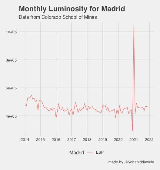
Upon looking at CSM’s data for Madrid in January 2021, I was baffled to see this massive spike (in the middle of lockdowns):
Upon examining it further, it seemed like this was being driven almost entirely by Madrid. Madrid seemed to have experienced record levels of luminosity during January 2021:
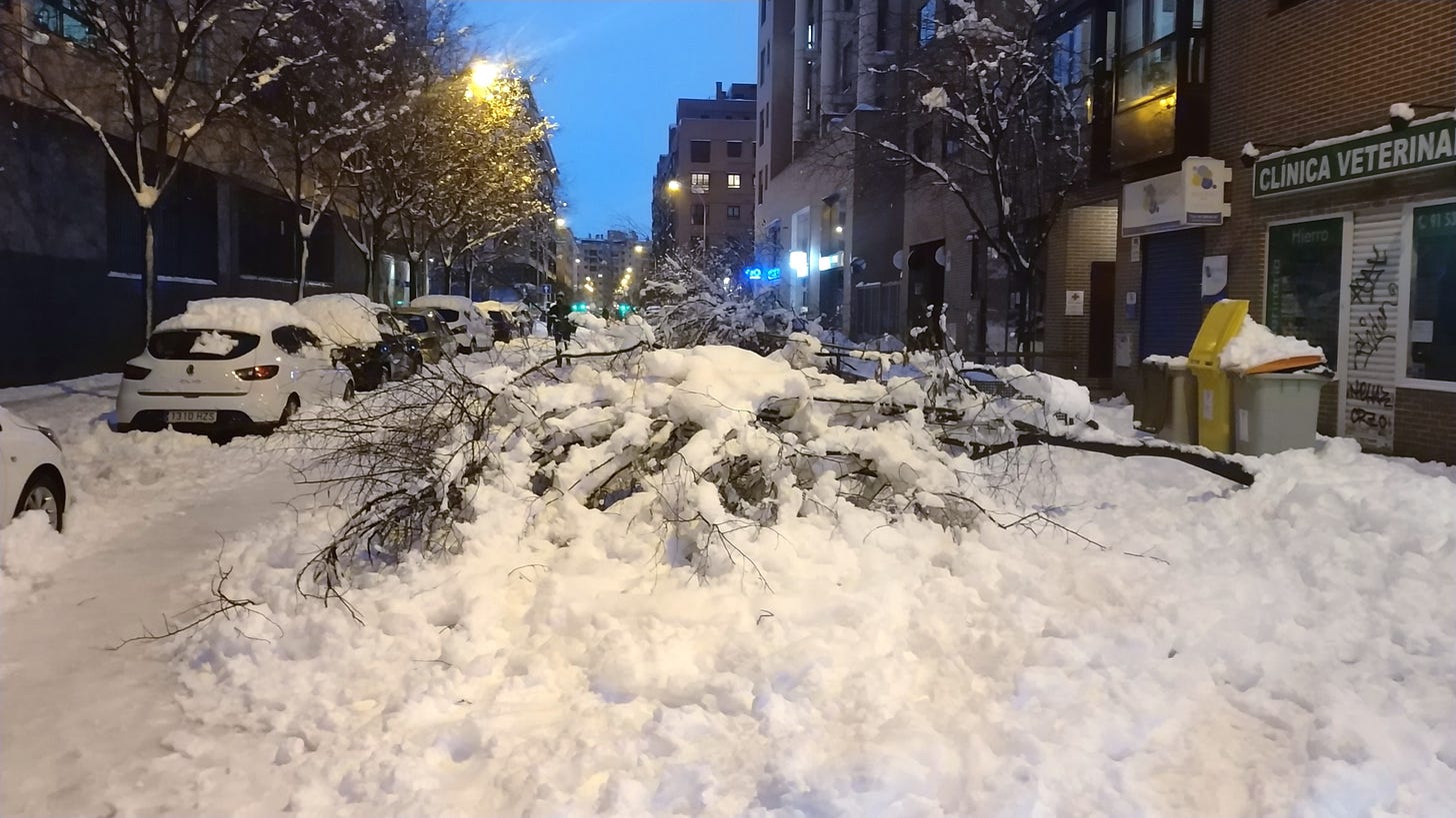
Finally, after a couple of days wondering what was going on, I stumbled upon the reason: Storm Filomena. Madrid had experienced its highest ever levels of snowfall during January 2021.
And snow reflects light.
The issue with vegetation
Another issue emerges with CSM’s data—seasonal vegetation.
Tree leaves and vegetation obscures luminosity from satellites. This means that regions may experience higher levels of luminosity in winter (when there’s less tree coverage), than in summer.
So the takeaway here is that while CSM’s luminosity data is easy to use, there are a few trade-offs in terms of accuracy.
What’s the alternative then?
It’s NASA’s new Black Marble Dataset.
2. Introducing NASA’s Black Marble Dataset
NASA released its monthly and annual luminosity data—Black Marble—at the end of 2021. And it claims to do things differently by providing ‘cleaner’ luminosity images.
‘Clean’ luminosity images sounds simple in practice. It’s essentially luminosity data that’s free from sources of noise. But in reality, this is incredibly hard to do.
In order to provide ‘clean’ luminosity images we need to account for a few things:
Surface-reflection: luminosity doesn’t reflect off the Earth’s surface (e.g. light bouncing off snow).
Atmospheric-reflection: luminosity doesn’t reflect off the Earth’s atmosphere (e.g. light bouncing of aerosols or clouds).
Stray light (which comes from the sun directly into the Satellite’s instruments) doesn’t contaminate the images.
Other issues: such as vegetation obscuring satellite images, the satellite’s angle from the Earth changing luminosity scores, or other outliers like lightning.
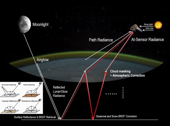
I find this GIF from NASA to be pretty helpful in understanding all of these things:
Let’s take a look at how Black Marble addresses each of these elements.
2.1 How NASA addresses surface reflection
At night, sources of light (like the moon or stars) can bounce off the Earth and be captured by a satellite. The satellite would mistakenly consider this to be luminosity from artificial lighting on Earth. That’s not the case.
NASA adjusts for these reflections by using something called a “Bidirectional Reflectance Distribution Function” or BRDF.
In essence, BRDF estimates how much light is coming from:
stars
the moon
the surface of the Earth itself
NASA’s model then measures how structures on Earth's surface (like buildings/trees) creates bright spots or shadows—and then adjusts luminosity values accordingly.
Snowfall is another surface-reflection issue, which I briefly mentioned above.
Addressing snowfall
To address snowfall, NASA runs an algorithm which:
detects whether snow has occurred
calculates snow albedo values (this measures the snow's reflectivity)
This is then used to adjust the luminosity scores NASA then provides us with snow-free luminosity estimates.
This allows us to move from the more noisy images of Madrid from Colorado School of Mines, to a more stable image from Black Marble. In Black Marble’s image below, we no longer see the large spike in January 2021 from Storm Filomena:
2.2 How NASA addresses atmospheric reflection
Whereas the BRDF process adjusts reflections from the surface of the earth, NASA also corrects reflections from the atmosphere.
Moonlight, for example, can reflect off the atmosphere (and from clouds or aerosols—i.e. tiny particles), which satellites may incorrectly perceive as luminosity from Earth.
So to minimise this issue, Black Marble uses a method they call “turning off the Moon.”
This uses a number of steps to isolate the light coming from artificial sources (like city lights) by considering various factors such as:
the location of the Moon in relation to the ground,
the location of the ground in relation to the satellite
the atmosphere’s composition (e.g. clouds and aerosols)
and the normal pattern of light reflectivity
The result of all of this is luminosity values that are corrected for atmospheric reflection.
2.3 How NASA addresses seasonal vegetation
Vegetation and tree canopy can block light from satellites.
This means that during winter (when there are less leaves), some places may appear brighter than during summer—which may not reflect reality.
NASA, adjusts for vegetation by:
measuring the density of leaves in a pixel (through the Leaf Area Index)
assessing likelihood that light passes through gaps in leaves
This allows NASA to produce luminosity estimates that have been corrected for vegetation.
So in short, Seasonal Vegetation Correction is about adjusting satellite data to account for the impact of trees and plants on how we see lights from space.
2.4 How NASA addresses variations from satellite angle
The angle at which a satellite is taken impacts the luminosity recorded for a pixel. Images taken:
directly above (near-nadir) are typically brighter
at an angle (off-nadir) are typically less bright
When looking at commercial areas for Dubai and Rome, Wang et al. (2022) found that observations:
from directly above (near-nadir) were brighter and varied a lot more
from an angle (off-nadir) were less bright but more consistent
which combined the two were in-between
Though in one area they analysed, they found off-nadir was slightly brighter than near-nadir.
As a result, NASA offers three different datasets you can choose from:
Near-nadir luminosity data (only takes observations from directly above)
Off-nadir luminosity data (only takes observations from an angle)
All-angle (a combination of near-nadir and off-nadir data)
2.5 How NASA conducts further outlier removal
Additional outlier removal takes place when NASA creates monthly and annual composites of luminosity data.
Through this, they drop additional outliers by calculating the interquartile range (IQR). This is the difference in luminosity between the 25th percentile and the 75h percentile.
Observations that are either 1.5 times the IQR below the 25th percentile or above the 75th percentile are considered too extreme and are excluded. This may have the effect of addressing additional ephemeral light (e.g. lightning) that wasn't removed in prior steps.

Following this final outlier-removal process, NASA averages the remaining daily data to create the monthly and yearly NTL composites.
Stray light: the biggest limitation of Black Marble
Stray light occurs when sunlight hits the satellite, and contaminates a satellite's ability to accurately detect luminosity.
See the top right corner of our favourite image:
NASA actually drops all pixels contaminated by stray light. Colorado School of Mines, on the other hand, has a way to adjust for stray light contamination.
As a result, Black Marble has many missing values for northern countries from June to August each year.
In this figure, all of the white pixels means there isn’t any luminosity data available. As we can see, there’s a bunch of missing data here—in fact even the whole of the UK is missing,
This is the biggest limitation of Black Marble data. It means the monthly/daily data can’t really be used for Northern countries during June to August. Annual data would be fine though.
So it’s important to keep this in mind when using Black Marble.
The takeaway
The point here is that Black Marble’s new luminosity data controls for a lot of factors that might cause noise in the data; and this is why I think you should be using it for economics-related studies.
And if you need any more convincing, this chart should get you a slightly worried:
It’s nightlights data for the same region (New South Wales, Australia) for both Colorado School of Mines (processed from Google Earth Engine), and Black Marble [1].
The differences between the red line and the green line are startling—and we see that Colorado School of Mines’s data even contains several negative values. There doesn’t seem to be a massive correlation between the two.
A part of me wonders if the significance of many economics studies would disappear if they replaced data from Colorado School of Mines with Black Marble.
Nonetheless, using Black Marble data is a bit more tricky as it’s not really an off-the-shelf product in the same way that Colorado School of Mines’s data is. So my intention for next week is to walk you through how to use Black Marble.
Next week
This post was all about setting the scene for Part Two next week. I’ll be providing an in-depth tutorial on how to setup a workflow to work with Black Marble data.
Stay tuned.
Endnotes
[1] The Colorado School of Mines data from Google Earth Engine is v1.0. However, the most recent data (which isn’t available from Google Earth Engine) is actually v2.2. This may address some of the issues we’re seeing here.


