

🌐 Shrinking map tiles without losing the details
PLUS: Averaging satellite images is a moral quandary, stopping AI from hallucinating satellite maps, and more.

Hey guys, here’s this week’s edition of the Spatial Edge. If you called your high school cover band Rasterheads, we have one thing to say to you. Welcome home… The aim of this newsletter is, as always, to make you a better geospatial data scientist in less than five minutes a week.
In today’s newsletter:
Map Compression: Optimising tiles without losing spatial detail
Embedding Methods: Moving beyond averages improves model accuracy
LLM Reliability: Reducing hallucinations in satellite image analysis
5G Prediction: Fixing spatial bias in network demand models
Soil Dataset: High-resolution global soil carbon mapping
Research you should know about
1. Shrinking massive map tiles without losing the details
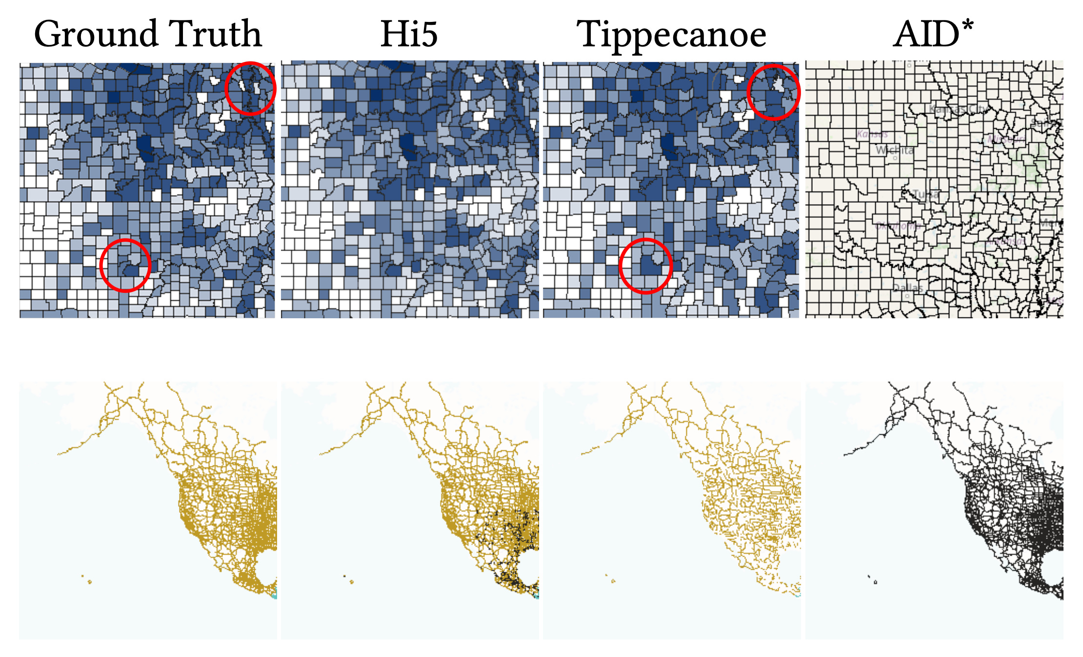
If you’re reading this newsletter, chances are you love a good interactive map. And let’s face it, who doesn’t? Well, making them fast and customisable is actually pretty difficult. Right now, developers are forced to choose between two flawed options. Server-side rendering generates static image tiles that load quickly, but they lock users into a single visual style with no room for client-side tweaking. Conversely, client-side rendering sends raw vector data to the browser for fully flexible styling, but these vector files don’t have size limits. As datasets grow, vector tiles become bloated with overlapping geometries and endless attribute tables, which chokes network bandwidth and browser memory. Existing compression tools try to fix this by blindly dropping data, but this typically warps geographical boundaries and deletes the exact attributes users want to visualise. Not great…
A new study introduces HiFIVE, a framework that treats map tile reduction as a strict mathematical optimisation problem. Instead of indiscriminately deleting polygons, the system uses a two-stage approach to shrink tiles to a strict size limit while preserving their visual and semantic fidelity. First, a lightweight triage step makes rough cuts by discarding visually insignificant records. Next, a highly precise ‘sparsification’ algorithm steps in. This algorithm weighs the visual prominence of a shape (such as its pixel footprint) against the usefulness of its underlying data. It selectively nullifies specific attribute values that are unlikely to be used for styling, like random unique identifiers, while preserving categorical data like state names or road types.
When tested on massive terabyte-scale datasets, HiFIVE processed almost a billion records in under an hour. The resulting maps proved to be vastly superior to those produced by standard reduction tools. By intelligently choosing exactly which data points to keep and which to discard, the framework maintained crisp, undistorted boundaries and retained the necessary attributes for complex client-side styling. Ultimately, this approach provides a highly scalable way to explore massive spatial datasets directly in the browser without sacrificing rendering speed or visual accuracy.
You can access the code here.
2. Why averaging satellite data is a bad idea
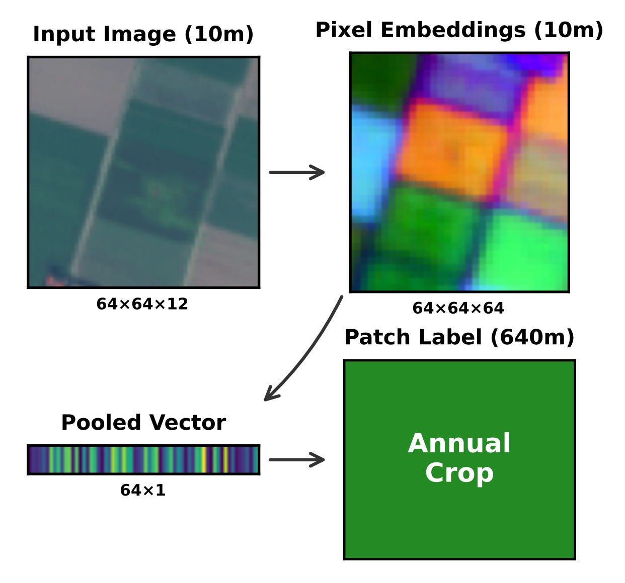
Geospatial foundation models are brilliant at turning satellite images into highly detailed pixel-level data. However, many practical applications require labelling entire regions, such as a whole farm or a residential neighbourhood. To make this work, developers typically compress thousands of pixel vectors into a single representation using a technique called mean pooling, which is essentially just averaging everything out. The major flaw with this default approach is that it completely erases all the nuanced variations within a patch. When these models are deployed in new geographic areas, this loss of detail causes their accuracy to drop significantly.
A team of researchers built a new dataset called EuroSAT-Embed. They generated 81,000 embedding files using three different foundation models and benchmarked eleven training-free pooling methods. Instead of just averaging the pixels, they tested richer statistical summaries that capture the extremes and the variability within a specific region. For example, a method called stats pooling combines the minimum, maximum, average and standard deviation of the pixels, while covariance pooling looks at the complex relationships between all the different data points.
The results clearly show that moving beyond simple averages makes a massive difference for spatial generalisation. By using richer pooling schemes, the researchers managed to cut the geographic accuracy gap in half and boosted overall performance by up to 6 per cent on spatial splits. They recommend a straightforward three-tier strategy for anyone working with earth embeddings. Mean pooling is fine for a quick baseline, but stats pooling should absolutely be the default choice, while covariance pooling should be reserved for projects where peak accuracy is the absolute priority.
3. Stopping AI from hallucinating over satellite maps
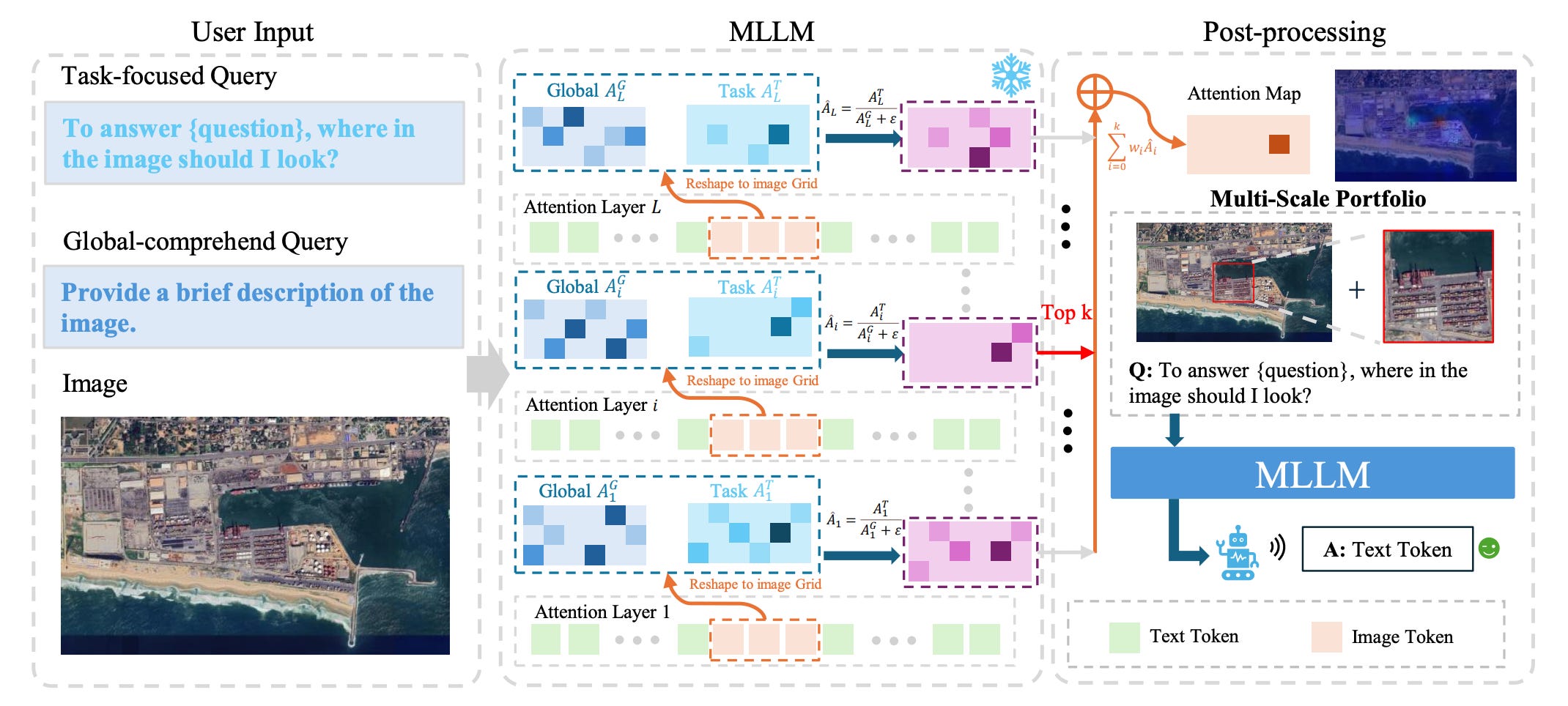
Multimodal LLMs are great at many things, but they tend to make things up when looking at satellite imagery. This issue, known as hallucination, usually happens for two reasons. Either the models get distracted by the massive scale of remote sensing images and can’t find the right area, or the targets are simply too small and cluttered to see clearly. To figure out exactly what is going wrong, researchers built RSHBench, a new diagnostic tool. It proved that models mostly suffer from factual errors, like making up objects or misidentifying attributes, which then snowball into flawed logic.
A clever training-free framework called RADAR essentially forces the AI to use its own internal attention mechanisms to zoom in on the image in two distinct stages. First, it asks a location-oriented query to pinpoint exactly where the relevant visual evidence is hiding. Once it locks onto that specific region, it uses a content-oriented query to zoom in and extract the fine-grained details needed to answer the prompt accurately.
When put to the test across a variety of major open-source and proprietary models, the results were highly impressive. By forcing the AI to actively seek out and refine visual evidence before making a guess, the RADAR framework consistently boosted overall accuracy by 2 to 4 per cent. More importantly, it slashed both factual and logical hallucination rates by around 10 per cent. Ultimately, this gives developers a highly scalable, plug-and-play way to make foundation models much more reliable for analysing complex Earth observation data.
4. Smarter spatial predictions for 5G networks
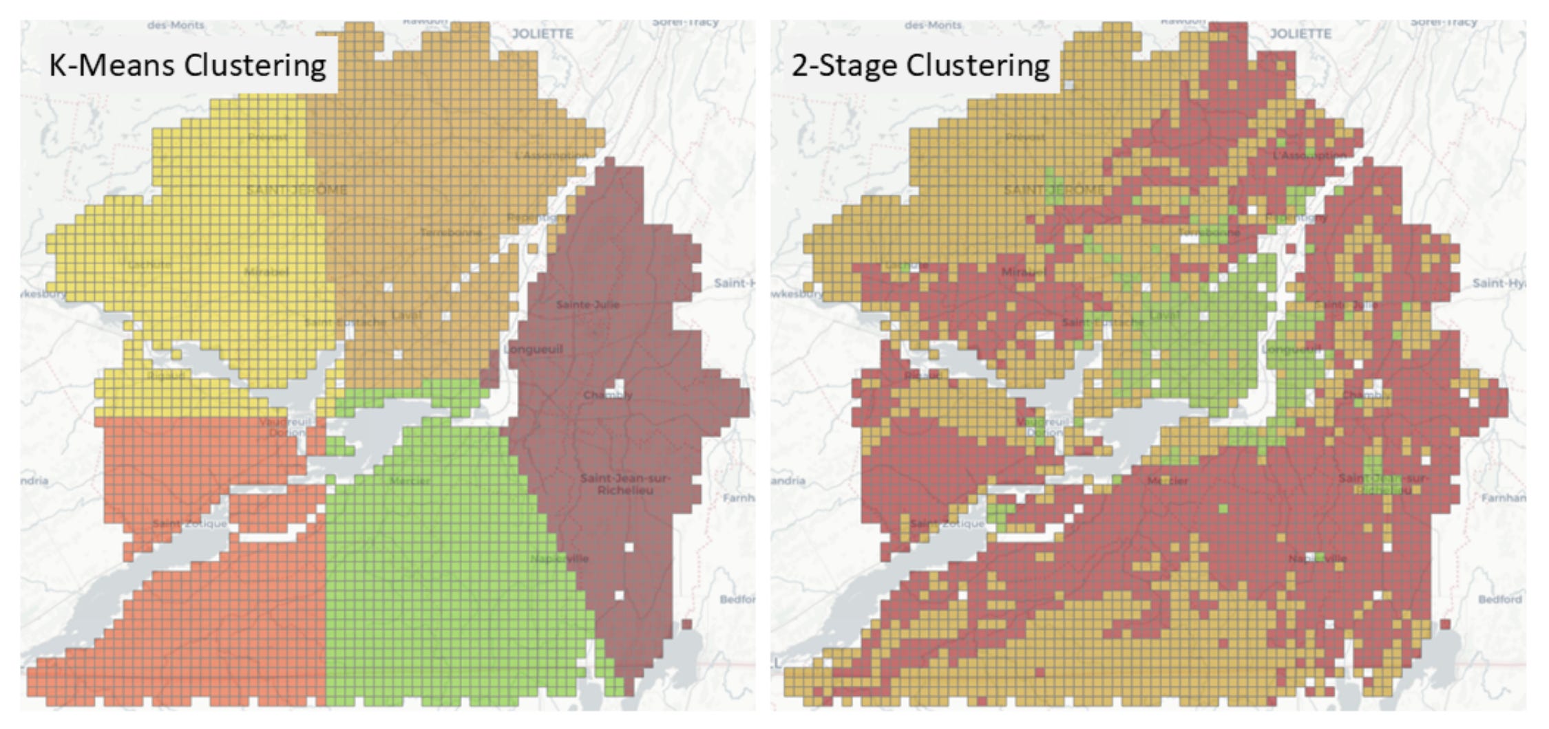
Predicting exactly where mobile network traffic will spike is essential for planning 5G and 6G infrastructure. While machine learning is great at combining different types of data (like population density and local land use) to map out demand, it often falls into a trap called spatial autocorrelation. Because neighbouring city blocks tend to have very similar traffic patterns, standard AI training methods accidentally leak information between the training and testing datasets. As a result, network planners get a model that looks highly accurate on paper but fails to generalise when deployed in the real world, leading to poorly placed cell towers and wasted spectrum.
A team of researchers developed a new AI-driven framework that forces the model to actually learn rather than just memorise nearby locations. They introduced a two-stage splitting strategy. First, it divides the city into geographically separate clusters to cut off the spatial data leakage. Then, it refines these clusters based on local context, such as whether an area is residential or commercial, to make sure the AI is tested on a truly diverse set of environments. Finally, they apply a Spatial Error Model to scrub out any leftover geographical biases from the predictions.
They tested the framework across five major Canadian cities using a massive crowdsourced dataset of 15 million mobile usage measurements. The new method consistently slashed prediction errors compared to basic location clustering, giving engineers a much more reliable picture of true network demand. When applied to real-world scenarios like 5G spectrum planning, these tighter predictions successfully prevented the costly overestimation or underestimation of network congestion. Ultimately, this gives telecom operators a much sharper tool for figuring out exactly where to deploy their next wave of antennas.
Geospatial Datasets
1. Global soil carbon dynamics dataset
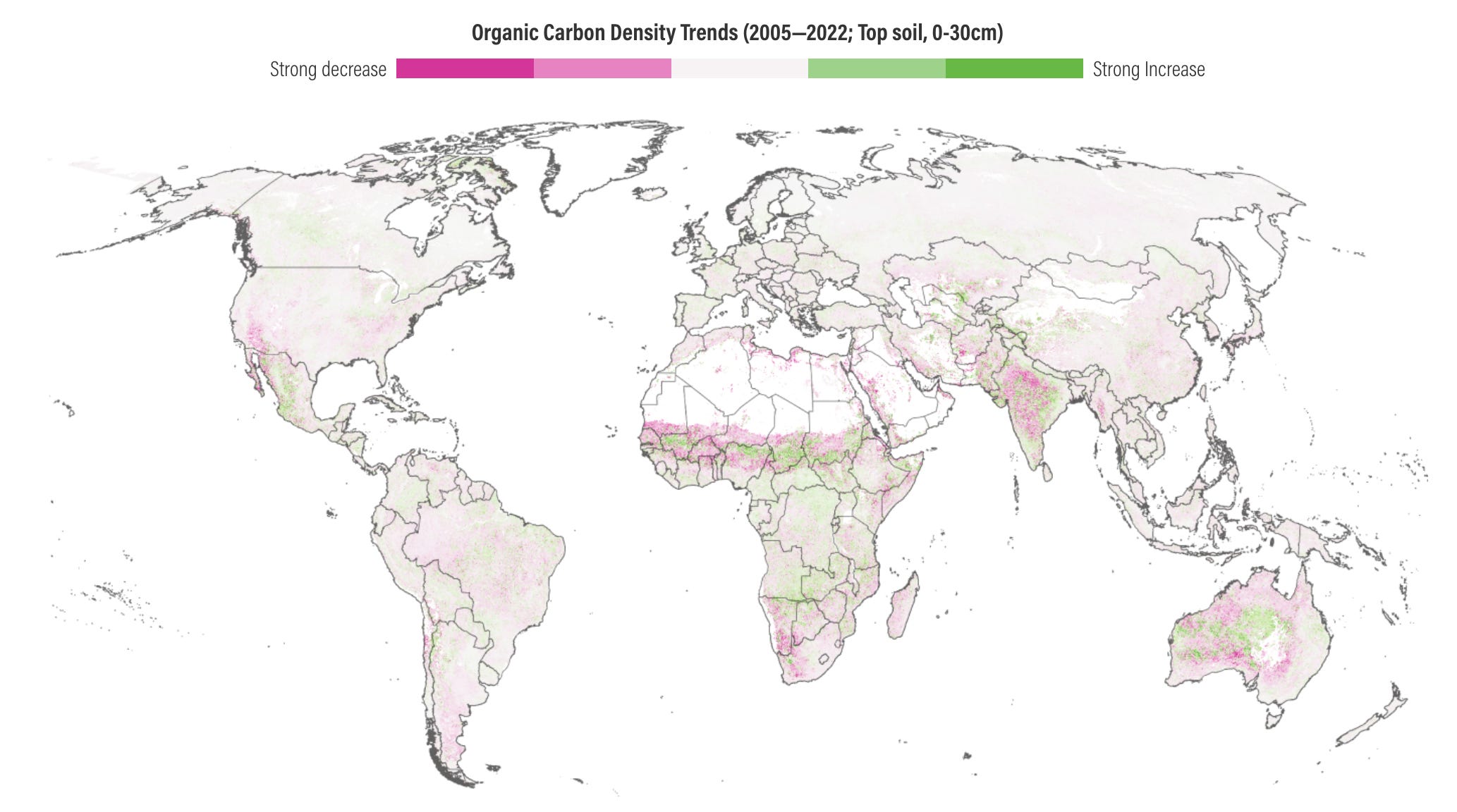
The OpenLandMap-soildb dataset provides the most detailed information to date on global soil carbon dynamics. It integrates over 600,000 field measurements with satellite data and machine learning, and maps soil organic carbon density and content at a 30-metre resolution across three soil depths from the year 2000 onwards. You can access the maps here, the files here, and the code here.
2. Inland water pH and alkalinity dataset
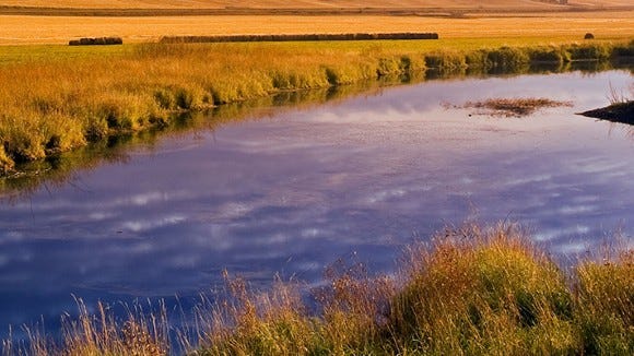
The newly compiled PHALK dataset provides a global assessment of pH and alkalinity across the world’s inland surface waters. It collates chemical data from 18 databases and 55 scientific publications, and maps over 1 million drainage basins. You can access the data here and the code here.
3. Global ocean boundary current dataset

GOXBT dataset provides high-resolution data on the dynamics of major ocean boundary currents. You can access the data here and the code here.
Other useful bits

ESA’s CryoSat ice-monitoring satellite has received a new software upgrade that allows it to now measure Earth’s magnetic field. Originally designed simply to keep the spacecraft on track, its onboard magnetometer recently captured incredibly precise data during a massive solar storm, offering researchers a fantastic, unexpected bonus alongside dedicated magnetic missions.
25 new Open Buildings datasets are now available on HDX thanks to the team at Google Research.

By measuring microscopic changes in gravity on the ocean's surface, a new satellite has helped researchers create the most accurate map of the seafloor to date. One finding is that small underwater hills cover a 70% of the ocean floor 🤯.
Satellogic has just announced Merlin, a new satellite constellation designed to map the planet every day at 1m resolution. It’s expected to become operational by first half of 2027.

Jobs
UN DESA is looking for two interns in (1) Geodesy & Geospatial Research Support and (2) Digital Design, Data Visualization & Geospatial Communications.
UNOPS is looking for an ICT Associate based in Valencia.
FAO is looking for a Remote Sensing and GIS Specialist based in Rome.
Esri is looking for a remote GIS Project Manager under their Assessment Department based in Canada.
ERM is looking for a Spatial Analyst (Remote Sensing) based in Australia.
Just for Fun
The recent equinox saw the sun align perfectly over the equator, treating everyone across the globe to an equal measure of day and night as spring arrives in the north and autumn settles in the south.
That’s it for this week.
I’m always keen to hear from you, so please let me know if you have:
new geospatial datasets
newly published papers
geospatial job opportunities
and I’ll do my best to showcase them here.
Yohan