

🌐 So how accurate is geospatial climate data really?
PLUS: AI traffic lights can reduce emissions, identifying building damage from satellites, and more.

Hey guys, here’s this week’s edition of the Spatial Edge — a weekly round-up of geospatial news. The Spatial Edge is sort of like STATA: some economists are quite into it, but no data scientists have heard of it.
In any case, the aim is to make you a better geospatial data scientist in less than 5 minutes a week.
In today’s newsletter:
Climate Data: issues with the accuracy of reanalysis datasets.
Carbon Emissions: AI cuts traffic congestion and pollution.
Earthquake Damage: Satellites quickly classify building damage after quakes.
Crop Yields: GlobalCropYield5min offers precise global yield estimates.
AI Geospatial Collab: Planet x Anthropic improve satellite imagery analysis.
Research you should know about
1. How accurate is climate reanalysis data?

I’m guessing many of you reading this have used climate reanalysis datasets, like ERA5. These datasets are hugely popular because they offer global daily (sometimes even hourly) data on things like rainfall, temperature, and wind.
But a new study published in Scientific Reports looks at how reliable these reanalysis datasets actually are (and the results aren’t amazing…).
In short, reanalysis products like ERA5 blend real-world weather measurements with climate models to recreate past weather conditions. These are super helpful but, as the researchers discovered, they can be a bit off-base when it comes to rainfall.
The authors compared ERA5 rainfall estimates with observational data (from weather stations and satellites) covering over 40 years (1980–2022). They found a bunch of big differences: ERA5 shows big drying trends during dry seasons in certain areas, even though observational records show rainfall levels holding steady or slightly increasing.
What's causing this mismatch?
The main reason is how ERA5 handles moisture transport. This is basically the way humidity moves through the air due to wind. ERA5 often miscalculates these atmospheric flows, especially where ground-based measurements are limited. For instance, ERA5 underestimated humidity in important areas, leading it to incorrectly predict lower rainfall. On top of that, ERA5 also struggles to capture local evaporation processes (e.g. when moisture is recycled back into the atmosphere from plants) which further skews rainfall predictions.
Why does all this matter?
Because ERA5 is widely used in climate forecasts, inaccuracies in moisture transport modelling can lead directly to incorrect predictions. And that can mess up everything from drought preparedness plans to environmental policy decisions.
2. Using big data to curb urban carbon emission
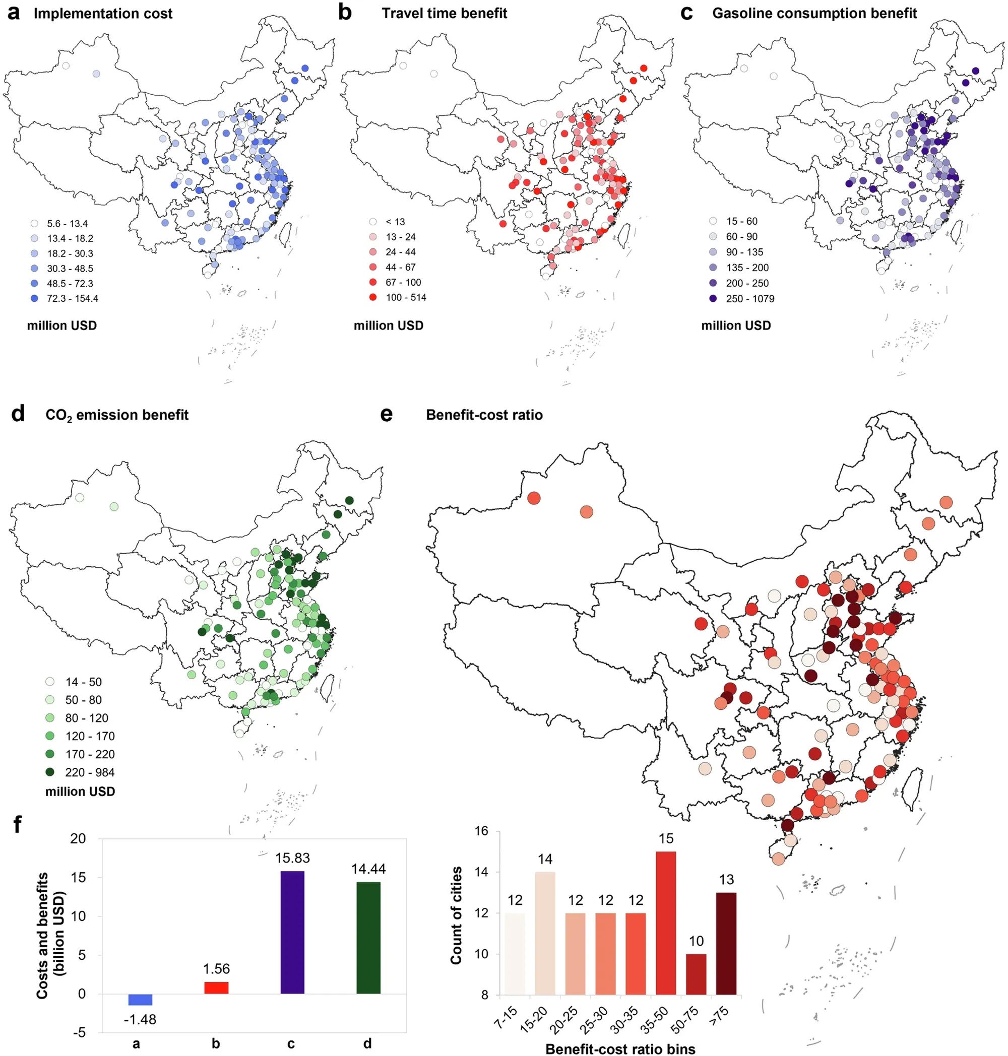
As anyone who lives in Manila will tell you, complaining about the traffic and brainstorming ways to minimise it is part of the fabric of life here.
So this is why I was pretty interested in this paper in Nature Communications, which shows how using big data to control traffic signals can help cities cut congestion and significantly lower carbon emissions. Fun fact: this is also something which Google is working on through its Green Light initiative.
In any case, the paper looks at China’s 100 most congested cities, and explores how adaptive traffic lights (a fancy term for signals that change timing based on real-time traffic) can improve urban mobility and air quality.
The researchers used real-time traffic data from Gaode Maps and road information from OpenStreetMap to test how these adaptive signals performed against traditional fixed signals. They ran detailed simulations and used the MOVES emissions model, a tool that calculates pollution based on how vehicles actually move, including idling and acceleration.
The results were impressive: adaptive traffic signals cut peak-hour travel times by 11% and off-peak times by 8%, which would lead to an annual reduction of around 31.7 million tonnes of CO₂. In a practical test in Shanghai, adaptive signals reduced idling time at intersections by nearly half, boosted average speeds by 17%, and lowered emissions by 16%. Across all studied cities, the benefits of this technology (like savings in fuel, time, and environmental damage) massively outweighed the costs, providing about US$31.8 billion in total annual benefits.
That’s pretty impressive…
3. Estimating seismic damage from space
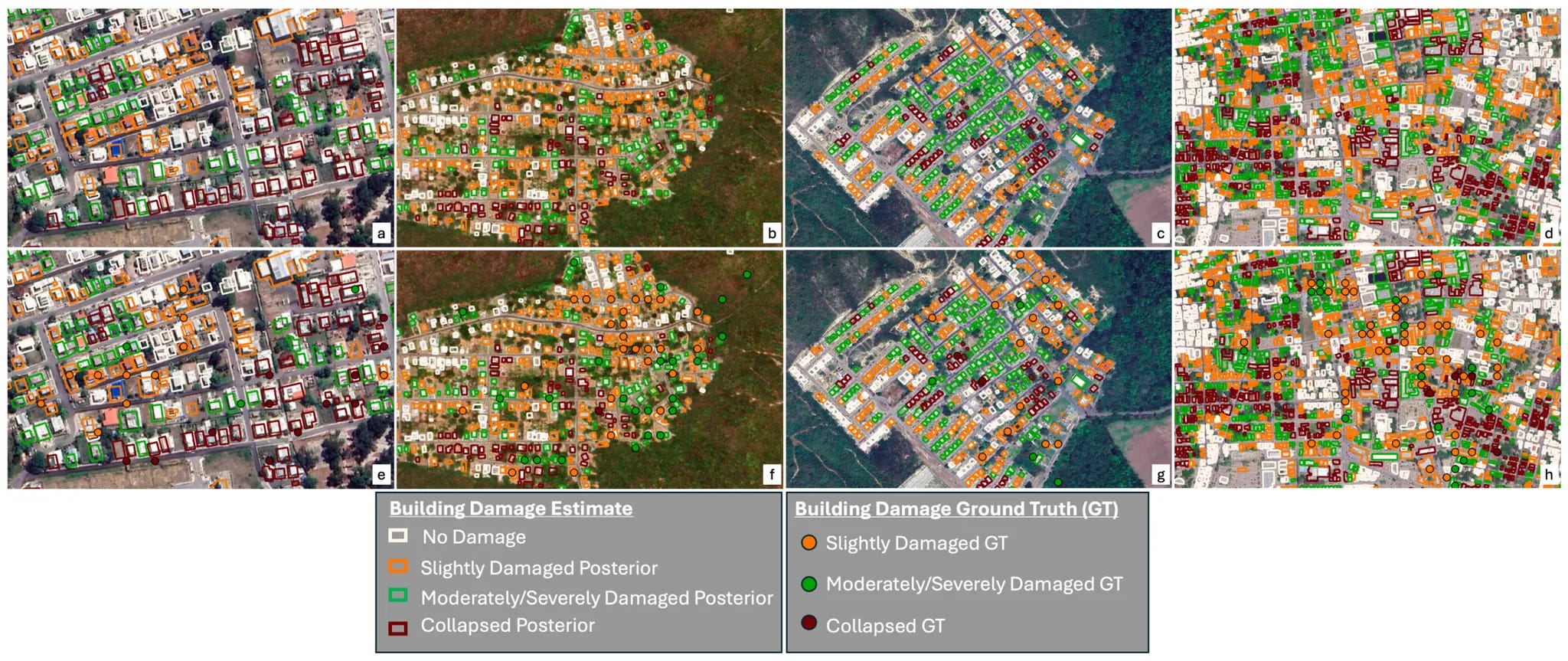
New research from Johns Hopkins University shows how satellite radar (InSAR) can quickly and accurately classify earthquake damage to buildings.
Rapid damage assessment is pretty important after earthquakes, but current methods can struggle to separate building damage from related issues like landslides or ground failures.
They developed a new method, called QVCBI, that combines satellite images of ground deformation (from NASA’s Damage Proxy Maps) with hazard models from the US Geological Survey and building vulnerability curves (HAZUS). They tested it across five recent earthquakes (including Haiti in 2021, Puerto Rico in 2020, and Italy in 2016). The method uses a Bayesian approach to model cause-and-effect relationships among earthquakes, building damage, and secondary hazards. To speed things up, it also uses mathematical shortcuts (variational inference) that simplify complex calculations.
The results are pretty impressive. The model reached accuracy scores (AUC) between 0.94 and 0.96, clearly outperforming existing approaches. Even better, it stayed reliable in tricky situations where multiple hazards overlapped and reduced analysis time by more than 40%, delivering regional-scale assessments within just four hours.
The bottom line is this could drastically speed up emergency response and potentially help teams quickly identify areas that urgently need assistance.
Geospatial datasets
1. Granular crop yield data

GlobalCropYield5min is a high-resolution dataset providing annual yield estimates for maize, rice, wheat, and soybean from 1982 to 2015 at a 5 arc-minute resolution. The dataset significantly outperforms existing global yield datasets in capturing yield trends and interannual variations. You can access the data here and the code here.
2. Abandoned and reclaimed cropland dataset

The ARCC10-IM dataset provides a 10-metre resolution map of abandoned and reclaimed cropland in Inner Mongolia, China, from 2016 to 2023. You can access the data and scripts here.
3. Fossil fungi records dataset

If you’re into fossil fungi then stop what you’re doing and check this out. The MyCeno 2.0 dataset compiles over 3,000 fossil fungi records from the Cenozoic era (66 million years ago to the present), covering 44 countries across all continents. You can access the data here.
Other useful bits

Planet is teaming up with Anthropic’s Claude AI on geospatial satellite imagery analysis. By combining Planet’s daily Earth observation data with Claude’s pattern recognition and reasoning, they’re aiming to address stuff like real-time threat detection, disaster response, and agricultural monitoring. This move could dramatically speed up insights from satellite data.
Satellites burning up on re-entry are polluting the stratosphere with metals like aluminium and lithium, causing a bunch of issues related to ozone depletion and atmospheric changes. With mega-constellations on the rise, the long-term effects remain a big question mark, and regulation is lagging. Scientists are exploring alternative materials and longer satellite lifespans, but for now, space junk just keeps piling up
ChatGPT hallucinations are creeping into academic citations, and Google Scholar is indexing them. Researcher Gustavo Batista found a bunch of fake papers attributed to him in scientific literature. These were likely generated by LLMs and cited in low-quality journals. This highlights a growing issue: bad AI-generated science is spreading. But on the flip side, if anyone has created an AI tool to create bad-quality research from scratch, please hit me up. I’d like to try and get another PhD.
The Compound Events Toolbox and Dataset (CETD) is a new tool designed to track and analyze climate hazards that strike at the same time—like wildfires and heatwaves. It was tested on major events like the 2019 Australian wildfires and 2022 European heatwaves.
Jobs
Uber is looking for a Product Designer (Maps) in SF, Seattle or NYC.
First Street is looking for a Data Engineer with a strong ML background in NYC.
Planet is looking for a Senior Payload System Engineer under their Programs and System Engineering group in SF.
Auspatious is looking for a Data Scientist who has experience in EO and/or geospatial data.
Just for fun
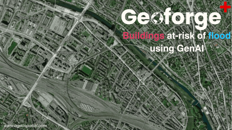
This GIF shows how an LLM can quickly identify buildings at risk in flood zones using satellite imagery-derived data.
That’s it for this week.
I’m always keen to hear from you, so please let me know if you have:
new geospatial datasets
newly published papers
geospatial job opportunities
and I’ll do my best to showcase them here.