Spatial Edge #1: How accurate are land-use maps?
PLUS: measuring air pollution in cities and new geospatial datasets
Hello! I’m trying something a bit different this week and publishing a concise round-up of geospatial news. The goal is to help make you a better geospatial data scientist in less than 5 minutes. I’m calling this the Spatial Edge.
In today’s newsletter:
Land-use maps: which one’s the most accurate?
Clearing the air: Using geospatial data to measure pollution in cities
Flood predictions: picking the right datasets
Fresh picks: new free datasets including high-res images and global flooding data
Geospatial jobs
Research you should know about
1. How accurate are land-use maps?
A new study was just published in Scientific Data to assess the accuracy of land-use maps. Land-use maps essentially tell us whether a pixel is cropland, urban, water, shrubs, and so on.
You may have come across a few of these, such as:
ESA’s WorldCover, or
ESRI’s Living Atlas datasets.
However, many of these datasets provide different results. So, in the past, this has left me pretty confused as to which dataset I should be using.
Thankfully, Kerner et al. (2024), studied 11 different land cover maps in eight Sub-Saharan African countries to help us out.
The takeaway:
Regional land cover datasets like Digital Earth Africa, performed better than global datasets. For obvious reasons, they’re more tailored to a specific geography, and are able to use more local datasets.
Of the global datasets, WorldCover and GLAD Maps performed the best. While ESA’s GlobCover performed the worst, which means we should be pretty careful when using this dataset.
2. What causes air pollution in cities?
A new study in Scientific Reports examined air pollution in 708 European cities, using a couple of geospatial data on particulate matter (such as CAMS and EDGAR).
The takeaway:
On average, 27% of air pollution in cities comes from the residential sector. This is mainly caused by burning biomass (e.g. things like wood burning in homes).
Surprisingly, air pollution from the residential sector is much higher than transport (14% of air pollution), agriculture (17%), and industry (18%).
3. How to improve flood area mapping
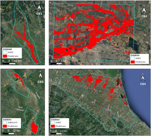
A study in Remote Sensing Applications has examined which variables were able to best predict flooded areas.
Flood mapping is one of the most important use-cases in the geospatial space. It’s used in areas ranging from disaster risk monitoring to insurance and urban planning.
The study used different combinations of variables in a Random Forest model to assess which variables improved the flood modelling performance.
The study focussed on four case studies:
Sesia River flood, Italy (2020)
Namoi River flood, Australia (2021)
Shire River flood, Malawi (2022)
Emilia Romagna Flood, Italy (2023)
The takeaway:
The Modified Normalized Difference Water Index (MNDWI), was one of the best predictors of flooding. This index is used to identify water areas.
The Red and Short-Wave Infra-Red index (RSWIR) was the second most important variable. RSWIR also helps us identify water since water absorbs more infrared light than other features.
Variables like elevation were useful only if the latest data was available. Surprisingly, many studies have used out-dated elevation datasets when trying to predict flooding.
New (and Free) Geospatial Datasets
1. High-Resolution Training Data:
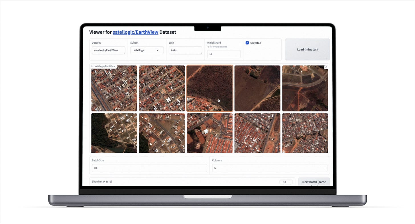
In case you missed it, Satellogic released a bunch of high-resolution images on Hugging Face, to help researchers train EO foundation models. This is game-changing for the geospatial space, where many researchers are restricted by the cost of accessing high-res data.
The data totals 6 million images for different land-use types, objects, geographies, and seasons.
Satellogic have now released Earthview Viewer, which includes both an open-source app, and a Python library to help us explore their open-sourced data.
• Link to dataset
• Link to the Earthview Viewer
2. Global flooding data
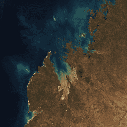
NASA’s MODIS Near Real-Time Global Flood Product is used to monitor floods across the world. It replaces the NASA NRT Global Flood Mapping Product.
It provides daily, global, ~250 m resolution data on flood and surface water.
In the image above, the data has been used to detect extensive flooding in Rio Grande do Sul, Brazil on May 6, after the devastating heavy rains in the region.
• Link to dataset3. Australian environmental data:
Digital Earth Australia has made its datasets available on Google Earth Engine. This includes data on:
land cover,
water observations statistics,
National Intertidal Digital Elevation Model, and so on
• Link to dataset4. UK population data:
The UK has published shapefiles for UK urban centres at 200m resolution.
The data originally comes from the Global Human Settlement Layer population dataset.
• Link to dataset Geospatial Policy Stuff
A short round-up of geospatial data in the news.
1. the Australian Geospatial Council released its Economic Impact of Geospatial Services in Australia Preliminary Report.
Some key highlights:
The geospatial services provides $39b to the economy, and this is expected to grow to $81b in the next 10 years.
Most of the demand for geospatial services comes from the mining industry, followed by government services and construction.
2. the UK’s Geospatial Data Standards Register was updated to adopt ISO standards for geospatial data.
I’m a big fan of data standardisation measures. It makes our lives easier when using multiple geospatial datasets from different parties. There’s nothing more annoying than different organisations adopting different naming conventions.
This is why I’m a fan of what STAC is trying to do.
Other interesting stuff
Geospatial OG, Qiusheng Wu, has just published a free 33 video course on designing Geospatial Software using Python. It teaches you how to develop python packages like geemap and leafmap from scratch.
The SITS package on R has been updated. It improves the performance of deep learning models using GPUs, supports merging Sentinel-1 and Sentinel-2 data cubes, and enhanced object-based time series analysis. More info here.
Free webinar on how to teach geography with satellite imagery on 23 May from Copernicus and Singergise. More info here.
A new Python package, HyperCoast, has been released to help visualise NASA’s EMIT and PACE datasets.
Geospatial Jobs
GIS/Remote Sensing consultancy position with the UN’s FAO: https://www.linkedin.com/jobs/view/3920357524/
Full-time Data Scientist position at the Asian Development Bank: https://www.adb.org/careers/240297
That’s it for this week.
I’m always keen to hear from you, so please let me know if you have:
new geospatial datasets
newly published papers
geospatial job opportunities
and I’ll do my best to showcase them here.
Till next time,
Yohan


