Spatial Edge #2: How to identify the function of buildings from satellites
PLUS: Using geospatial data to track human trafficking routes, super-resolution for SAR data, and the world's largest building dataset.
Hey guys, here’s this week’s round-up of geospatial news. The goal is to help make you a better geospatial data scientist in less than 5 minutes.
In today’s newsletter:
Buildings datasets: how to detect the function of buildings from satellites
Human trafficking routes: plotted using NLP and geospatial methods
SAR super-resolution: increasing the resolution of Sentinel-1 data
Space comics: ESA is now venturing into the genre of graphic novels (why not?).
Research you should know about
1. How to identify the function of all buildings using satellite data
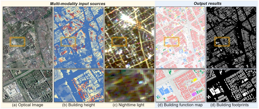
A cool paper that uses satellite data to categorise all buildings by their function was just released.
They collected: (i) optical images, (ii) nightlights, (iii) building height data, and (iv) area of interest and building masks.
This data is then used to train a segmentation model using a semi-supervised approach.
The authors were then able to classify buildings into the following categories:
Industrial
Residential
Commercial
Public Health
Public Service
Sports and art buildings
Education and research
The results were evaluated with 20,000 validation points and government survey reports, showing an overall accuracy of 82% for 1.6 million buildings in Shanghai.
P.S. the code is open-sourced on GitHub.
2. New tool to identify changes in coastlines
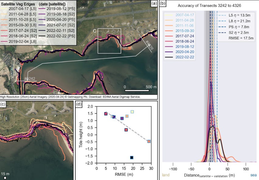
I was pretty surprised to find out that it’s not so straightforward to detect coastlines — and changes in coastlines — from satellite images.
In hindsight, this should've been obvious. Coastline changes might just reflect different tidal times when satellite images were taken.
To tackle this, researchers have published a new open-source tool to monitor changes in coastline using vegetation edges. In other words, it uses the boundary where vegetation meets the sea to monitor changes in the coastline. The tool is called VedgeSat.
It can accurately detect vegetation boundaries in 83% of Sentinel-2 images.
3. Using NLP and geospatial methods to plot human trafficking routes.
Understanding routes for human trafficking can be important for humanitarian organisations to help victims.
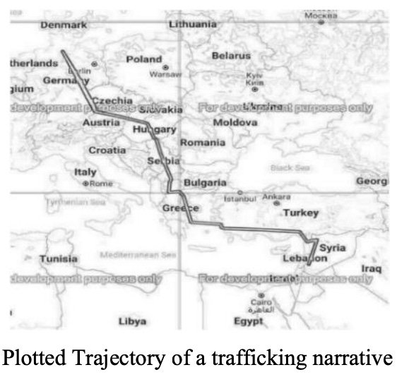
In a new study, researchers have managed to plot human trafficking routes by:
Obtaining a bunch of anonymised media reports that recount the journey of victims.
Using natural language processing (NLP) to extract the names of locations victims travelled through.
Using geospatial techniques to map those places.
4. Increasing the resolution of SAR images from Sentinel-1
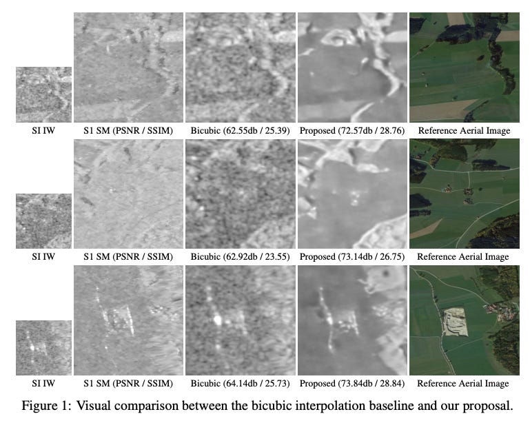
A new paper from some of the folks at Tracasa and the Public University of Navarre looks at increasing the resolution of Sentinel-1 satellite imagery from 10m to 5m.
Super-resolving Sentinel-2 data is growing in popularity (I’ve covered it previously here), however less has been done with SAR data.
SAR (i.e. radar-based satellite images) essentially allows us to ‘see through’ clouds and smoke, and can provide images day or night. However, the freely available data is only available at 10m resolution.
Their paper introduces a new deep-learning method to reduce speckle and improve the spatial resolution of Sentinel-1 data. Unlike previous methods that use high-resolution satellites like TerraSAR-X as ground truth, they use Sentinel-1 in a different mode (i.e. Stripmap mode — which captures data at 5m resolution) as the ground truth.
New (and Free) Geospatial Datasets
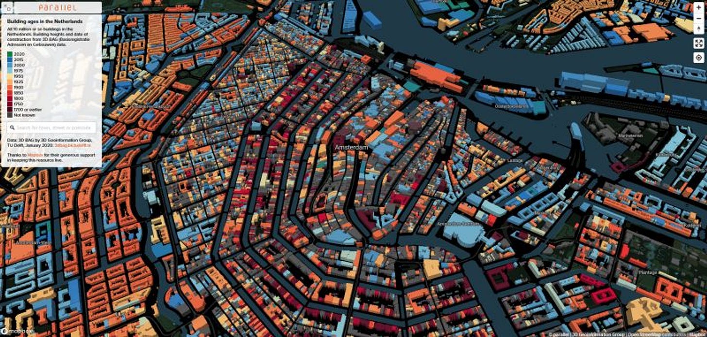
Data (and interactive maps) of building ages in the Netherlands. I’m a sucker for good UI and geospatial data. So I get quite excited when these two things are combined. Here you can interactively explore the age of buildings in the Netherlands.
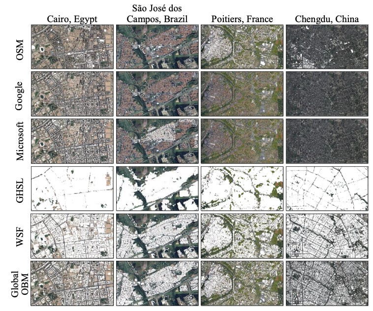
Global OpenBuilding Map (OBM) provides the most detailed and accurate building map ever made. Researchers from the Technical University of Munich used big data analytics and nearly 800,000 satellite images to create the dataset. You can read more about the dataset here.
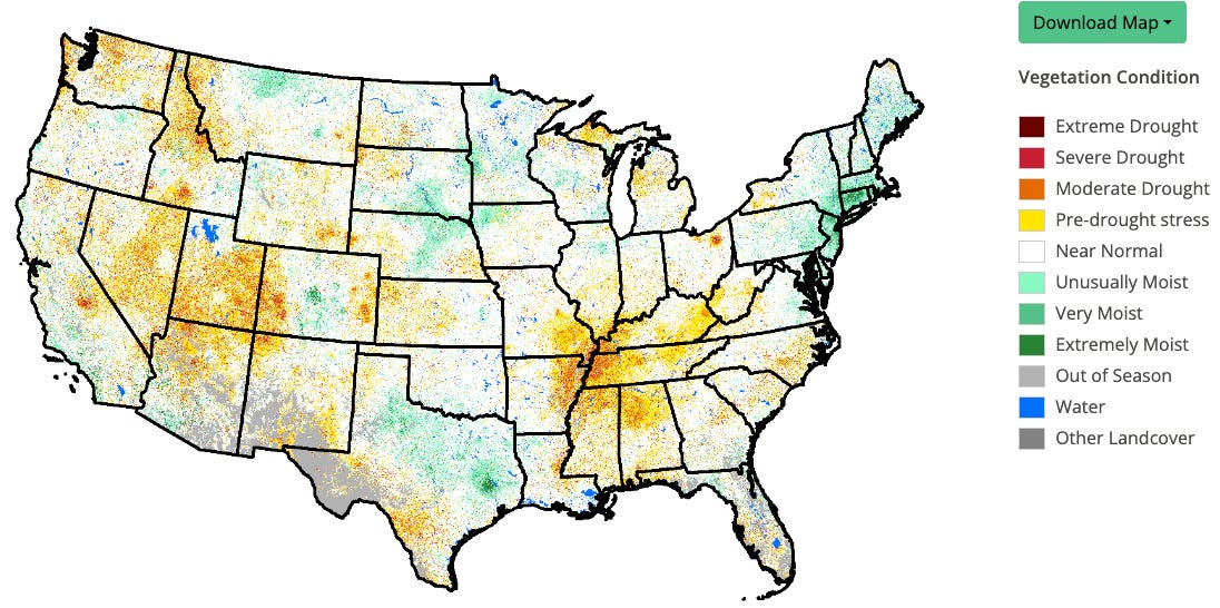
The Vegetation Drought Response Index (VegDRI) is a weekly geospatial model that depicts drought stress on vegetation within the US: https://support.climateengine.org/article/141-vegdr
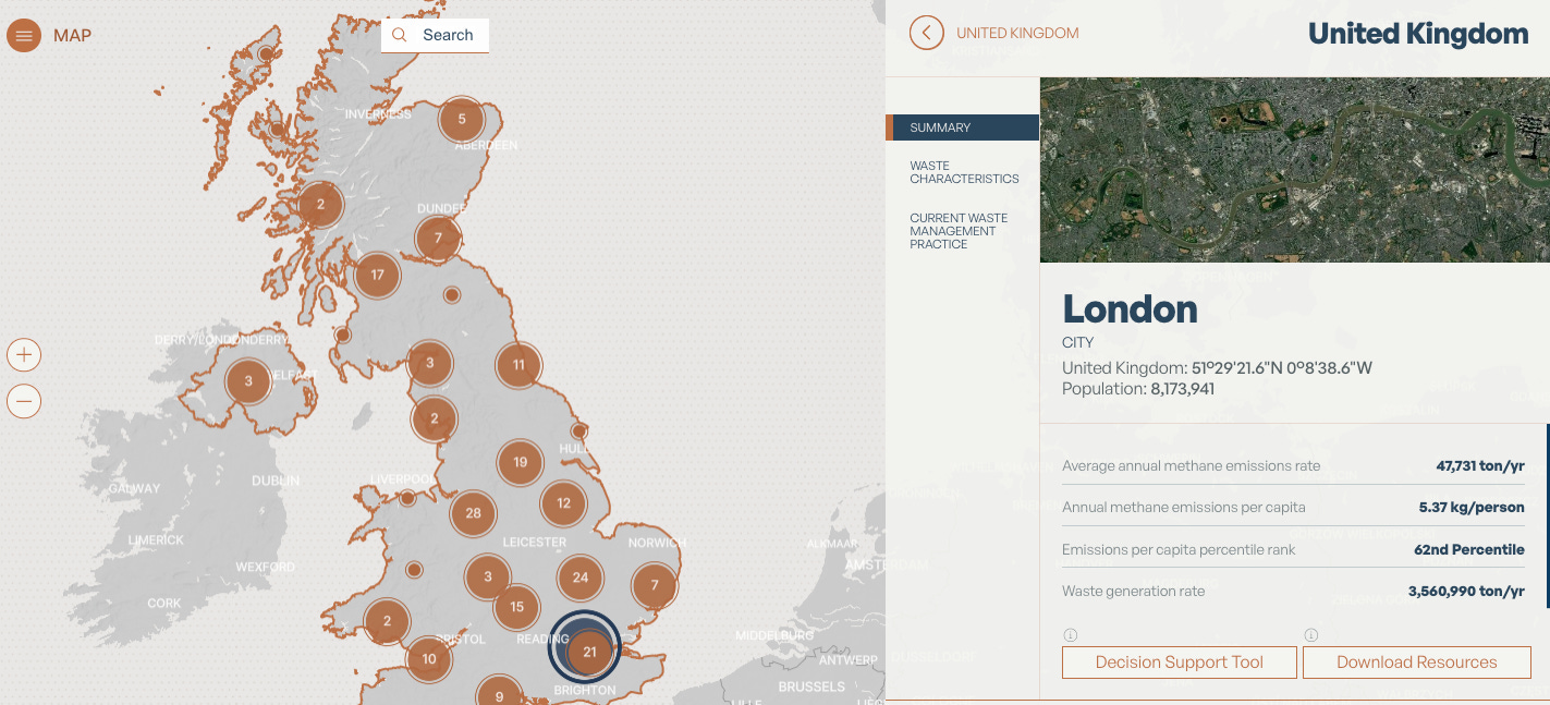
WasteMAP provides geospatial data on local waste emissions. It uses data from Climate TRACE, satellite imagery from Carbon Mappers, and emissions estimates from the United Nations Framework Convention on Climate Change and the Emissions Database for Global Atmospheric Research (EDGAR).
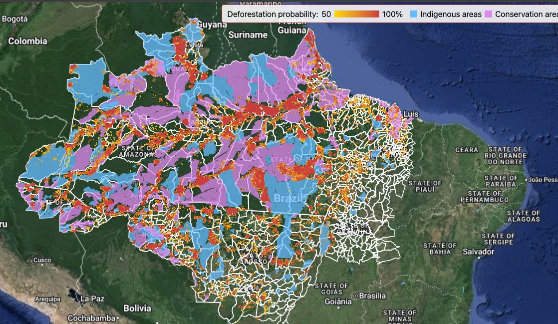
IPAM Amazonia, in partnership with the World Bank, has created a map of forests at risk of deforestation in Brazil. You can access the data here. They use macroeconomic data to estimate the amount of deforestation expected, while governance and vulnerability factors are used to estimate the location most at risk of being deforested. The full methodology is published here.
Other Interesting Bits
ESA is hosting its first conference on super-resolution next week in Frascati, Italy. I’ll be going along, so come say hi if you’ll be there.
My
tweetpost on Ghost Roads has been getting a bit of attention on X. Researchers from James Cook University found that ‘ghost roads’ (i.e. roads that are missing from geospatial datasets like OSM) are often a leading indicator of deforestation.This study examines how to detect building height from a single SAR image.
OmniSat is a new model that combines different types of satellite data to get a more complete and accurate picture of Earth. By using various types of data like high-resolution images, time series satellite data, and radar data, OmniSat learns to create detailed representations of the environment without needing labelled data. This approach helps improve tasks like monitoring the environment and climate and identifying different types of land cover, even in areas where data is limited.
This paper reviews the ways to use SAR to obtain cloud-free optical images. Here are the cliff notes:
This article from ArcGIS provides a tutorial on how to downscale climate models using Python. I go into more detail on climate models here.
ESA has done something that no one has asked for —they’ve released a comic, Space Odyssey, which is the first complete history of space in graphic novel form. Full credit to ESA for not staying in its lane. Here, they tell the story of the men and women who pioneered humankind's journey into space.
A new Python package, HyperCoast, has been released to help us visualise hyperspectral data, such as NASA’s EMIT and PACE. It makes it easy to plot spectral signatures without coding.
Geospatial Jobs
The New York Times is looking for a cartographer, with experience in GIS and EO.
The University of Edinburgh is looking for a couple of lecturers in Physical Geography.
The European Space Agency is recruiting an Internal Research Fellow (Post-Doctoral) on Disruptive Innovation for a Green and Sustainable Future.
The UN’s FAO is advertising for a GIS/Remote Sensing consultancy position.
The ADB is looking for a full-time Data Scientist this is actually in the same team as me (so probably a good reason to stay away…).
That’s it for this week.
I’m always keen to hear from you, so please let me know if you have:
new geospatial datasets
newly published papers
geospatial job opportunities
and I’ll do my best to showcase them here.



Thanks for sharing