

🌐 The shady business of academic citations
PLUS: planning flood evacuations using AR, generating terrain models using text, and more.

Hey guys, here’s this week’s edition of the Spatial Edge — we like to think of ourselves as a safe space for the CRS-curious. The aim is to make you a better geospatial data scientist in less than five minutes a week.
In today’s newsletter:
Citation Scams: Study uncovers paid and AI-generated citations
Flood Planning: XR tool improves evacuation coordination in Philippines
Terrain Modeling: New model turns text into 3D landscapes
Soil Data: EcoDataCube adds 110TB of high-res layers
Coastal Mapping: NASA uses lidar to fill shoreline data gaps
Land Parcels: New dataset maps land use across China
Research you should know about
1. The shady business of academic citations
Ok, this one isn’t really a geospatial paper, but it’s too interesting (crazy?) not to include. If you thought academic citations were a reliable measure of scientific impact, then this paper is going to make you think again.
A new study has uncovered widespread manipulation in how citations are accumulated, and it’s worse than many of us suspected. Using Google Scholar data, the authors show just how easy it is to game the system, including through citation rings, AI-generated papers, and even paid citation “packages”.
Here’s a breakdown of what they found.
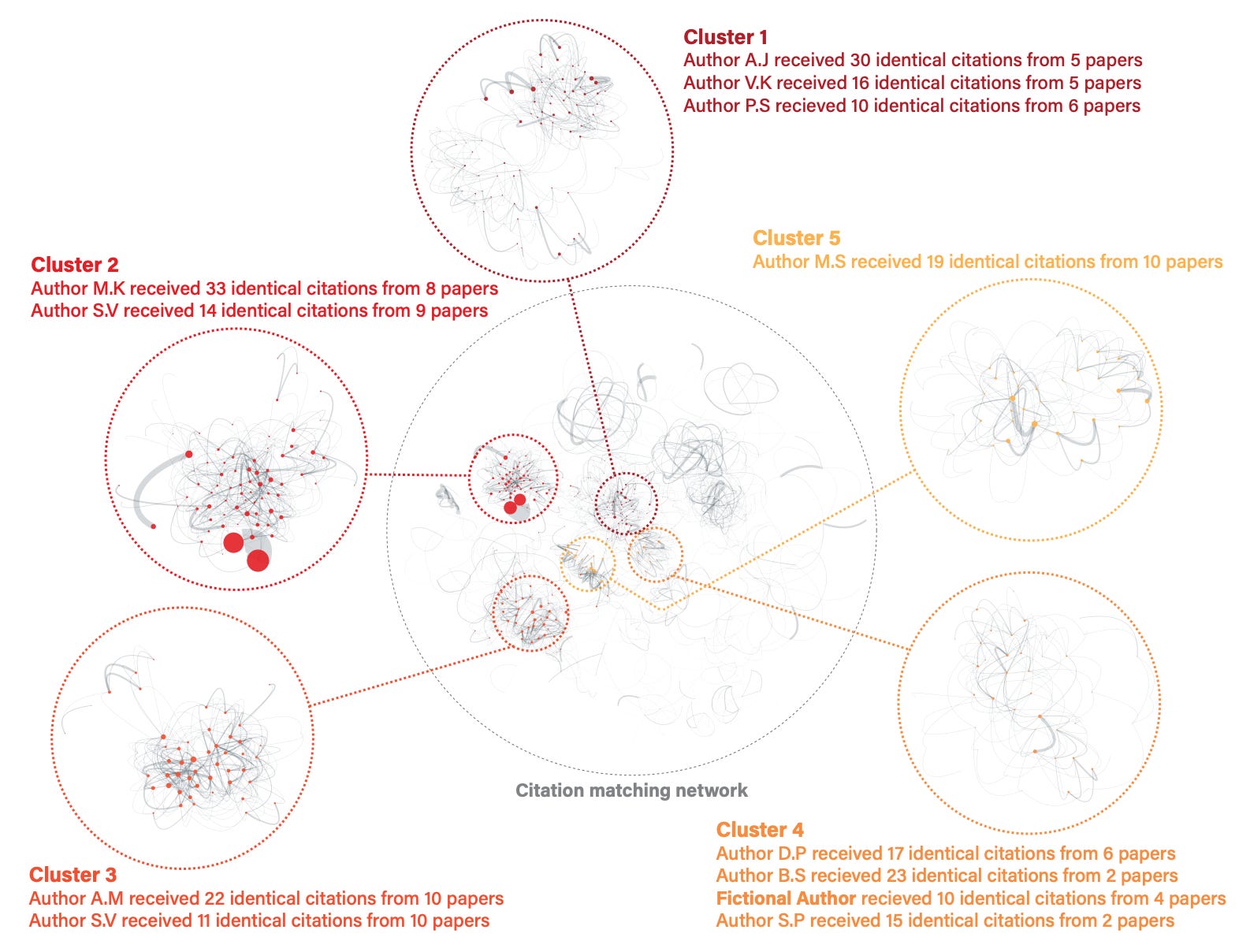
Citation counts can be engineered
The paper documents some wild examples. One scientist received 2,025 citations in a single year. This turned out to be exactly 45 citations from each of 45 different papers. Another was cited 167 times by a single paper, which itself was only three pages long but had over 200 references. And in both cases, these were not self-citations.
Because Google Scholar doesn’t show where a paper’s citations come from, this kind of manipulation is nearly impossible to spot through casual browsing.
Yes, you can literally buy citations
The researchers even tested this themselves.
Using a fictional Google Scholar profile, they contacted a vendor offering “citation boosting services”. For $300, they purchased 50 citations. These citations showed up within 33 to 40 days, across five separate papers, all indexed in Google Scholar. These were all supposedly published in peer-reviewed journals, including some from major publishers like Springer and Elsevier.
The vendors refused to say which journals would be used, but some had real impact factors as high as 4.79.
AI is making the problem worse
Generative AI makes it easier than ever to produce fake papers that look convincing but offer no scientific value. The authors show that these papers can be submitted to pre-print servers and cited just like legitimate work.
Researchers could also use AI to paraphrase existing work, mask plagiarism, or insert citations to themselves or others.
Current databases are too easy to game
Google Scholar, Scopus, and Web of Science all fall short. For example:
They don’t flag suspicious patterns, like clusters of papers citing the same author 10 or more times.
They rarely moderate what gets indexed. Google Scholar still lists almost anything it finds online.
They offer very limited visibility into where citations come from, which makes detecting manipulation harder.
One potential solution then, could be to look at citation density. I.e. how concentrated a scientist’s citations are (i.e., how many come from a small number of sources). Another one would be to let users filter citations by source (e.g. peer-reviewed, Q1 Journal, etc.).
In any case, if you happen to know the name of these citation-boosting services, please drop me a DM (asking for a friend).
2. Planning flood evacuations with 3D maps
Flood evacuation planning is often messy and fragmented. A new project from the researchers at De La Salle University in the Philippines shows how extended reality (XR) can fix that. It’s essentially designed to help disaster response officers visualise flood scenarios and plan evacuation routes more interactively.
The challenge: fragmented disaster planning
Coordination between disaster response agencies is often fragmented when it comes to disaster planning in the Philippines. This makes it pretty difficult to develop shared evacuation plans, especially when different offices hold different pieces of the picture.
The team saw XR as a way to bring people onto the same page. Their goal was to create a shared virtual space where planners could see flood risk and evacuation options clearly, and work together in real time.
What RoutScape lets you do
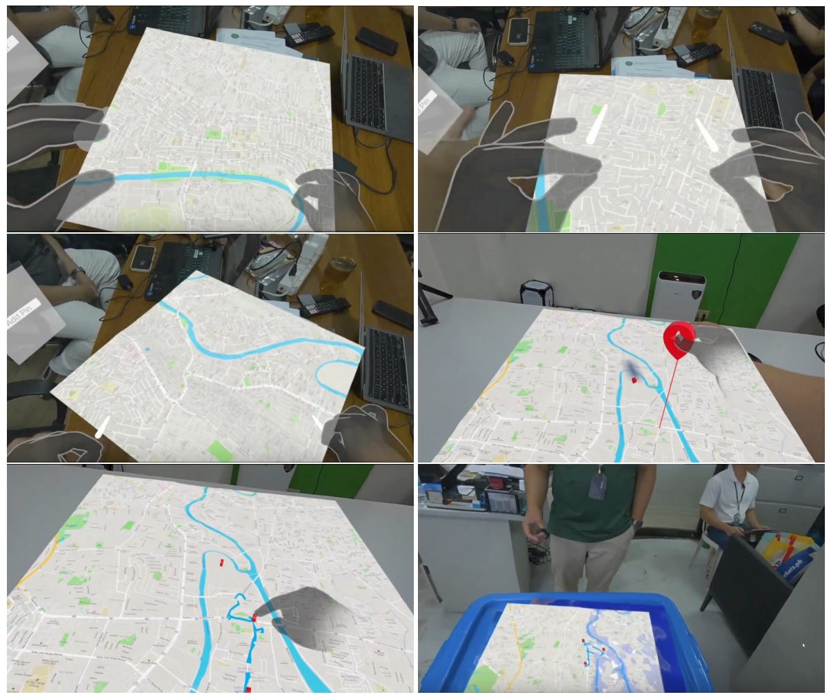
The team built RoutScape through multiple rounds of prototyping with local disaster officers. It runs on XR headsets like Meta Quest and allows users to:
View a 3D map of their area
Zoom, rotate and explore different flood levels
Drop pins on key locations
Sketch evacuation routes directly into the map
The first version was single-user only. But the team then developed a multi-user version that allows two people to use the system at the same time. Users interact through hand gestures instead of controllers, which made the experience feel more natural.
What the testing showed
Local disaster officers responded positively to the tool. Two things stood out in particular.
First, visualising flood scenarios in 3D helped them understand the risks more clearly. Showing local landmarks and flood zones directly on the map made planning feel more grounded and realistic.
Second, familiar features like clear text labels and points of interest (similar to Google Maps) helped users orient themselves and use the tool more confidently.
Why this matters
Most disaster planning tools are either too static (like paper maps) or too technical (like GIS dashboards). RoutScape offers something a bit more intuitive. And who knows, perhaps this will unlock an actual use case for the Apple Vision Pro…
3. A new way to generate realistic terrain maps using text and satellite data
If you’ve ever tried to model terrain, whether for games, simulations, or earth science, you’ll know it can be slow, rigid, and highly manual. Most current approaches rely on rule-based methods or handcrafted simulations. These often struggle to produce realistic or varied landscapes at large scale.
A new study from Adobe and the European Space Agency, introduces a more flexible alternative: generating terrain using text prompts.
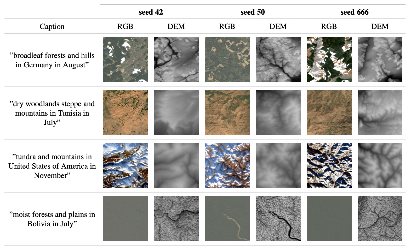
It’s called MESA (Modeling of Elevation and Surface Appearance). The model uses diffusion techniques trained on global satellite data to generate paired optical imagery and elevation maps based on simple text descriptions. For example:
“Temperate forests and mountains in New Zealand in March.”
The outputs are 2.5D terrain samples that include both satellite images and elevation data, aligned and realistic.
MESA is trained on real satellite observations rather than simulated or synthetic terrain. Specifically, it uses Sentinel-2 imagery and 30m resolution elevation data from the Copernicus programme. The dataset includes over 1.3 million tiles, each covering 10 by 10 kilometres, and spans most of the world’s land surface.
Each tile is tagged with a set of descriptors:
Biome (such as tundra, rainforest, or dessert)
Geology (such as plains, hills, or mountains)
Country
Month of the year
These descriptors are converted into short captions that guide the model during generation.
MESA is one of the first large models able to generate both RGB images and elevation maps from a single text prompt. This makes it possible to produce terrain with consistent shading, slopes, and textures, based on what the caption describes.
The team adapted Stable Diffusion 2.1 to do this, modifying the architecture so it could produce two outputs: an optical image and a depth map. Both are conditioned on the same text input.
It’s pretty interesting work, but I’m still not sold on who the main users would be.
The model code and weights are available on GitHub and HuggingFace
Geospatial Datasets
1. High-res environmental layers
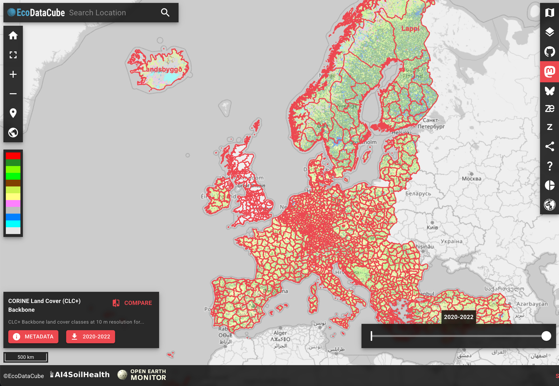
Over 110TB of analysis-ready data has just been added to EcoDataCube.eu, covering 2000–2024 at 10–30 m resolution. New layers include dynamic soil properties (AI4SoilHealth), biophysical indices (e.g. NDVI, vegetation height), and soil carbon density.
2. NASA ATL24 dataset

NASA's new ATL24 dataset fills long-standing nearshore data gaps using ICESat-2’s spaceborne lidar to provide global, refraction-corrected seafloor and sea surface heights. You can access the data here or here.
3. Land parcel dataset

MSLU-100K, offers over 100,000 irregular land parcel samples from 81 major Chinese cities. It covers 7 primary and 28 secondary land use types and uses a human-machine collaborative framework to ensure quality. You can access the data here and the code here.
Other useful bits

Microsoft Fabric’s integration with ESRI GeoAnalytics is bringing scalable geospatial processing to big data workflows. It was used to analyse land subsidence in the Netherlands using point clouds and building data. You can check out the notebook and other details here.
India’s latest rocket launch ended in failure, resulting in the loss of the EOS-09 Earth observation satellite. The PSLV rocket’s third stage experienced issues about six minutes after liftoff, cutting the mission short.
A new satellite constellation design promises near-global Earth observation in just 35 minutes. Using 891 satellites grouped into “basic” and “accompanying” units, a research team developed a flexible LEO mega-constellation optimised through swarm algorithms, enabling faster, more precise Earth imaging.
NASA’s SWOT satellite is revealing tiny ocean currents and waves, known as submesoscale features, with 10x more detail than before. These small but powerful motions help move heat and nutrients through the ocean.
Jobs
My team at ADB is looking for an Associate Statistics Officer (Data Science).
IIASA is looking for a Research Scholar for a nature-based climate solutions research project based in Laxenberg, Austria.
EBRD is looking for an Analyst, Climate Strategy and Delivery based in London.
IFAD is looking for a Technical Specialist (Geospatial Analysis) based in Rome.
Conservation International is looking for a Conservation AI Intern based in either Arlington, Seattle, or Santa Barbara.
Just for Fun

Astronomers have discovered a star orbiting another star. When one of the stars gets older, it can swell up and its outer layers can spill over and surround both stars. This is called a ‘common envelope’. Check out the full paper here.
That’s it for this week.
I’m always keen to hear from you, so please let me know if you have:
new geospatial datasets
newly published papers
geospatial job opportunities
and I’ll do my best to showcase them here.
Yohan