

🌐 Turning messy street view imagery into structured data
PLUS: Mapping vulnerability at 10x higher resolution, using phones to assess seismic risk, and more.

Hey guys, here’s this week’s edition of the Spatial Edge. If someone asks who your favourite band is, and you answer ‘near infrared’, then we have one thing to say to you: welcome home. As usual, the aim is to make you a better geospatial data scientist in less than five minutes a week.
In today’s newsletter:
Mapping Buildings: OpenFACADES turns street images into structured data.
Identifying Vulnerability: New index tracks climate risks at subnational levels.
Seismic Mapping: Smartphones improve accuracy of urban shaking maps.
Transit Analysis: Tool links metro access to housing price trends.
Forest Data: Map distinguishes natural forests from tree plantations.
Research you should know about
1. An open framework for understanding buildings from street-view images

Gaps in objective building data are a massive headache for urban analytics. While we have plenty of street-level imagery, extracting structured data from it remains a bit of a challenge. A new study introduces OpenFACADES, a framework that combines crowdsourced street-level visuals with OpenStreetMap data to train a Vision-Language Model (VLM). The goal is to automate the extraction of physical attributes like material, age, and type, while also generating descriptive captions. It essentially turns messy street photos into structured, actionable geospatial data on a global scale.
The researchers used a pipeline involving isovist analysis and reprojection to grab holistic views of building facades from crowdsourced images. They then fine-tuned open-source VLMs on this dataset, and the results were pretty impressive. These fine-tuned models outperformed traditional computer vision models and even beat zero-shot ChatGPT-4o in predicting multiple attributes. They found that even a modest, well-curated dataset allowed small-scale models to capture most of the benefits of large-scale pretraining. This shows you don’t always need the biggest model or the most compute to get state-of-the-art results.
To prove the system works, they applied this pipeline to half a million buildings across seven global cities. This generated a massive dataset of objective attributes and rich textual descriptions which they have released openly. This kind of data is gold for things like energy modelling, structural risk assessment, and understanding urban morphology. By releasing the code and data, they are making advanced building profiling accessible without the high costs of proprietary APIs. It opens up a bunch of new possibilities for analysing the built environment using open-source tools.
You can access the data and code here.
2. Mapping vulnerability at 10x higher resolution
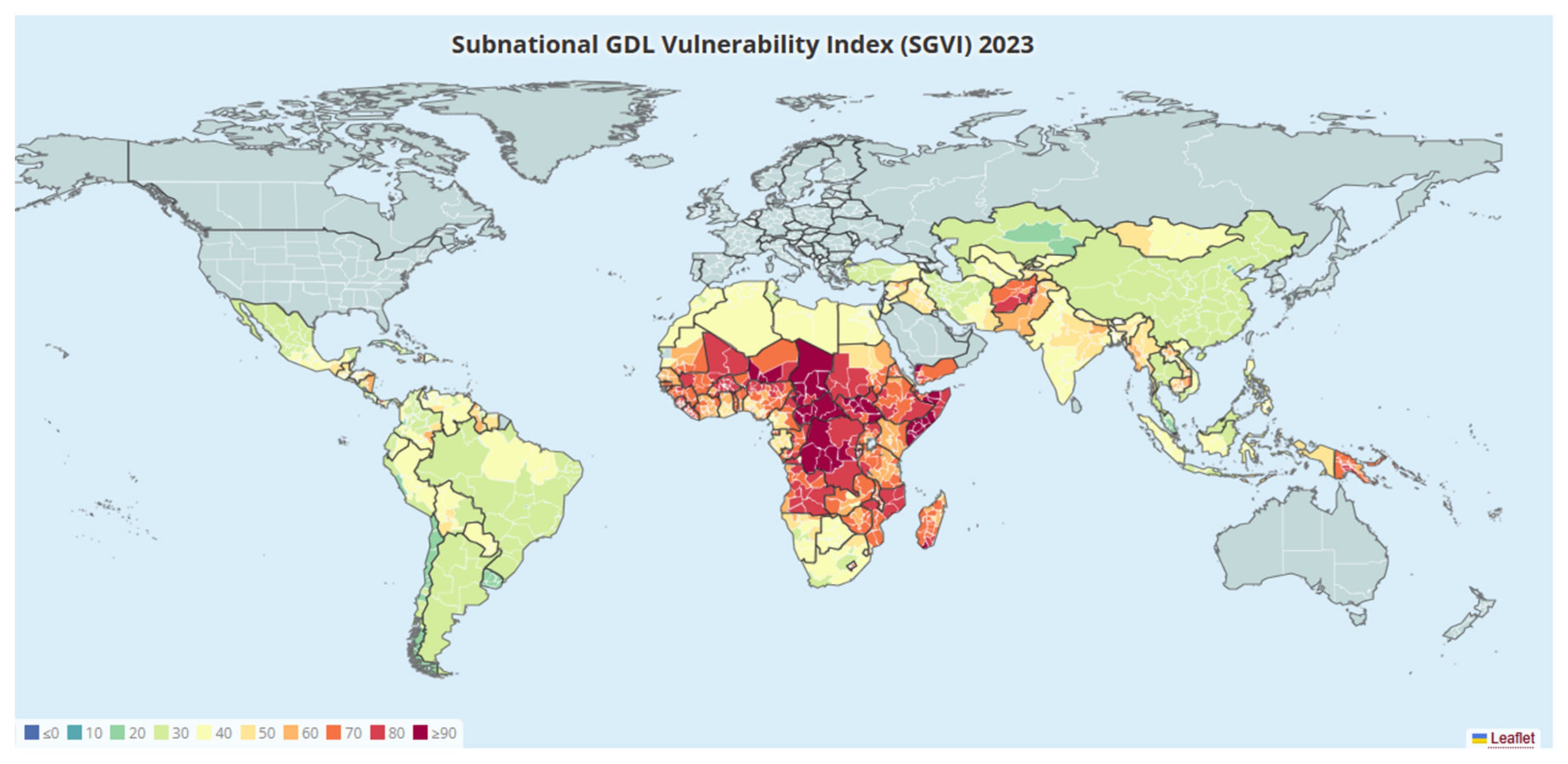
Most climate vulnerability indices rank countries against each other, but a new study published in Sustainability argues that national averages hide massive disparities on the ground. To address this blind spot, researchers from the Global Data Lab have released the Subnational Global Data Lab Vulnerability Index (SGVI). This massive new dataset covers 1260 regions across 118 Low- and Middle-Income Countries to track human vulnerability to climate change and natural disasters. It represents a pretty big leap forward for the field as it provides ten times more detail than previous national-level models, allowing us to see exactly where the hotspots are located within borders.
The team constructed this index by aggregating eleven indicators across seven core dimensions, including economy, education, health, gender, and infrastructure. Since subnational data is often patchy in developing regions, they used regression-based prediction models to estimate missing values based on available survey and satellite data. They then standardised these local estimates around established national means to ensure consistency with existing country-level datasets. This approach essentially allowed them to generate a complete year-by-year record of vulnerability for every included region from 2000 to 2023.
The results highlight just how much information is lost when we only look at national statistics. The study found that using national data masks about 20 per cent of the variation in vulnerability globally, and this figure jumps to over 70 per cent in the poorest regions like Sub-Saharan Africa. While the data shows that overall vulnerability across the developing world has dropped by roughly 24 per cent since 2000, the gap between the best and worst-performing regions has actually widened. This indicates that while development is happening, it is highly uneven, making these local-level insights essential for targeting climate adaptation funds where they are needed most.
3. We can now use phones to map seismic risk

We rely on seismic shaking maps to understand earthquake impacts, yet these maps often lack detail in urban areas because monitoring stations are too sparse. A new study in Nature Communications tackles this by tapping into a resource that’s pretty much everywhere: the smartphone. Focusing on the Campi Flegrei red zone in Italy, the researchers used data from the Earthquake Network citizen science initiative to densify the recording network. While traditional stations are few and far between, thousands of residents have phones equipped with accelerometers that can capture seismic motion right where people live.
Integrating this crowdsourced data is sort of tricky because smartphones aren’t anchored to the ground like scientific instruments. The study found that smartphones typically record higher acceleration values than ground stations, likely because they sit on furniture or loose surfaces that amplify the shaking. To solve this, the authors developed a statistical approach that fuses data from both sources. They extracted the consistent spatial patterns of amplification from the noisy smartphone readings and combined them with the precise data from seismic stations. This allowed them to map local site effects at a much higher resolution than was previously possible.
The results show that adding smartphone data makes a massive difference to the accuracy of ground motion models. By incorporating these devices, the researchers reduced the uncertainty in their shaking estimates by over 70 per cent compared to using stations alone. This method created a detailed amplification map that highlights exactly which parts of the city are most prone to heavy shaking. It provides a pretty big leap forward for emergency planning, as it allows authorities to generate real-time, street-level shaking maps immediately after an event occurs.
You can check out the data and code here.
4. Exploring how metro access shapes housing prices
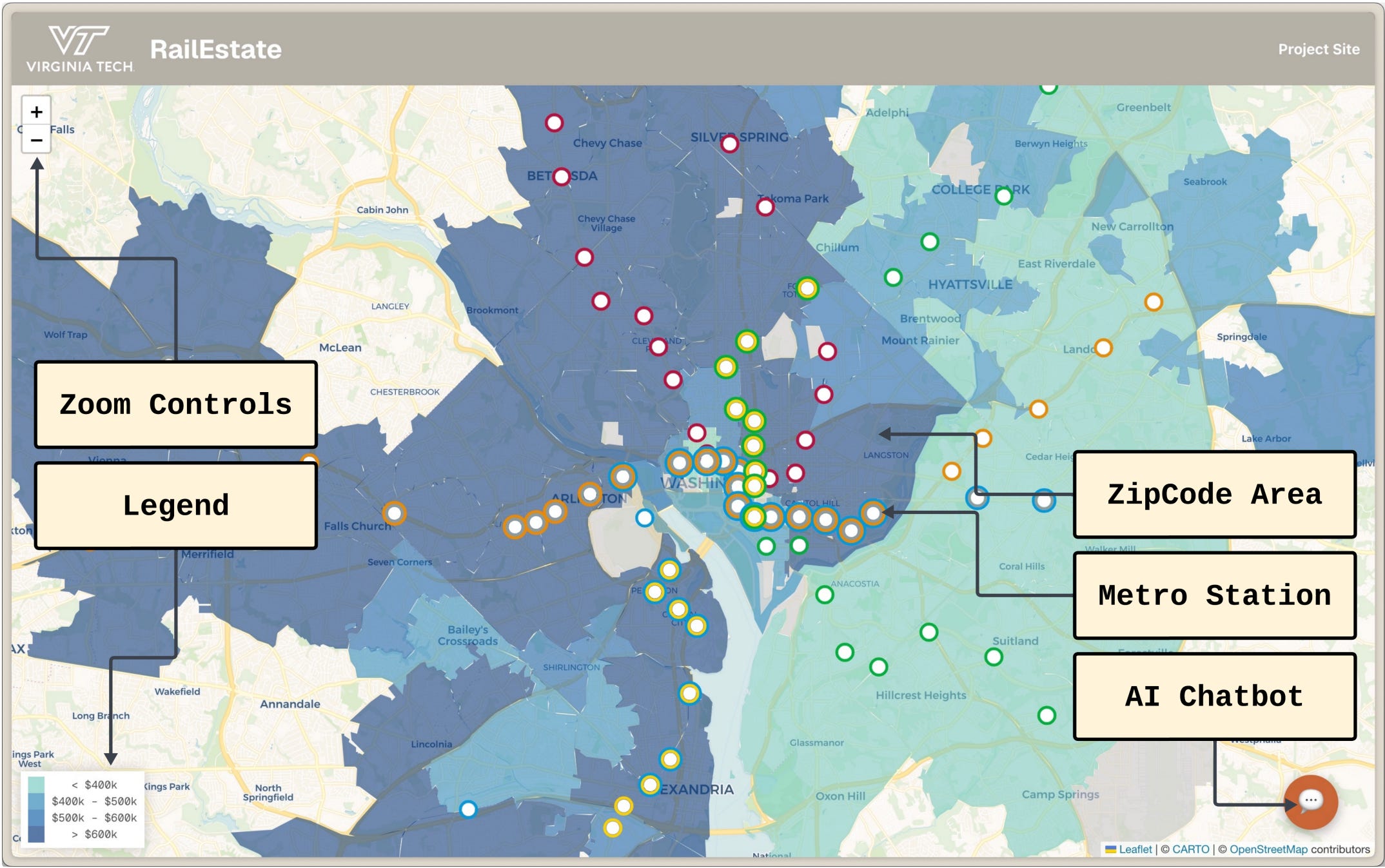
It’s pretty well established that living near a metro station bumps up property values, reducing commute times and boosting neighbourhood appeal. Usually, though, trying to visualise this data is a pain because you have to cross-reference static maps with market reports manually. That’s where a new system called RailEstate comes in. Developed by researchers at Virginia Tech, this web-based tool mashes up twenty-five years of housing data with transit infrastructure to show exactly how proximity to the Washington metropolitan area’s metro stations impacts local real estate prices.
The platform lets you interactively explore price trends at the ZIP-code level, but one feature (of course) is the integration of a natural language chatbot. Instead of needing to know how to code, you can just ask plain English questions like ‘What’s the highest price in Falls Church in the year 2000?’. The system uses an LLM to translate that text into an optimised SQL query, runs it against the spatial database, and spits back the answer in seconds. It basically democratises access to complex geospatial queries that used to require a fair bit of technical know-how.
On top of the historical analysis, the tool includes a forecasting engine that projects future values up to a year in advance. This is super useful for seeing how infrastructure shocks, like a new line extension, might shake up the market down the road. While the current demo focuses on D.C., the architecture is portable enough to work for any city with standard transit data. It is a pretty solid example of how we can combine spatial analytics with AI to make urban planning data accessible to just about anyone.
You can check out the demo video here.
Geospatial Datasets
1. Natural Forests of the World 2020

Natural Forests of the World 2020 is a globally consistent 10-m map that distinguishes natural forests from plantations and other tree cover. It’s trained on over 1.2 million multi-temporal Sentinel-2 image patches. The release also includes large benchmark datasets (Planted and ForTy) to support next-generation forest-type modelling and the development of future global maps. You can access the data here and the code here.
2. Integrated Urban Traffic-Flood (IUTF) dataset

The IUTF dataset offers a rare, cross-border view of how rainfall and flooding affect urban mobility, bringing together harmonised traffic sensor data, ERA5 precipitation, and detailed road-network topology for 40 cities across Europe, North America, and Asia. With over 21,700 sensors (raw 5-minute readings aggregated to hourly) and more than 1 million road segments, it provides one of the most comprehensive resources yet for studying weather–traffic interactions at scale. You can access the data here and the code here.
3. Integrated meteocean-seismic dataset

This integrated meteocean–seismic dataset provides rare, high-resolution observations from Deception Island, Antarctica, capturing seawater pCO₂, temperature, salinity, wind, solar radiation, tides, and volcanic seismic activity. You can access the code here.
4. Hourly potential light availability dataset

SwissRad10 is a high-res dataset of hourly potential light availability at 10 m across all of Switzerland, capturing how terrain and every individual tree shape direct and diffuse light over a full year. You can access the data here and the code here.
Other useful bits

Sentinel-2A is running a special December 2025 night-time acquisition campaign, collecting Level-1B images over hotspots like gas flares, bright city lights, wildfires, and fishing zones to test how well the mission can see the world after dark. The data will help shape Sentinel-2 Next Generation by showing where night-time imaging adds real value.
The World Bank’s new MANAGE-WB model offers teams a flexible, single-country CGE framework to explore macroeconomic scenarios across sectors, institutions, and production factors. It comes with a user-friendly interface, SAM-building tools, and built-in sensitivity and stochastic simulation features, making complex macro analysis much more accessible.
SamGeo v0.14.0 recently dropped, bringing interactive, SAM3-powered segmentation to remote sensing workflows. Draw a box or type a prompt, and it instantly finds matching objects across an image. It’s fast, label-free, and delightfully simple to use, with demos and code ready on GitHub and the new notebook.
Jobs
Map Action is looking for a remote Geospatial Data Engineer.
MapBox is looking for a Director of Product (Maps), in the US.
Just for Fun
Check out this video from NASA, which shows what the first 150 milliseconds of a supernova looks like.
That’s it for this week.
I’m always keen to hear from you, so please let me know if you have:
new geospatial datasets
newly published papers
geospatial job opportunities
and I’ll do my best to showcase them here.
Yohan