

🌐 What's really coming out of refineries?
PLUS: When AI models get it wrong in urban planning, detecting ships using radar, and more.

Hey guys, here’s this week’s edition of the Spatial Edge — a weekly round up of the latest happenings in the geospatial space. If you read this letter, I’m told you’re guaranteed to be as cool as a Drake impersonator at a Kendrick concert. With takes this sharp, the aim is to make you a better geospatial data scientist in less than 5 minutes a week.
In today’s newsletter:
Refinery Emissions: Massive VOC leaks traced to storage tanks.
EV Charging: AI siting tools overlook the underserved.
Ship Detection: New model learns from background in SAR.
Childbirth Access: Gridlock keeps women from safe deliveries.
Pesticide Maps: Where and how much Europe sprays its crops.
Research you should know about
1. What’s really coming out of oil refineries?

I’m guessing you’ve probably heard that petroleum refineries pollute the air. But what might not be common knowledge is the chemicals that are released, how far they travel, and what kind of damage they do.
Luckily, a new study published in Scientific Reports gives us the rundown. It maps out the exact cocktail of volatile organic compounds (VOCs) released by a large oil refinery, how far these pollutants move through the air, and what happens once they settle.
Storage tanks are the main culprits
Most emissions came from storage tanks. They released over 1,000 tonnes of VOCs per year, which is about 88 percent of the refinery’s total. The main chemicals were pentane, cyclopentane, and cyclohexane.
The wastewater treatment unit produced fewer emissions overall, but it was the main source of toluene and benzene, which are two chemicals known to cause cancer.
It’s not just what’s released. It’s where it goes
Using wind and terrain data, the team modelled how these emissions spread. Areas downwind of the refinery saw the highest concentrations, especially near the tanks and wastewater unit.
Although VOC levels stayed below official safety limits, the concern lies in what these emissions turn into once they become airborne.
Secondary pollutants are the real issue
Once in the atmosphere, VOCs react to form secondary organic aerosols (SOAs) — fine particles that can enter the lungs and bloodstream.
Toluene was the main driver of SOA formation. In some areas, SOA levels exceeded Thailand’s 24-hour PM2.5 limit. m/p-xylene also contributed significantly.
What this means
There’s essentially three main points:
Refineries release large volumes of VOCs, mainly from storage tanks.
Toluene and benzene, though less in volume, pose greater health risks.
These emissions lead to secondary pollutants that travel further and do more harm.
2. Weaving AI through equitable charger planning
AI is starting to play a bigger role in how cities plan the rollout of EV charging stations. But what happens when the models get it wrong?
A new paper from the University of Texas at Austin finds out. Planners are starting to use different types of AI to determine where charging stations should go:
Geospatial AI (GeoAI) to analyse satellite images and spot potential sites like parking lots.
Generative AI (GenAI) to predict which areas are most suitable, based on past siting patterns.
Large Language Models (LLMs) to simulate scenarios or act as AI assistants during the planning process.
But these tools are far from perfect.
The study finds that when the models are wrong, they can reinforce existing inequalities or suggest completely impractical locations.
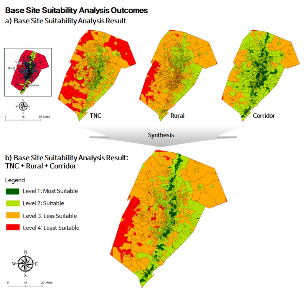
The researchers used Austin, Texas as a test case. They focused on three kinds of areas: high-traffic ride-share zones (TNCs), areas near major highways (EV corridors), and rural neighbourhoods.
They ran three types of analysis:
A baseline model using standard GIS methods.
An enhanced version using GeoAI to improve land classification.
A GenAI model trained to predict suitable locations from satellite images.
Each tool added value but also introduced some risks. For example, the GeoAI model improved the precision of site selection by identifying overlooked parcels. But the GenAI model sometimes failed to detect low-suitability areas, producing inaccurate results when tested on new data.
If planners rely too heavily on AI outputs without checking them, the results could be misleading or even harmful. A site might appear ideal on paper but be unsuitable in real life. Worse, disadvantaged communities, who already have lower access to chargers, could end up overlooked again if the data or models aren’t properly audited.
The solution is more humans, less robots
So the key takeaway from the paper is that human oversight is pretty important. AI can support planning, but it cannot replace it (for now…).
The authors’s concrete solutions for planners are therefore to:
Use community feedback to audit and review AI-generated plans.
Develop user-friendly tools that let non-experts engage with the process.
Treat AI outputs as one input among many, not the final word.
3. Context aware sparse R-CNN for SAR ships
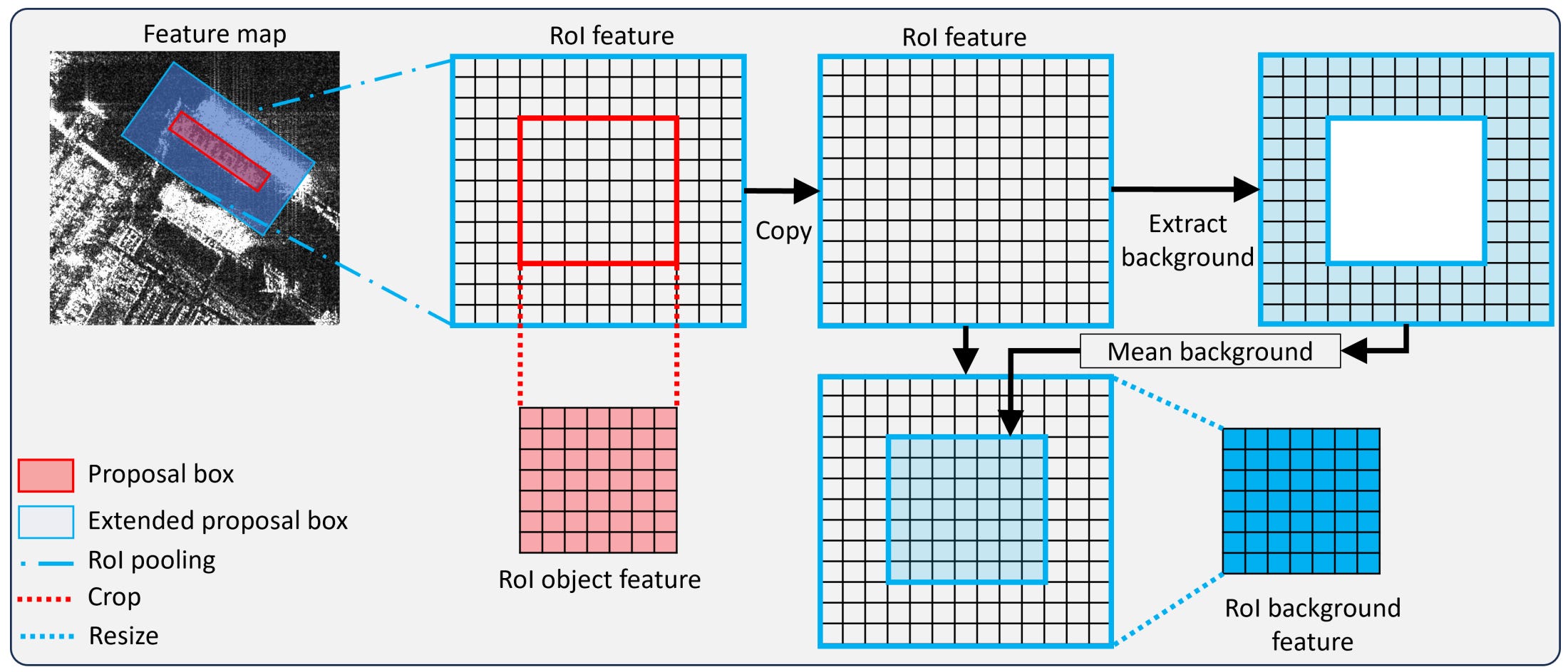
Detecting ships in satellite imagery is actually harder than it sounds—especially near coastlines. A new paper solves this by doing something most models ignore: it learns from the background.
Synthetic Aperture Radar (SAR) is one of the best tools we have for maritime monitoring. It works at night, through clouds, and in all weather. But detecting ships in SAR data, particularly in busy near-shore areas, isn’t straightforward.
Most models use horizontal bounding boxes. These don’t rotate, and often end up capturing too much of the background. That leads to false positives or missed detections, especially when ships are densely packed or overlap with land.
The catchily named R-Sparse R-CNN (I guess they hired OpenAI’s marketing team), makes three main breakthroughs:
1. It uses sparse proposals instead of dense anchors.
Most models check thousands of possible locations to find objects. This one starts with just a few smart guesses (learnable proposals) and improves them during training. It’s faster and better suited to spotting scattered ships in radar images.
2. It learns from background context.
Instead of looking at ships in isolation, the model also looks at what’s around them. This helps it understand the difference between a ship and similar-looking background, like waves or docks.
3. It combines object and background info efficiently.
The model pulls in both object and background features in one go, using a single pooling step. Then it blends them using attention, making it better at filtering out false positives and spotting real ships.
On two benchmark SAR datasets (SSDD and RSDD-SAR), this model outperformed state-of-the-art alternatives by over 10 percentage points in detection accuracy.
In any case, this is the first model to use background-aware sparse proposals for detecting oriented ships, and the results seem to be pretty promising.
4. Exploring access gaps in childbirth care
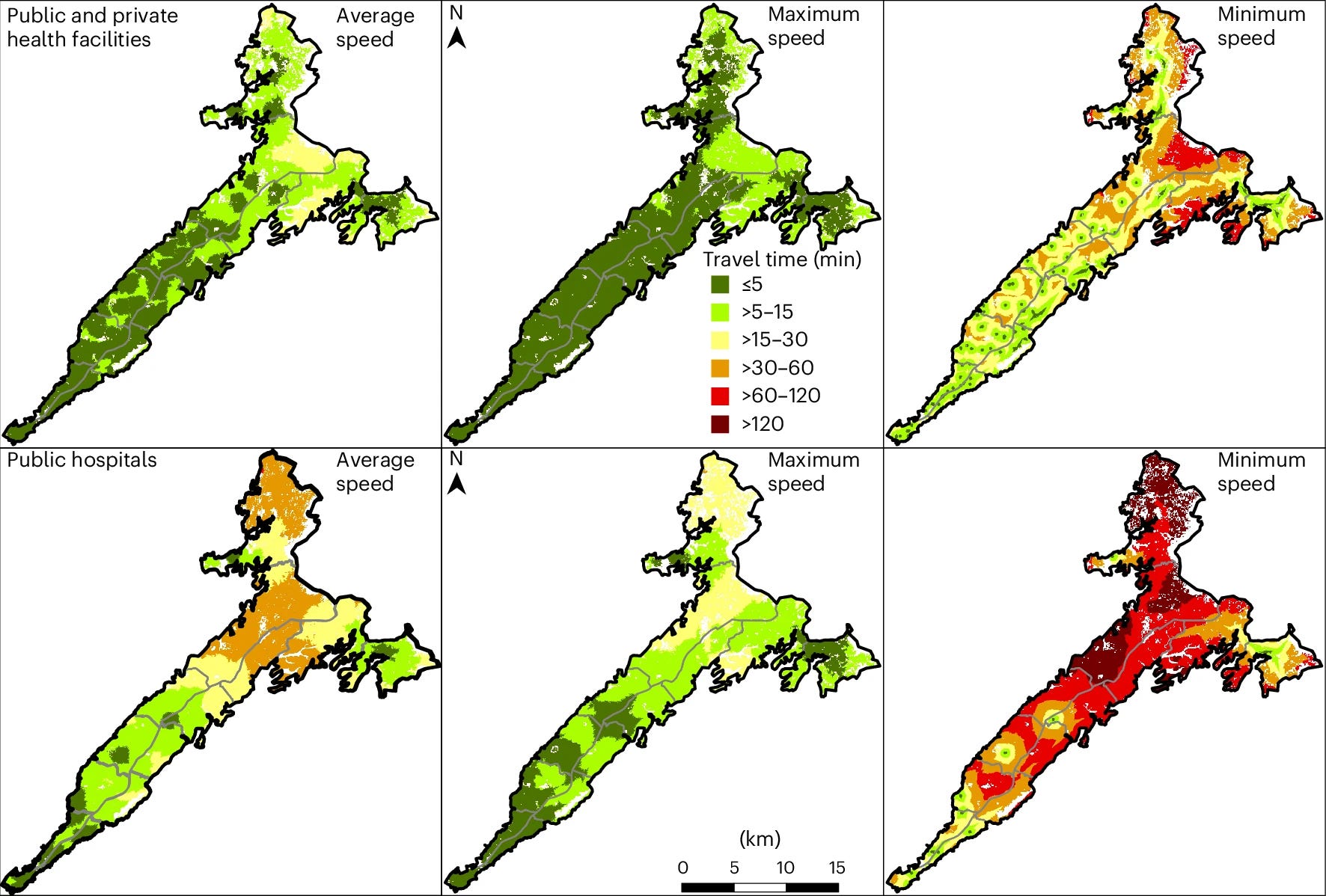
Conakry might look like a pretty dense, urbanised city on a map, but when it comes to accessing childbirth care, distance isn’t the only problem. A new study in Nature Cities shows how travel time, traffic and inequality combine to make reaching care in Guinea’s capital far more complicated than expected.
The researchers used geospatial data on roads, land cover, elevation, and travel speeds to calculate how long it takes women to reach the nearest facility offering childbirth care. They modelled 20 different travel-time scenarios and matched this with population and wealth data.
Access to public hospitals is the issue
Almost all women of childbearing age live within 30 minutes of some childbirth facility. But access to public hospitals, which offer emergency care like caesareans and blood transfusions free of charge, is much more limited, especially under heavy traffic.
Here’s what stood out:
Traffic, not distance, is the barrier.
Most women live close to a facility on paper, but heavy traffic can double or triple travel times. Some women in peri-urban areas face 2-hour journeys to public hospitals during peak congestion.
The wealthy are closer to care.
Richer women have shorter travel times. In worst-case traffic, they’re often 50 minutes closer to public hospitals than the poorest. But in older inner-city areas, poorer women still benefit from proximity to public facilities.
Private clinics fill gaps (but not for everyone).
Private facilities expand coverage in underserved areas, but they charge fees and aren’t always aligned with public health standards.
Conakry’s layout makes things worse.
The city’s narrow, linear shape funnels traffic through a congested core, worsening delays and cutting off access for those on the outskirts.
Why it matters
Maternal deaths are still high in Guinea, and access to skilled birth care remains pretty important. The study makes it clear that physical distance is a poor proxy for access in urban Africa. Travel time, especially under real-world traffic and infrastructure conditions, is a better metric.
Geospatial Datasets
1. 2D and 3D building datasets
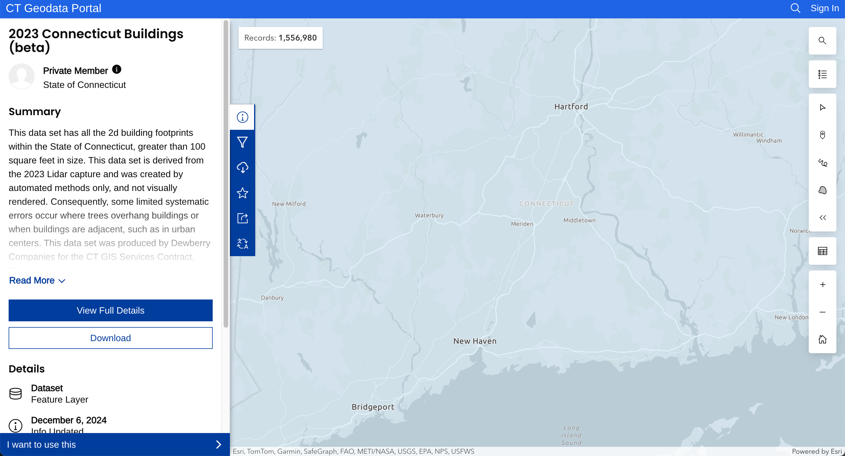
The Connecticut GIS Office has published beta versions of both their 2D and 3D building datasets. These are still under development and will continue to be refined.
2. Daily longwave radiation dataset

This new dataset offers daily surface longwave radiation (SLWR) at 1 km resolution, derived from MODIS and reanalysis data. It includes both upwelling and downwelling radiation and spans 2000–2023, validated across 369 ground stations worldwide. You can access the data here and the code here.
3. Monthly groundwater level dataset

This dataset provides monthly groundwater level data across China at 1 km resolution from 2005 to 2022, based on over 4.2 million observations from 11,911 wells. You can access the data here.
4. Pesticide application rates dataset

Based on 2018 data, this dataset presents 250m spatial resolution maps of pesticide application rates across the EU. You can access the data and code here.
Other useful bits

Esri is integrating Google’s Photorealistic 3D Tiles into ArcGIS, giving us instant, no-code access to lifelike 3D views across 2,500+ cities. This new basemap makes 3D the default for ArcGIS projects, improving realism and spatial context for better decision-making.
UP42 has teamed up with Maxar to bring high-res satellite imagery, including direct tasking of WorldView Legion satellites, to its platform. We can now access near real-time geospatial data and soon, archived 30–50 cm imagery too.
Jobs
ESA is looking for a Geospatial System Engineer based in Frascati.
Mapbox is looking for Software Development Engineers in several locations: Finland, Germany, and the UK.
UNICEF is looking for a remote Frontier Data Communication, Analysis and Engineering Support Consultant.
UNDP is looking for a remote Generative AI Research Intern.
Just for Fun
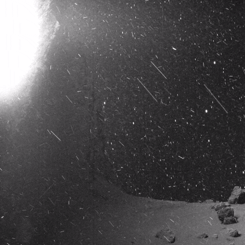
This is a video from Comet 67P. You can see dust and cosmic rays on the surface of the comet, with stars moving in the background. This was filmed by Rosetta's OSIRIS instrument.
That’s it for this week.
I’m always keen to hear from you, so please let me know if you have:
new geospatial datasets
newly published papers
geospatial job opportunities
and I’ll do my best to showcase them here.
Yohan