

🌐 Why weather forecasts are worse in poorer countries

Hey guys, here’s this week’s edition of the Spatial Edge, a place where every pixel gets its fair share of ground truth… Anyway, the aim as usual is to make you a better geospatial data scientist in less than five minutes a week.
In today’s newsletter:
Forecast Gaps: Poorer countries get far less accurate weather forecasts.
Roman Roads: Network science measures the Empire’s 299,000 km network.
Model Calibration: Geospatial foundation models turn overconfident under clouds.
WeatherNext 3: Google’s AI weather model now updates hourly.
Power Outages: Ten years of US outages matched to warnings.
Research you should know about
1. Why weather forecasts are worse in poorer countries
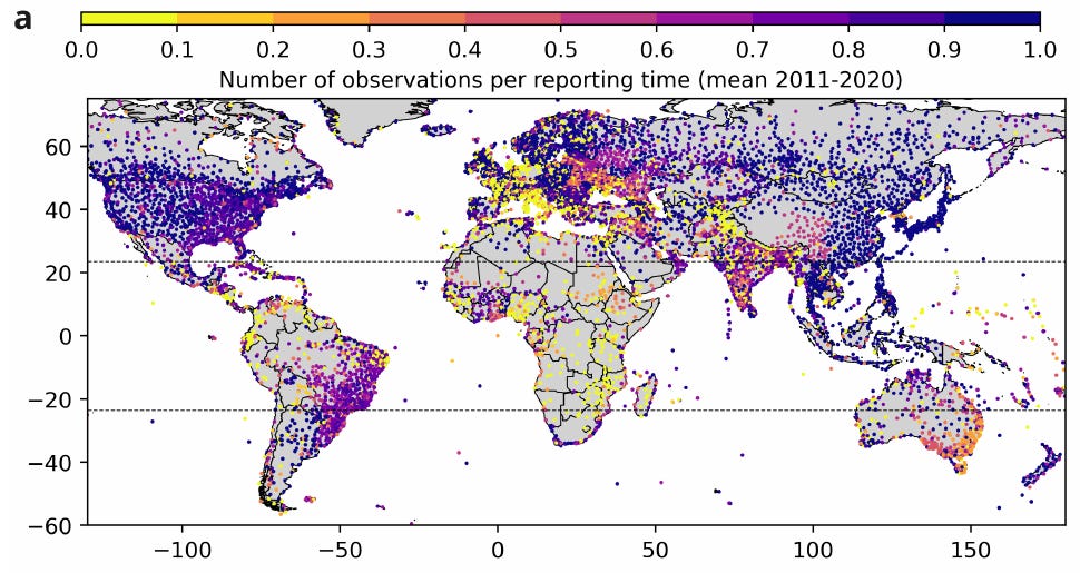
A new study in Nature Communications finds that weather forecasts are much less accurate in low-income countries, which is kinda a big deal given how much we lean on forecasts to adapt to climate change. Farmers use em to decide when to plant, governments use em to issue heat warnings and energy firms use em to plan supply. But a forecast is only as good as the observations feeding it, and those observations aren’t spread evenly around the world. Anyway, researchers from Columbia University set out to measure how big the gap actually is.
They compared global temperature forecasts against what was actually observed, country by country, going back to 1985. The main forecasts come from ECMWF, verified against weather station records for lead times of one to seven days. They grouped countries by tge World Bank’s income level and checked the pattern held using NOAA’s GFS forecasts and model analysis instead of stations. They also mapped the observing infrastructure itself, which included stuff like land-based weather stations, balloons, etc.
They found that a seven-day forecast in a high-income country is roughly as accurate as a one-day forecast in a low-income country. Accuracy has improved quite a bit since 1985, but the gap between richer and poorer countries hasn’t closed. Part of this is down to some regions simply being harder to forecast. The rest is infrastructure: lower-income countries have fewer stations and radiosondes, the ones they have report less often, and they appear to have less institutional capacity to issue official local forecasts. The upshot is that investing in basic monitoring could narrow the gap.
2. Measuring the Roman Empire’s road network
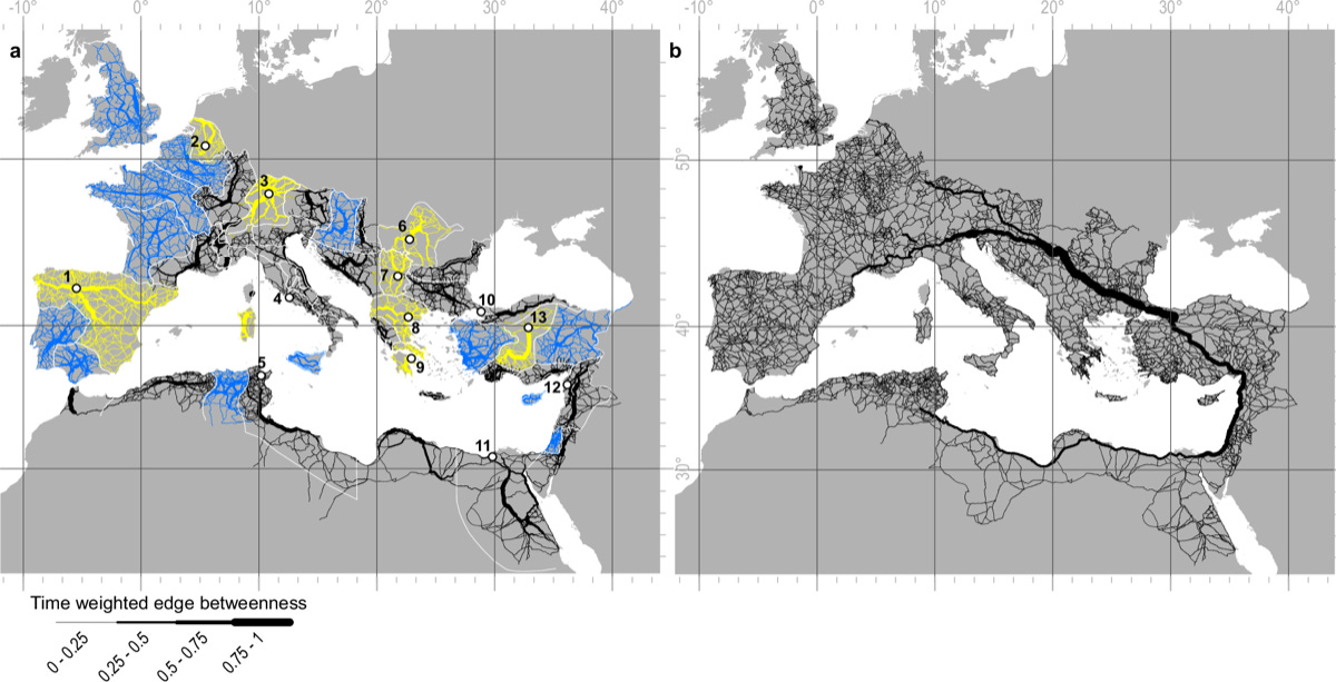
The Roman road network is the classic example of ancient infrastructure shaping where we live today, but its structure had never been measured across the whole Empire. At its height in 117 CE, the Empire covered almost 5.5 million km² across Europe, the Middle East and North Africa. Most of what we “know” about its roads (that they were straight, that all roads led to Rome and that modern roads follow them) comes from qualitative or regional studies.
A team led by Aarhus University used a detailed digital model of 299,171 km of Roman roads to test these assumptions with terrain analysis and network science. They split the roads into 1 km segments and calculated:
slope, topographic position and sinuosity (my favourite word)
road density, and how it correlates with modern roads, ancient sites and today’s population
travel-time-weighted betweenness centrality using Tobler’s hiking function, (which basically captures how many of the quickest overland routes pass through each segment).
Roman roads are straight where the terrain allows, but still less straight than modern roads, and Rome itself wasn’t the best-connected hub despite pretty much everything you’ve heard about all roads leading there. About 91% of roads stay below a 16% gradient (the upper end of estimates for wheeled traffic) and the median slope is 3.88%. Modern major roads have a median sinuosity of 1.0026, against 1.0035 for Roman main roads and 1.0051 for secondary ones. Roman road density correlates with modern major roads, and 24 of 45 provincial capitals sit in the top two deciles for betweenness. For overland travel, Antioch, Ancyra, Byzantium and Corinth were all better placed than Rome, whose central position came from sea and river routes.
3. Geospatial foundation models get overconfident when imagery is messy
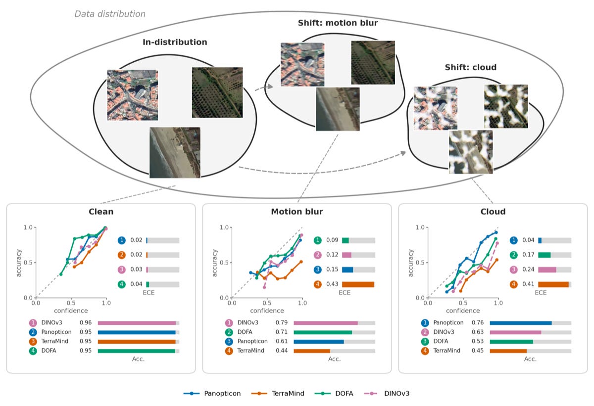
Geospatial foundation models are usually judged on accuracy alone, but a new study from TUM, DLR, MIT and Taylor Geospatial argues we also need to know whether their confidence can be trusted. This is called calibration: when a model says it’s 90% sure, it should be right about 90% of the time. Real imagery is messy (clouds, sensor noise, blur) and a model that’s confidently wrong is a real problem in operational settings.
They tested 16 frozen encoders on 4 classification and 5 segmentation datasets while deliberately degrading the imagery. The line-up included EO-pretrained models like Clay, Prithvi, DOFA, TerraMind and OLMo-Earth alongside general-purpose ones like ResNet, Swin and DINOv3. They then (1) added clouds and shadows, sensor noise and motion blur at five severity levels, (2) cut the training data from 75% down to 1%, and (3) tried three fixes: temperature scaling, deep ensembles and Gaussian-process probes.
On clean data the two groups are indistinguishable, but under distribution shift the EO-pretrained models drift further into overconfidence. At the heaviest cloud level, expected calibration error ranged from 0.32 to 0.82 across encoders. Among high-drift predictions, EO models were confidently wrong about 2.4 times as often (0.14 vs 0.06). Rankings reshuffled too: the rank correlation between clean and cloudy calibration was just τ = 0.07. Temperature scaling didn’t help, and Gaussian-process probes roughly halved the error under heavy cloud but tripled it on clean data. The practical takeaway is to test models across several conditions and metrics before trusting a leaderboard.
4. Using satellite embeddings to map neighbourhood liveability
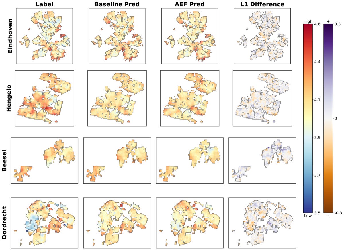
A new study from the University of Illinois Urbana-Champaign tests whether satellite foundation model embeddings can improve maps of how liveable neighbourhoods are. Socioeconomic indicators are hard to measure in places with little survey data, while satellite imagery is available almost everywhere. Embeddings like Google’s AlphaEarth compress that imagery into ready-made features, but it’s not obvious how much they add on top of the usual inputs.
The team added AlphaEarth, AnySat and TerraMind embeddings to a multimodal transformer that predicts the Netherlands’ Leefbaarometer liveability scores on a 100 m grid. The baseline model already used 2 m imagery, a surface model, night-time lights and points of interest (POIs). It predicts overall liveability plus five dimensions: physical environment, housing, amenities, social cohesion, and nuisance and insecurity. They trained on nine Dutch cities and tested on four others: Eindhoven, Hengelo, Dordrecht and the rural municipality of Beesel.
AlphaEarth gave the most consistent gains, cutting overall liveability error (RMSE) from 0.106 to 0.098, with amenities improving the most. The embeddings helped most where data was patchy. When the aerial imagery was removed at test time, the model with all three embeddings had an error of 0.108 against 0.156 for the baseline. There’s a catch though: in rural Beesel a single embedding made things slightly worse (0.082 vs 0.078), and only combining all three recovered performance (0.073). The code is on GitHub.
5. Shrinking a cropland model 158 times for edge devices
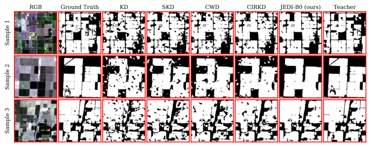
Big vision models are great at mapping cropland from satellite imagery, but they’re far too heavy to run on satellites or devices in the field. Distillation (training a small “student” model to mimic a big “teacher”) is the usual fix. However, most methods assume the two models have similar architectures and stop aligning their features once task training begins.
Researchers at UC Riverside built JEDI, a two-stage method that distils a 639M-parameter I-JEPA vision transformer into a compact SegFormer. First, they project and spatially align the student’s final features to the teacher’s token space, even though the architectures differ. Then they train the student on segmentation while it continues to (1) match the teacher’s softened predictions and (2) keep its features aligned with the teacher’s. They tested it on CalCROP21, a Sentinel-2 cropland dataset from California’s Central Valley.
The smallest student, with just 4.04M parameters, reaches 68.0 mIoU, only 2 points behind the teacher while being 158 times smaller. That’s a 16-point jump over the same student trained without distillation (52.0). It also runs in 7.1 ms per image against 83.5 ms for the teacher. The code is on GitHub.
Geospatial Datasets
1. Ten years of US power outages matched to weather warnings
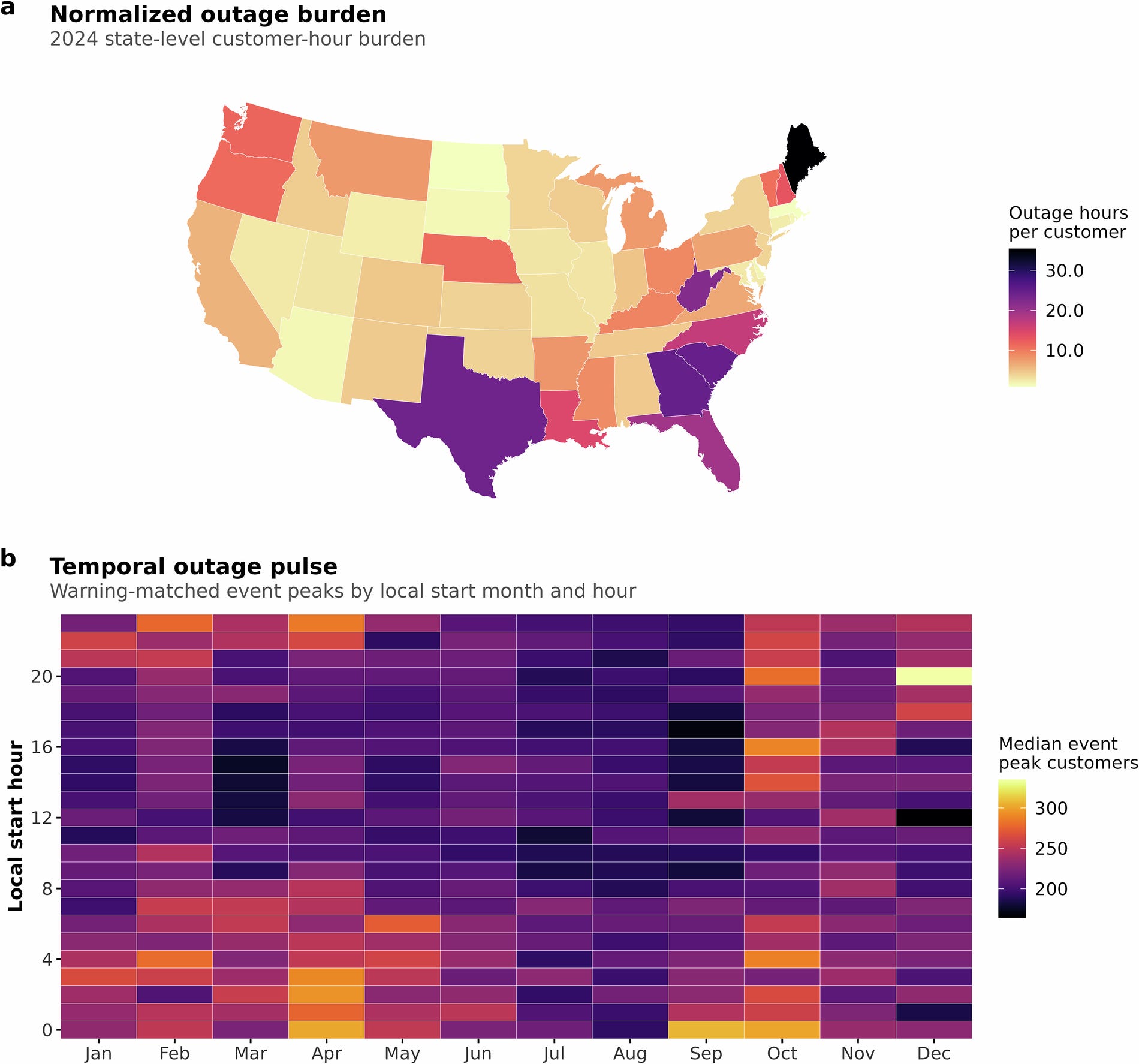
This harmonised outage and warnings dataset links county-level customer power outage records from the US Department of Energy’s EAGLE-I platform with National Weather Service watches, warnings and advisories for the contiguous United States from 2015 to 2024, indexed hourly. It also includes a consolidated warning archive and daily summaries of missing outage records. You can access the data here.
2. Daily travel between Chinese cities, 2020 to 2025
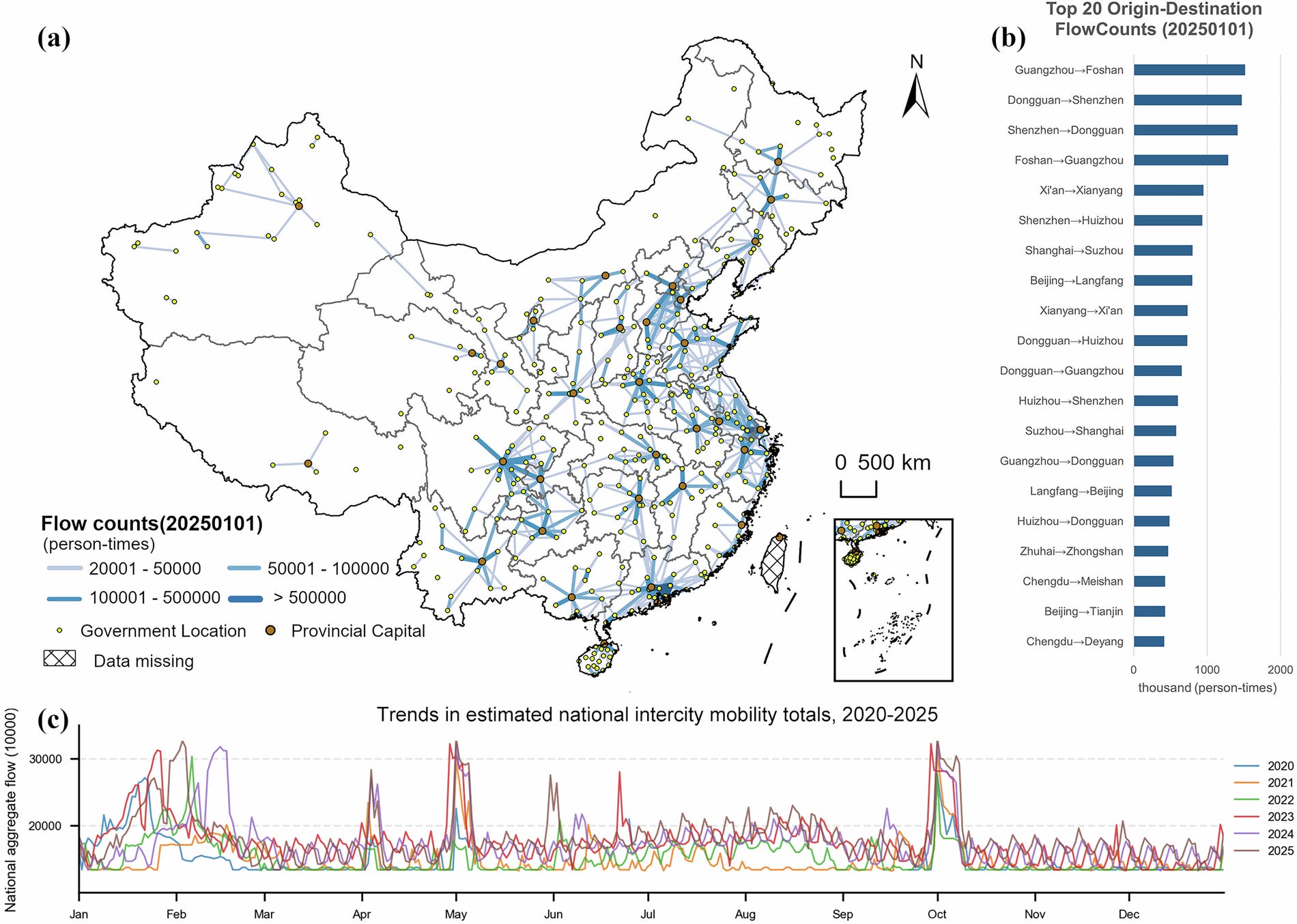
DIMNet-CPC estimates directed daily trip volumes between 366 Chinese administrative units from 2020 to 2025 by calibrating the Baidu Migration Index against Ministry of Transport totals. Validation errors (WAPE) range from 4.74% at the national level to 26.52% for individual origin–destination pairs. You can find the paper here.
3. Disaster impacts in the Global South from Red Cross reports
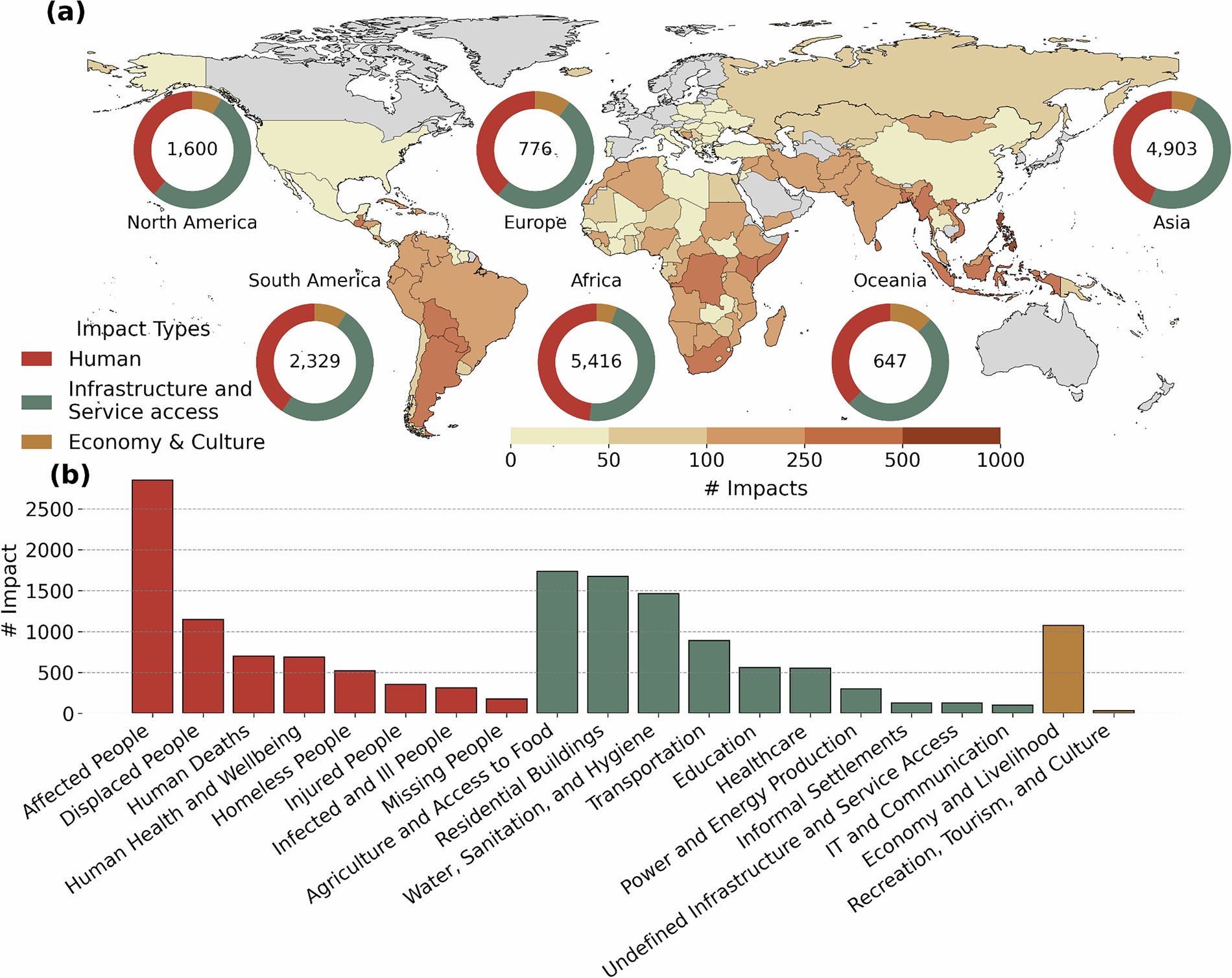
ROUGE is a database of non-monetary disaster impacts extracted with large language models from IFRC operational reports, with detail down to subnational level. The EGU version covered 11,370 impacts from 717 reports spanning 2016–2025 across 20 impact types. You can access the code here.
4. Hourly energy demand for 1.69 million Belgian buildings
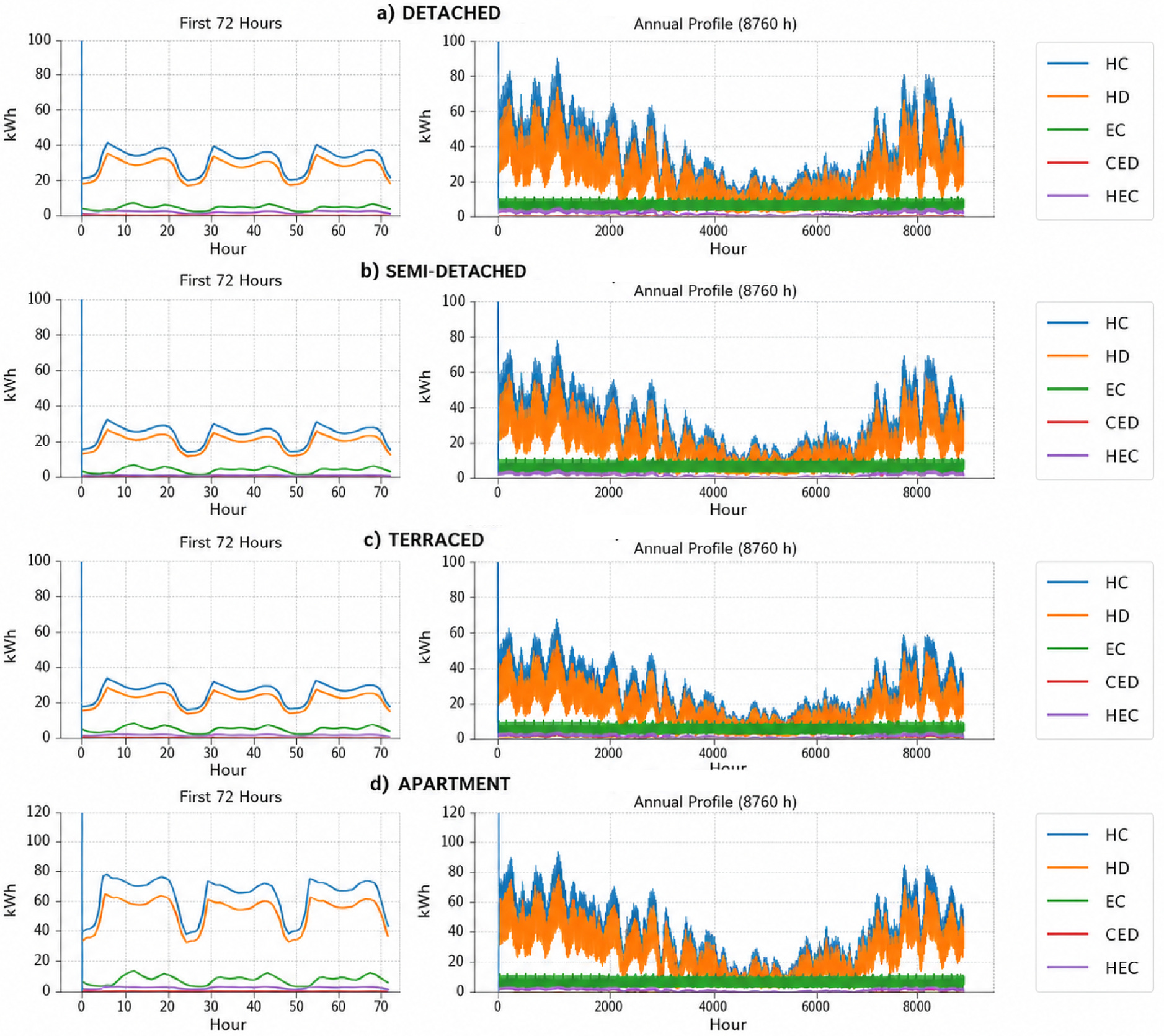
This urban energy atlas estimates 8,760-hour heat and electricity profiles for about 1.69 million buildings in Wallonia, Belgium, aggregated to 262 municipalities, 20 arrondissements and 5 provinces, and served through an interactive Dash web app. You can find the paper here.
5. Weather grids paired with forecasters’ reasoning
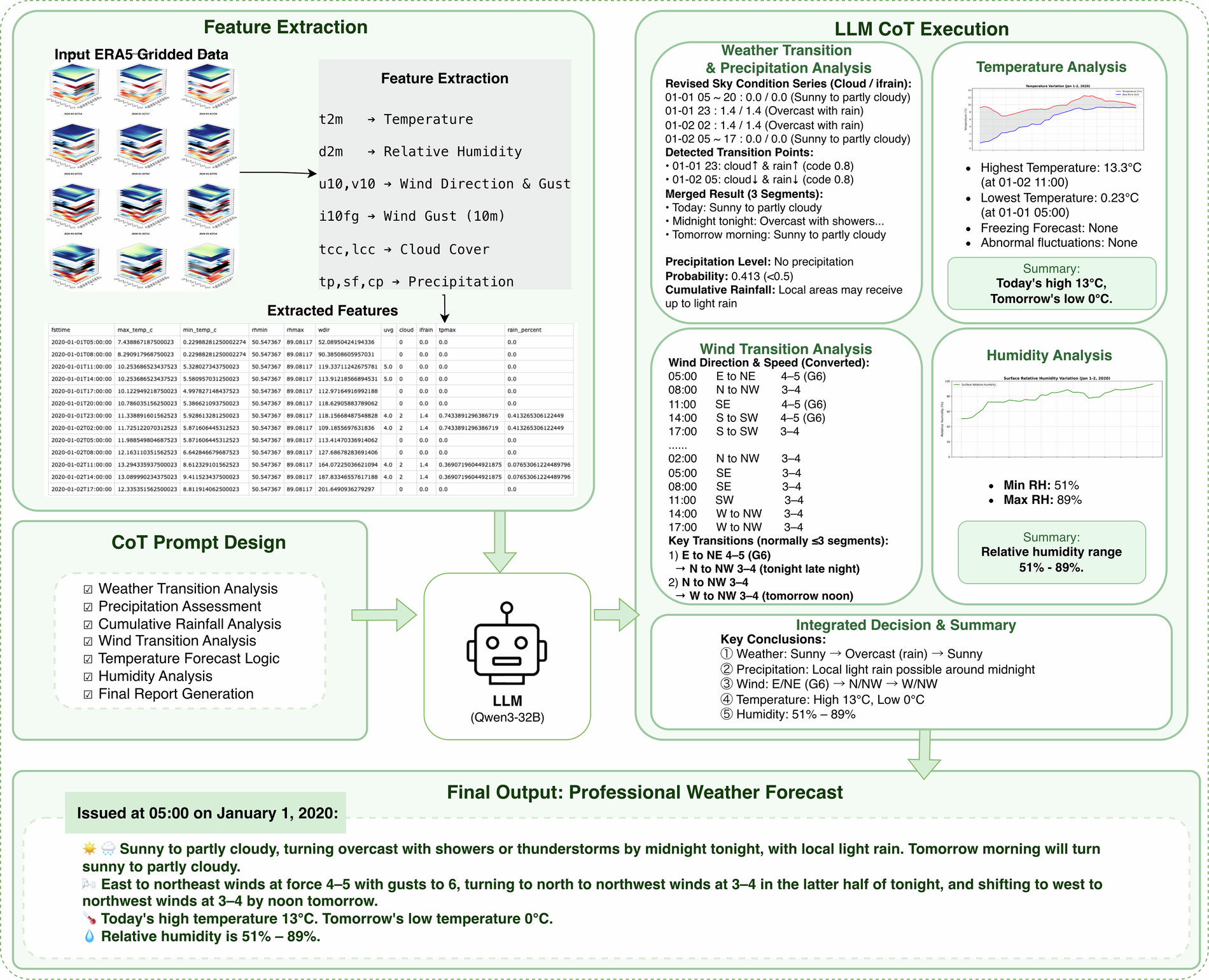
Grid2Text pairs ERA5 meteorological grid data with expert-verified forecast text, including reasoning chains for temperature trends, wind shifts, humidity ranges and precipitation types. It was built by Fudan University and the Shanghai Central Meteorological Observatory for training and benchmarking language models that write forecast discussions. You can find the paper here.
Other useful bits
Google DeepMind has launched WeatherNext 3, an AI weather model that learns directly from live geostationary satellite data and produces a new forecast every hour. Surface variables like temperature come at 5 km resolution (down from 25 km in WeatherNext 2), and Google reports medium-range precipitation gains of up to 60% when checked against NASA’s IMERG. It’s available in Earth Engine, BigQuery and the Maps Platform Weather API.
Image: Google.

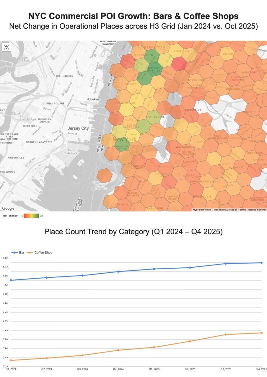
Google’s Places Insights historical data is now generally available in BigQuery, with monthly snapshots of place counts going back to January 2024 across 480+ place types. A new PLACES_COUNT_CHANGE function compares two months in a single query, which is handy for tracking openings, closures and turnover.
Image: Google Maps Platform.
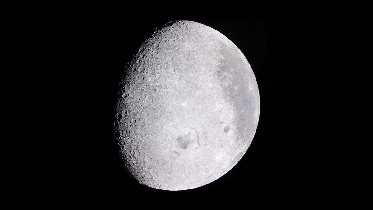
IBM and NASA have released an open-source lunar foundation model on Hugging Face, trained on over 30 aligned data layers from nine instruments, including NASA’s Lunar Reconnaissance Orbiter and GRAIL missions plus Japan’s Kaguya. It beats an ImageNet-trained baseline by up to 22% at finding likely ice deposits and 19% at crater detection.
Image: IBM.
Satellogic has made SynMax the exclusive maritime intelligence channel for its upcoming Merlin constellation, which will remap the planet daily at 1 m-class resolution and co-collect AIS ship-tracking data. The first launch is planned for October 2026, and SynMax’s Theia platform will use the data to track dark vessels and illegal fishing.
Google Research has released TimesFM-3, a 330M-parameter time-series foundation model pre-trained on over a trillion time points that now handles multivariate forecasting and covariates. The weights are on GitHub and Hugging Face.
Jobs
EUMETSAT is looking for a Machine Learning Application Developer based in Darmstadt, Germany.
UNITAR is looking for a Geospatial Analyst – Satellite Imagery and GIS based remotely.
Laterite is looking for a Developer based in Amsterdam, Netherlands.
Environmental Investigation Agency is looking for a Climate Data Analyst based in Washington, DC, United States.
Just for Fun
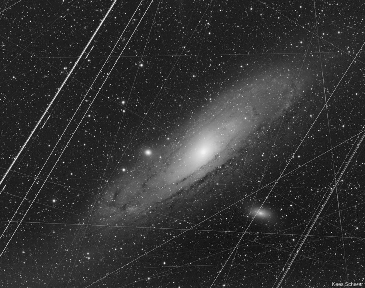
This is the Andromeda Galaxy before any clean-up: a stack of 223 five-minute exposures taken from a garden observatory in Portugal in 2019. The streaks and specks are airplane trails, satellite trails, cosmic rays and bad pixels. Anyone who’s cloud-masked a Sentinel-2 scene will relate, since the polished versions come from reducing these Earthly artefacts with software like DeepSkyStacker and PixInsight.
That’s it for this week.
I’m always keen to hear from you, so please let me know if you have:
new geospatial datasets
newly published papers
geospatial job opportunities
and I’ll do my best to showcase them here.
Yohan