

🌐 A new high-resolution lens on US migration
PLUS: New 3D maps of cities, solar forecasting and more.

Hey guys, here’s this week’s edition of the Spatial Edge — a safe space for the geospatially curious. The aim is to make you a better geospatial data scientist in less than five minutes a week.
In today’s newsletter:
US Migration: New granular data reveals neighborhood-level movement trends.
3D Cities: Deep learning creates urban models from radar.
Solar Forecasting: Explainable AI improves renewable energy yield predictions.
Agricultural AI: Google’s AlphaEarth model tested against traditional metrics.
Renewable Scenarios: New dataset closes gaps in distributed energy studies.
Research you should know about
1. A new high-resolution lens on US migration

US migration data has essentially been stuck in a ‘pick one’ scenario: reliable but clunky Census data that only goes down to the county level, or high-resolution proprietary data that is full of biases. To fix this, researchers have developed MIGRATE, a new dataset that fuses commercial address histories from Infutor with the reliability of Census constraints. By harmonising these sources, they created annual migration matrices between 47.4 billion pairs of Census Block Groups. That’s roughly 4,600 times more granular than the standard county-to-county data we’re used to seeing, effectively letting us zoom in from a satellite view right down to the neighbourhood level.
The team spent a lot of time cleaning up the messy commercial data, which tended to overcount wealthy and rural populations while missing others. Once corrected, the national trends revealed a stark picture of ‘homophily’, where people overwhelmingly move to areas demographically similar to where they left. The data shows that movers from plurality Black, Asian and Hispanic neighbourhoods are 5.5, 14.6 and 4.3 times more likely, respectively, to move to areas with the same plurality race group. Upward mobility is also uneven; while people generally aim for higher-income neighbourhoods, there is a clear racial gap. Even when starting from the same income level, movers from plurality Asian areas are more likely to upgrade to a wealthier block, whereas movers from plurality Black areas are less likely to do so.
This granular view proves its worth when looking at localised shocks like the California wildfires. Public county-level data completely missed the migration impact of the 2017 Tubbs and 2018 Camp fires because the displacement happened within county lines or was washed out by broader averages. In contrast, MIGRATE picked up a massive signal, showing that out-migration rates in the distinct burn zones spiked to over 37% and 46% respectively in the year following the fires. It turns out that a huge chunk of these displaced people didn’t leave the county, but just moved to a safer block nearby, a dynamic that remains invisible unless you have this kind of street-level resolution.
MIGRATE is available upon request here. You can also find the code here.
2. Building 3D cities from messy radar data
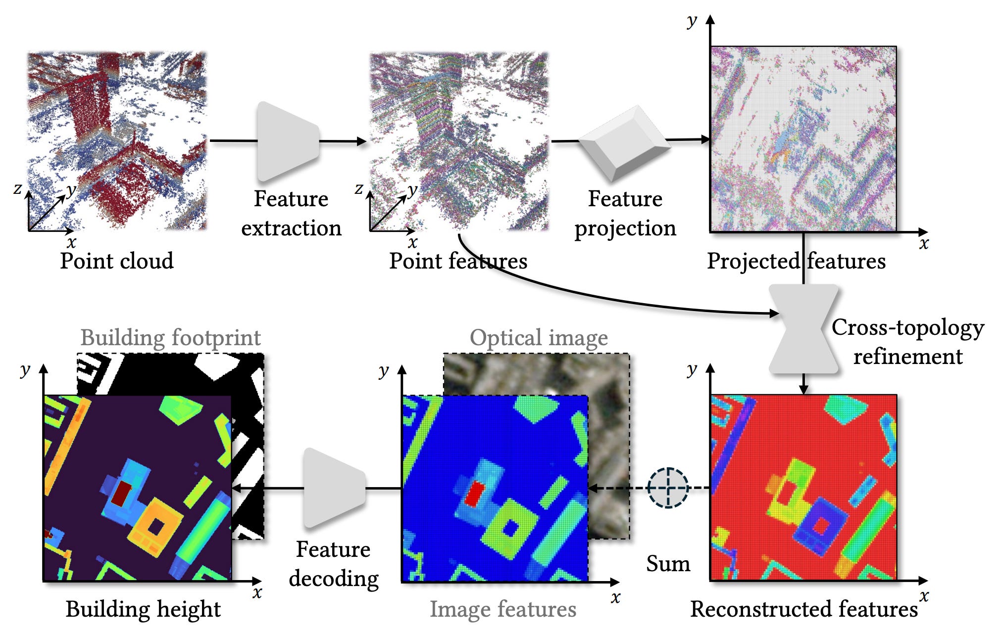
Getting accurate 3D models of cities is usually a bit of a headache involving expensive LiDAR flights or waiting for cloud-free satellite imagery. Synthetic Aperture Radar (SAR) offers an interesting alternative since it works day and night in any weather, and a technique called TomoSAR can even reconstruct 3D point clouds from space. The problem is that these point clouds are often pretty messy. They suffer from noise and gaps that make it tough to extract clean building heights. To fix this, researchers from the Technical University of Munich have developed a new deep learning framework that turns these raw, rough radar points into high-res height maps.
The main part of their approach is a ‘dual-topology’ network that toggles between two different ways of looking at the data. One branch processes the irregular 3D points to capture structural details, while a second branch projects everything onto a 2D grid to enforce spatial consistency. By constantly exchanging information between these two views, the model effectively learns to denoise the data and fill in the missing blanks where the radar signal didn’t bounce back. This allows it to generate continuous height estimates even from sparse inputs, without needing an external terrain model to tell it where the ground is.
The team tested this on TerraSAR-X data over Berlin and Munich, representing both high-quality and lower-quality datasets. The results showed a massive improvement over standard interpolation methods, successfully reconstructing building shapes that were previously lost in the noise. They also demonstrated that the framework is flexible enough to ingest standard optical satellite imagery alongside the radar data, which further sharpens the results. This is a pretty big step forward as it serves as a proof of concept for generating large-scale, weather-independent urban height maps directly from space.
You can access the code here.
3. Solar energy forecasting gets a transparent upgrade

Solar energy is great, but it can be a bit fickle. For example, clouds and local climate shifts can sometimes make it hard to integrate into the grid reliably. Instead of installing expensive sensors everywhere, researchers are turning to machine learning to predict solar irradiance based on weather data. A new study from Scientific Reports compared six different regression models to see which could best handle the job using data on temperature, humidity, wind and pressure.
The clear winner in their tests was the Random Forest Regressor, which edged out competitors like Gradient Boosting and Linear Regression with a regression score of roughly 0.90. But the researchers didn’t just want a number; they wanted to know why the model worked. To peek inside the ‘black box’ of the AI, they employed Explainable AI (XAI) techniques known as LIME and SHAP. These tools help interpret complex algorithms, breaking down exactly how much weight the model assigns to different variables when making a prediction.
The XAI analysis revealed that temperature is the biggest factor, showing the strongest positive correlation with solar radiation. In contrast, humidity and wind speed tended to have a negative impact. This insight is valuable because it allows engineers to forecast potential energy yields for new solar farm locations using readily available geospatial data, rather than deploying costly hardware first. By making these AI decisions transparent, grid operators can trust the forecasts more, leading to better stability and smarter investment decisions in renewable infrastructure.
You can access the data here.
4. Google’s giant AI model meets the farm
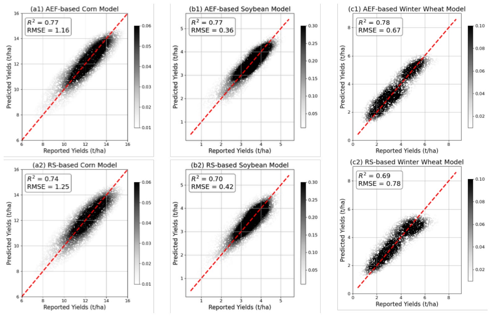
As I’ve previously covered on here, last year Google DeepMind released AlphaEarth Foundation (AEF), a massive model pre-trained on billions of images that harmonises optical, radar and climate data into ready-to-use ‘embeddings’. A new paper puts AEF to the test on specific agricultural tasks in the US, such as predicting crop yields and mapping tillage practices, to see if these pre-cooked features can actually beat traditional, hands-on remote sensing methods.
The results were pretty encouraging at a local level. When trained and tested in the same region, models built on AEF embeddings performed just as well as those built on carefully engineered remote sensing features. For tasks like estimating corn and soybean yields, the AI approach was competitive and offered a huge convenience advantage. Since AEF automatically handles data harmonization and fills in gaps caused by clouds, researchers didn’t have to spend weeks cleaning data to get a usable input.
However, the study uncovered some serious limitations when the models were pushed further. AEF struggled quite a bit with ‘spatial transferability’, which means a model trained in the eastern Corn Belt failed completely when tested in the west. Traditional satellite metrics handled this shift much better because they are based on consistent physical properties of plants. Additionally, AEF is a ‘black box’, so users have no idea what a feature like ‘A05’ actually represents physically, unlike an index like NDVI which directly measures vegetation vigour. This lack of interpretability suggests that while foundation models are powerful, we can’t quite ditch our physics-based indices just yet.
Geospatial Datasets
1. Distributed renewable energy scenarios dataset

The DDRE-33 dataset addresses the scarcity of public data for distributed renewable energy (DRE) studies within the standard IEEE-33 distribution network. This provide spatiotemporally correlated scenarios for both distributed wind and photovoltaic generation without the data gaps found in earlier collections. You can access the data here and the code here.
2. Riverine levee overtopping events dataset

The Levee Loading and Incident Dataset - Overtopping (LLID-OT) version 1.0 provides data on 487 riverine levee overtopping events across the US from the past 15 years. You can access the data here.
3. Electric distribution networks dataset

This harmonized geospatial dataset provides data on electric distribution networks across the US Northeast, covering seven states from Connecticut to Vermont. It features over 3.8 million line segments. You can access the data here and the code here.
4. LiDAR benchmark for railway corridors

SemanticRail3D and its enhanced V2 iteration provide a comprehensive mobile LiDAR benchmark designed specifically for railway infrastructure monitoring. It features 2 semantic classes, including rails, catenary systems, and masts and is comprised of approximately 2.8 billion points across 438 high-resolution segments. You can access SemanticRail3D here andSemanticRail3D-V2 here. You can access the code here.
Other useful bits
Google DeepMind is powering a new agricultural layer in Google Earth that uses machine learning to map individual field boundaries across the Asia-Pacific region. This essentially allows users to pinpoint water resources and calculate acreage with precision, offering vital data for drought contingency planning.
Researchers have introduced Embedded Seamless Data (ESD), an ultra-lightweight database that compresses twenty-five years of global 30-metre imagery into a surprisingly manageable size. With a massive 340x compression ratio, it allows the entire global land surface for a single year to fit on a standard workstation, democratising planetary-scale analysis. Check out the demo and the manuscript.
Google has launched a handy new endpoint for its Weather API, giving developers a single, reliable source for global weather alerts. By unifying data from government agencies worldwide, it takes the hassle out of aggregating warnings and automatically surfaces local alerts based on simple coordinates.
Jobs
FAO - Food and Agriculture Organization of the United Nations is looking for a Junior Agricultural Specialist based in Rome, Italy
UNEP - United Nations Environment Programme is looking for a Information Management Assistant based in Nairobi, Kenya
Zipline is looking for a Senior Analyst based in South San Francisco, USA
FAO - Food and Agriculture Organization of the United Nations is looking for a remote Data Analyst
OICT - Office of Information and Communications Technology is looking for a Chief of Service, Information Systems and Telecommunications based in New York, USA
Just for Fun

Those spectacular auroras seen in mid-January might have been a treat for stargazers, but they served as a stark warning for the upcoming Artemis II mission. With the launch just weeks away, the European Space Agency is using data from these severe solar storms to ensure the crew’s journey to the Moon remains safe from dangerous radiation.
That’s it for this week.
I’m always keen to hear from you, so please let me know if you have:
new geospatial datasets
newly published papers
geospatial job opportunities
and I’ll do my best to showcase them here.
Yohan