

🌐 Stanford's foundation model for predicting poverty
PLUS: sharpening the world of thermal imaging, mapping out the best data for satellite AI, and more.

Hey guys, here’s this week’s edition of the Spatial Edge — a safe space for the cartographically curious. As usual, the aim is to make you a better geospatial data scientist in less than five minutes a week.
In today’s newsletter:
Poverty Mapping: Tempov updates wealth maps using satellites.
Thermal Imaging: Dual AI models sharpen infrared imagery.
Satellite Training: Pixel diversity improves foundation model performance.
Weather Extremes: AI forecasts struggle beyond past records.
Nightlights: NASA reveals shifting global illumination patterns.
Research you should know about
1. Stanford’s foundation model for predicting poverty

Traditional methods for measuring poverty in developing nations rely on household surveys and census data. These methods can be expensive, slow, and infrequent, which leaves policymakers working with outdated information when deciding where to allocate resources or build infrastructure. Over the last decade, researchers have started using daytime satellite imagery to try to measure economic activity, looking for visual proxies like new roads or agricultural expansion. While this works well for a static snapshot of an area, these models often struggle to track changes in wealth over time, confusing seasonal changes like fields turning brown in the winter for actual economic decline.
To fix this, a team of researchers built Tempov, a new geospatial foundation model specifically designed to track long-term economic changes (more info on foundation models here). The model was trained on a massive dataset of three million satellite images spanning two decades. Interestingly, the researchers intentionally fed the model ‘bi-temporal’ pairs, i.e. pictures of the exact same location taken during different seasons of the same year. This forced the model to ignore transient, seasonal changes like snow or dead crops and focus entirely on permanent, human-made changes like new buildings or roads.
Tempov proved to be pretty effective. The researchers demonstrated that if Tempov was given a decade-old census from a country, it could accurately predict the modern wealth distribution using only 5% of modern survey data. In resource-strapped nations, this means governments can achieve highly accurate poverty mapping at a fraction of the cost of a full census. To prove its scalability, the team deployed Tempov to map the entire continent of Africa, producing a high-resolution, 6km-by-6km grid showing the exact changes in wealth from 2015 to 2025. This open-source tool could dramatically change how we monitor and combat global poverty.
2. Sharpening the world of thermal imaging
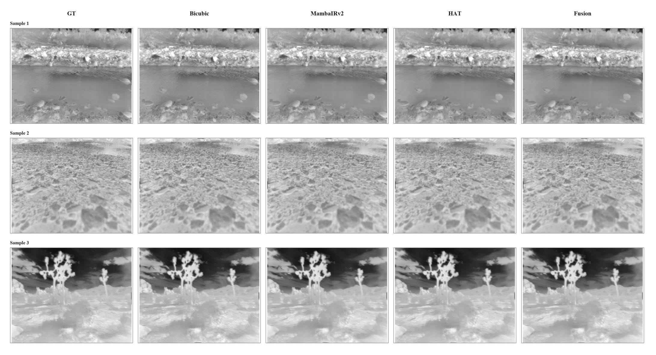
Enhancing the resolution of remote sensing imagery can be pretty important for applications like autonomous driving and environmental monitoring. But Super-resolution for infrared or thermal images brings a specialised set of challenges. Unlike standard visible light photographs, thermal images lack rich textures and rely heavily on clear object outlines and stable regional temperatures. If a super-resolution system sharpens the image too aggressively, it can create fake hot spots or unstable temperature readings that ruin the utility of the data.
To tackle this, a team of researchers developed a dual-branch framework for the NTIRE 2026 Infrared Image Super-Resolution Challenge. Instead of forcing one neural network to do everything, they combined two different architectures to capture the best of both worlds. The first branch uses a transformer model called HAT-L to focus on sharpening local edges and fine contours. The second branch employs a state-space model named MambaIRv2-L to handle the big picture, ensuring long-range temperature consistency across the entire scene. The system processes the low-resolution images through both branches independently, applies specific test-time enhancements to each, and simply averages the two outputs together to create the final image.
This collaborative approach proved pretty successful in generating clear and accurate thermal imagery. By blending the aggressive edge recovery of the transformer with the global stability of the state-space model, the fused output comfortably beat either model working on its own. The researchers evaluated their system using the official NTIRE 2026 development and hidden test sets, alongside a custom evaluation batch derived from the Caltech Aerial RGB-Thermal dataset.
3. Mapping out the best data for satellite AI
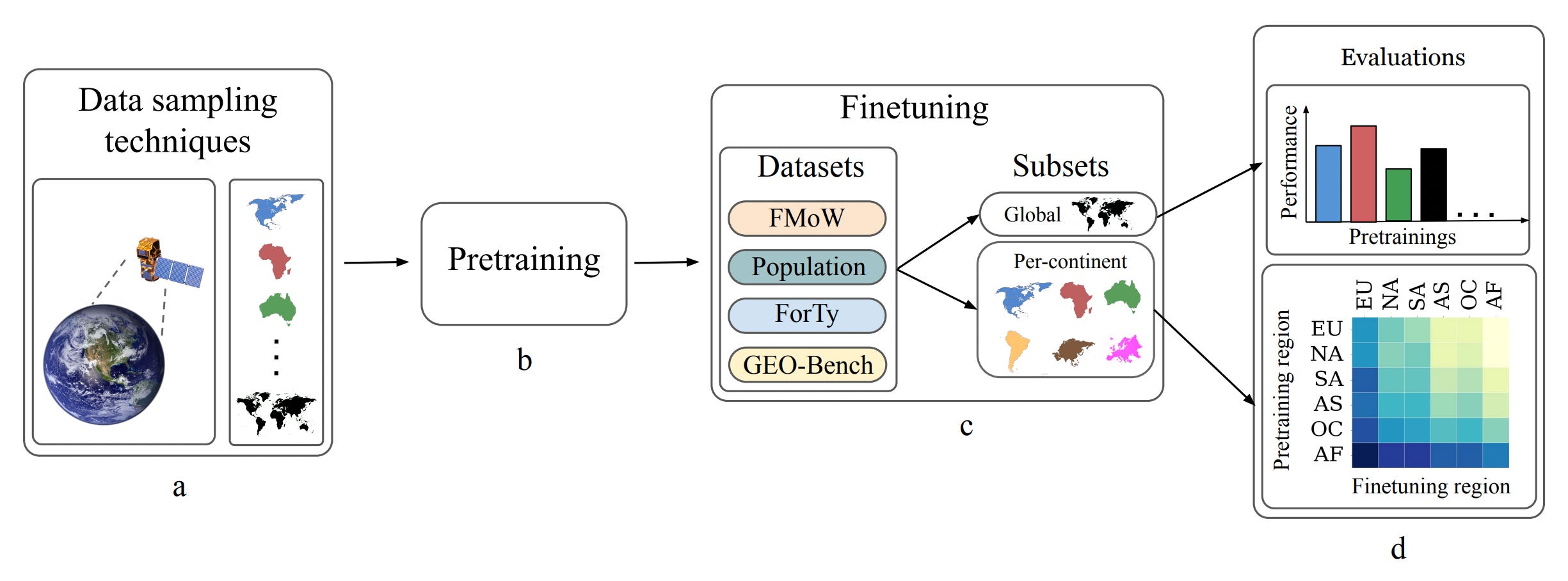
As I mentioned above, in recent years, developers have built massive ‘foundation models’ designed to analyse satellite imagery for tasks like mapping populations, tracking floods, or estimating crop yields. To train these models, researchers use huge datasets of unlabelled satellite images, a process known as pretraining. However, there are no real standards for how this data is collected. Some models are trained exclusively on images of European cities, some are trained on a perfectly even grid of the entire Earth, and others focus heavily on specific biomes like deserts or forests. Until now, no one had rigorously tested how these different geographic sampling strategies actually affect the AI’s final performance.
To solve this, researchers built seven distinct pretraining datasets (six covering individual continents and one global mix) and used them to train identical foundation models. They then tested these models on a variety of global and local mapping tasks. The results were highly surprising. The model trained exclusively on images of Europe consistently outperformed all the others, including the globally trained model, across almost every single task. Even when the AI was asked to map farms in Africa or populations in South America, the Europe-trained model proved to be the most accurate.
To figure out why the European dataset performed so well, the researchers measured the ‘diversity’ of all the datasets across different metrics. They discovered that simply having a wide variety of continents, biomes, or landcover types in the training data didn’t actually boost performance. What mattered most was ‘spectral diversity’, which measures the sheer complexity and variety of colour and light values within each individual image. Because the European images happened to have the highest spectral complexity, they provided the best training ground for the AI, proving that when it comes to training satellite models, the richness of the pixels matters far more than the geographic coordinates they came from.
4. AI vs Physics: Forecasting extreme weather
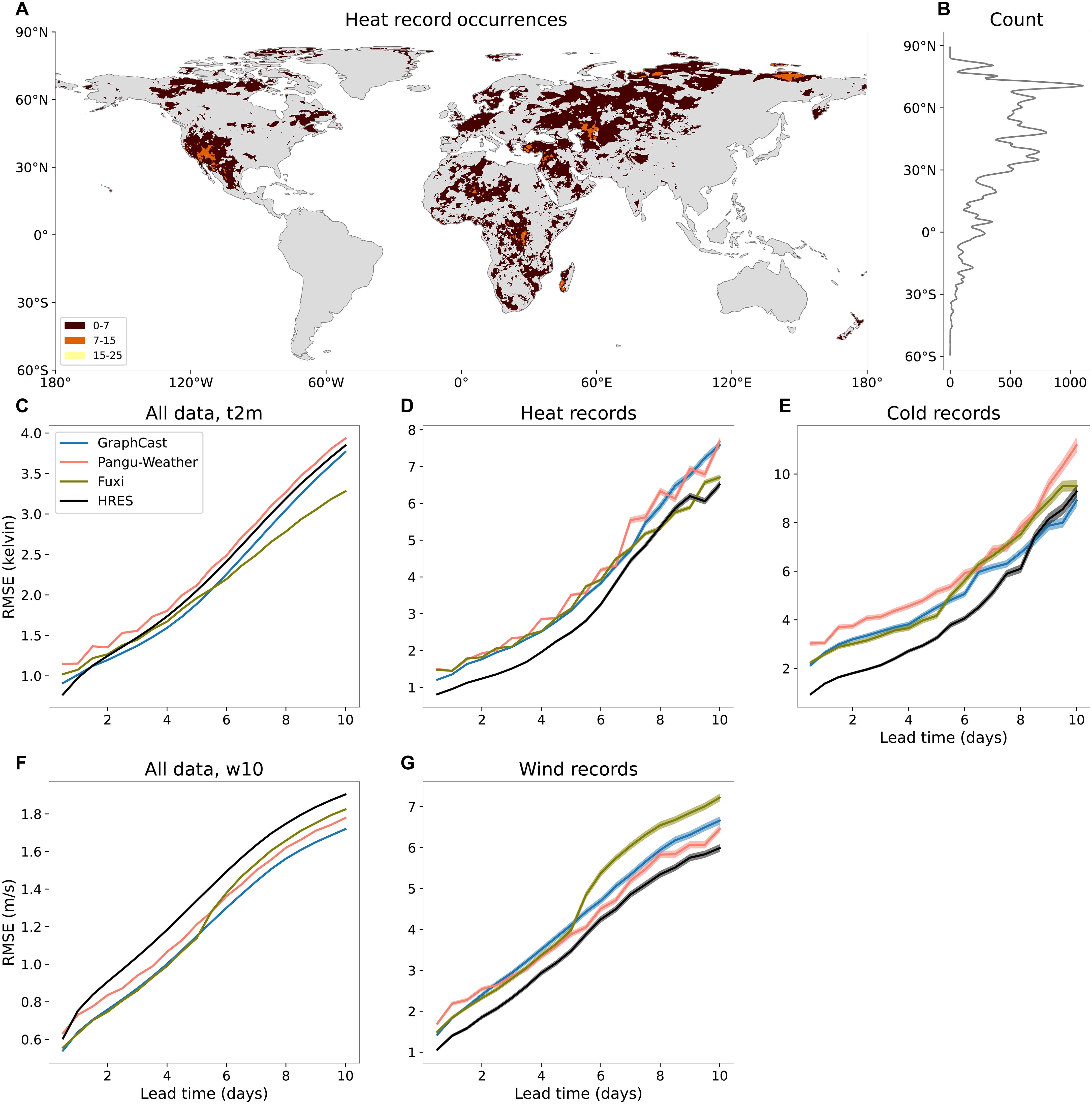
Geospatial models have begun to target weather forecasting, often outperforming leading physics-based numerical models on standard benchmarks. Models like GraphCast and Pangu-Weather are faster, more energy-efficient, and generally provide more accurate daily forecasts. However, scientists have questioned whether these data-driven models can reliably predict unprecedented, record-breaking weather events. Unlike physics-based models that calculate the actual laws of thermodynamics and fluid dynamics, AI models rely entirely on finding patterns in historical training data. A new study from Science Advances put this to the test by evaluating how well leading AI models could predict record-breaking heatwaves, cold snaps, and windstorms compared to the gold-standard physics-based model, the European Centre for Medium-Range Weather Forecasts’ HRES.
The researchers built a massive dataset of record-breaking weather events from the years 2018 and 2020. These events were specifically chosen because they exceeded any measurement recorded in the AI models’ training data (which covered 1979-2017). When tested on these unprecedented extremes, the AI models consistently failed, significantly underperforming the physics-based HRES model. The AI models not only failed to predict the frequency of these record-breaking events, missing many of them entirely, but they also severely underestimated their intensity.
Importantly, the researchers found that the larger the extreme event was compared to historical records, the worse the AI’s prediction became. It was as if the AI models hit a soft “ceiling” based on their training data and simply could not imagine an event being any worse.
These findings highlight a dangerous “extrapolation” problem in current AI weather models. Because they are not grounded in the actual laws of physics, they struggle to predict events that fall outside of their historical training data. While AI offers incredible speed and general accuracy, this study proves that we cannot solely rely on them for early warning systems or disaster management, particularly in a rapidly warming climate where unprecedented extremes are becoming the new normal. For now, physics-based models remain essential for keeping communities safe from the worst that nature can throw at them.
Geospatial Datasets
1. European agricultural land use systems map
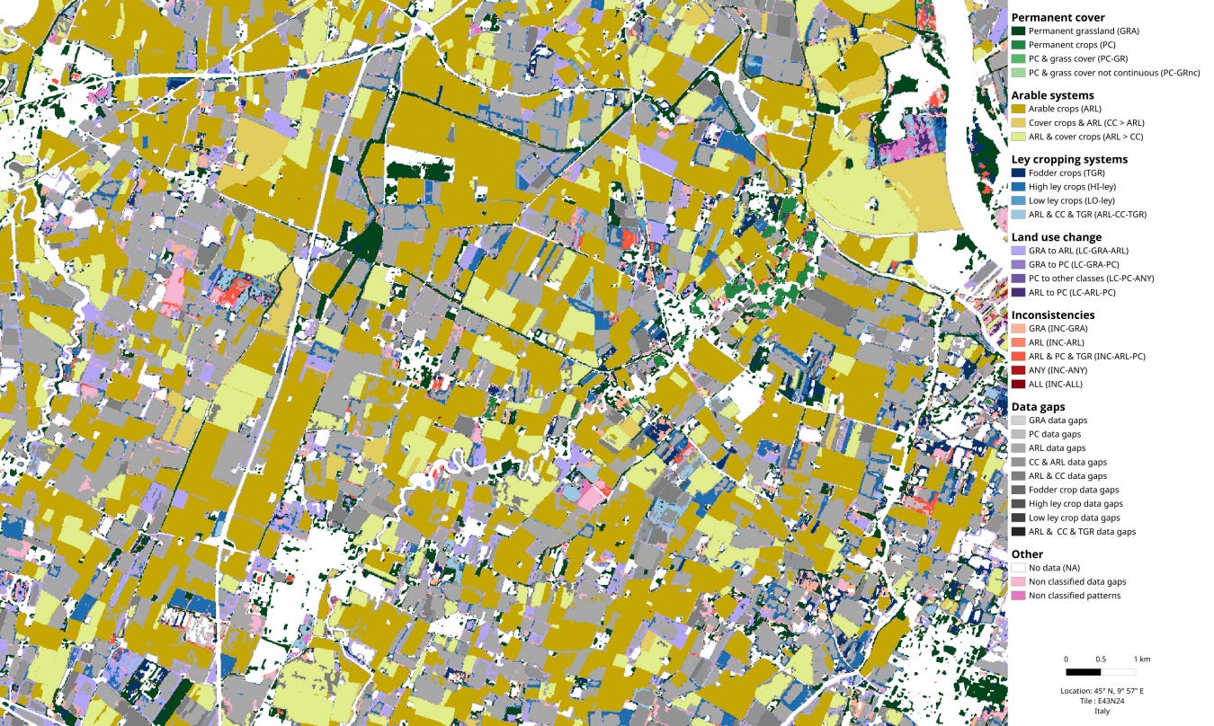
This collection provides a harmonised, Europe-wide agricultural land use systems map at a 10-m spatial resolution covering the period from 2017 to 2021. You can access the data and code here.
2. Global sea and sea-Ice surface temperature dataset
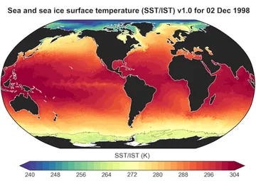
This dataset introduces a 43-year Climate Data Record providing daily, gap-free global fields of combined sea surface temperature and sea-ice surface temperature at a 0.05-degree spatial resolution from 1982 to 2024. You can access the data here and the code here.
3. Pan-Arctic super-resolved land surface temperature dataset
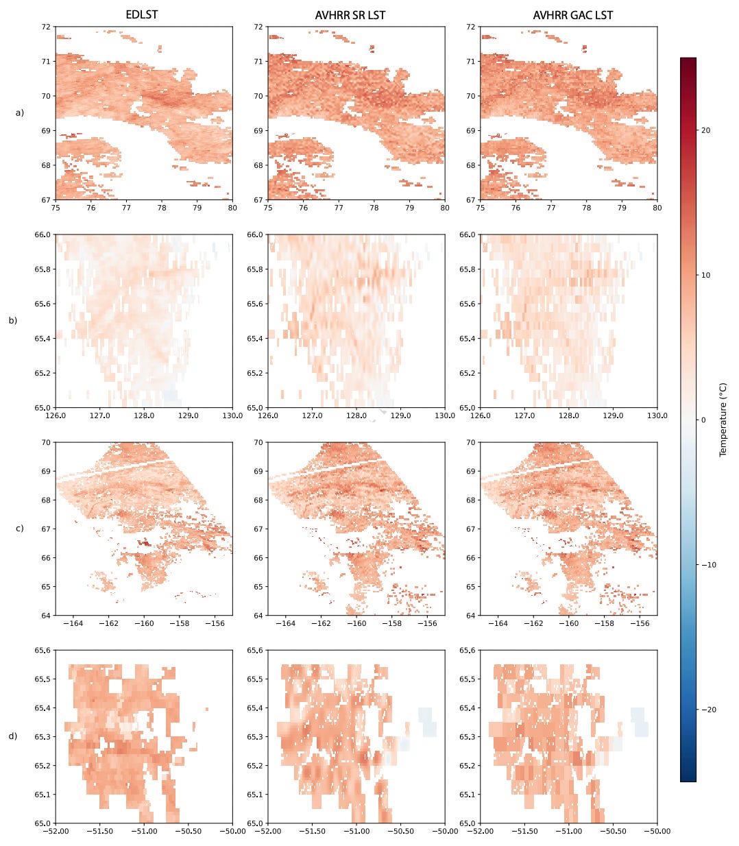
A new 42-year climate data record offers twice-daily, clear-sky land surface temperature (LST) data for the entire pan-Arctic region at a 1-km spatial resolution from 1982 to 2023. You can access the data here.
4. Global coastal soil carbon accumulation dataset
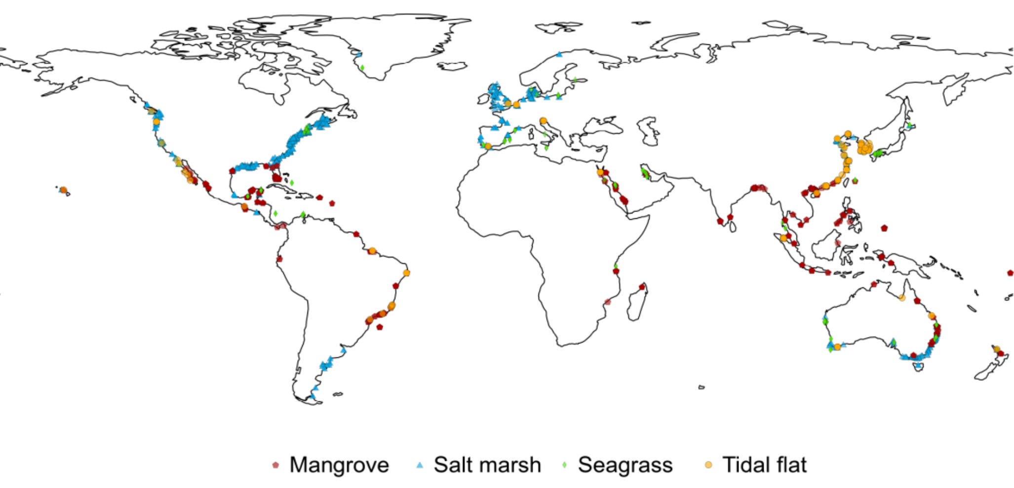
A new global dataset provides a comprehensive inventory of soil organic carbon accumulation rates within coastal wetlands. This open-access resource contains 8,998 standardised field observations derived from a systematic review of 247 peer-reviewed articles published between 1981 and 2025. You can access the data and code here.
Other useful bits
 between October 25, 2025, and January 17, 2026. Uneven and seemingly small elevation changes have added up over the decades, fracturing roads, buildings and water lines.")
New imagery from the NISAR satellite has revealed that Mexico City is sinking at an alarming rate of up to 0.8 inches a month due to the over-pumping of its underlying aquifer. It captures subtle ground movements in detail, providing some pretty shocking insights to help the city manage its infrastructure and pressing water crisis.
As the number of active satellites skyrockets, the science academies of G7 countries have called for the creation of an Intergovernmental Panel on Space Sustainability (IPSS). This initiative aims to establish international standards and global thresholds to protect the night sky, manage orbital space debris, and balance commercial innovation with environmental safety before a critical tipping point is reached.
By analysing a decade of data from its "Black Marble" program, NASA revealed that the Earth's nighttime lighting is highly dynamic and flickers with industrial shifts. The study shows how changes in artificial light trace real-world human stories, from economic booms and urban development to energy crises and green policy shifts. And if you’re a nightlights nerd, you might want to check this out.
Jobs
WFP is looking for a Geospatial Data Engineer based in Rome.
UNICEF is looking for a GIS Lead based in Florence.
GiveDirectly is looking for a Remote Sensing Analyst based in New York.
UNITAR is looking for (1) Geospatial Analysts - Satellite Imagery and GIS and (2) Geospatial Quality, Assurance, Training and Analytical Support Specialists based in Geneva.
WWF is looking for a Senior Conservation Data Analyst/Engineer based in Washington, DC.
Just for Fun
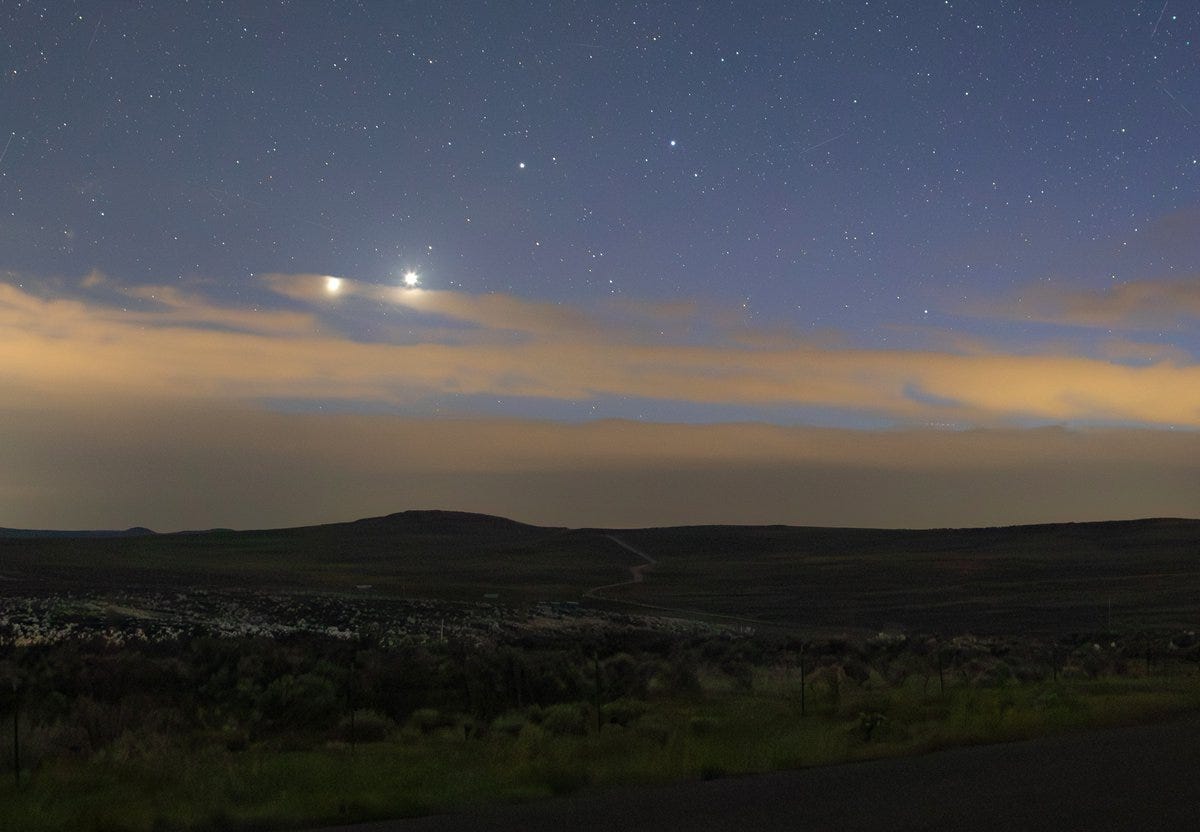
Jupiter and Venus, on 9 June, had the appearance of being pretty close together. This is known as a ‘planetary conjunction.
That’s it for this week.
I’m always keen to hear from you, so please let me know if you have:
new geospatial datasets
newly published papers
geospatial job opportunities
and I’ll do my best to showcase them here.
Yohan